Unedo app icon
EducationScreenshot teardown15 min read

Unedo App Store screenshots

Education apps on the App Store tend to converge on the same visual promise: a friendly mascot, a green progress bar, and a flashcard glowing in soft purple light. Unedo’s screenshot set breaks that mold by borrowing from editorial magazines, party-game packaging, and dark-mode flashcard utilities—sometimes within a single swipe. The result is a seven-frame sequence that feels less like a product tour and more like a set of collectible posters, each arguing a different side of the app’s personality.

Set published by Unedo LLC · 7 frames analysed

4.9 · 201 ratingsFreev2.2.5Updated 4mo ago
Unedo App Store screenshot 1
01At a glance

The set in one screen

Framing
Full-device portrait mockups with thick graphite bezels; partial second device appears in Frame 3; device dropped entirely in Frames 4 and 7.
Captions
Heavy white rounded sans-serif, two to four lines, broken for scannability; top-aligned in the upper safe zone.
Backdrop
Full-bleed solid color fields with darker abstract blob shapes pooling in corners; colors rotate per frame rather than staying uniform.
Type
Large, rounded, almost bubble-weight headlines in white; UI text inside the device is smaller, dark gray or blue, with a contrasting editorial serif for story headers.
UI / copy split
Roughly 60 percent device canvas, 40 percent oversized caption and background; the UI never fights the poster-like framing.
Frame 1 job
Establish daily-use context, show two feature types simultaneously (story and puzzle), and flash an App Store editorial badge.

Sampled palette

#E84A3C#E84A3C
#1565C0#1565C0
#008037#008037
#303F9F#303F9F
#121212#121212
#F5F5F0#F5F5F0
02The challenge

What this screenshot set had to solve

Language apps in the Education category suffer from instant stereotyping: shoppers assume flashcards, phrasebook drills, and travel-small-talk lessons before they read a word. Unedo’s screenshot team had to telegraph, in under four seconds, that the product is not a utility for taxi-vocabulary survival. The frames needed to prove three distinct propositions through imagery alone: first, that the core loop involves tactile word puzzles rather than translation drills; second, that the content is story-driven and culture-specific, complete bylined articles and listenable audio; and third, that there is a credible human editorial layer behind the curriculum. All of this had to be packaged around a new brand character—an orange heart-headed mascot with spectacles—without letting that character dominate the actual interface. The challenge was not simply to show screens; it was to sequence emotional beats so that a scroller moved from curiosity about the game, to trust in the writers, to desire for the outcome, in exactly seven swipes.

The sequence is built like a magazine masthead: color first, caption second, UI third.
03The approach

How the set argues its case

The overarching strategy is 'show the mechanic, then the people, then the proof.' Frame 1 opens with lifestyle dashboard imagery to establish habit-forming context. Frame 2 immediately validates the puzzle mechanic so the shopper knows the interaction model. Frames 3 and 4 pivot to content depth and authorship, answering the question 'why should I trust this?' Frame 5 explains the learning model through inline scaffolds. Frame 6 introduces the retention layer. Frame 7 closes with social proof. This arc mirrors how a skeptical Education shopper evaluates: what is it, how does it work, who made it, and what do I get out of it. Visually, the team relies on a thick-rimmed device mockup—graphite gray, rounded, almost toy-like—to physically anchor each frame. When the device disappears in Frame 4 and Frame 7, the absence is deliberate, forcing the eye to absorb human faces and customer voices without UI chrome. The typography is uniformly heavy: white rounded sans-serif headlines that occupy the top third, set with aggressive line breaks so no caption line exceeds four words. Inside the device, the app uses a lighter touch—editorial serifs for story headers, clean blue sans-serif for puzzle categories, and red pill buttons for audio triggers—creating a clear hierarchy between marketing layer and product layer.

The screenshots position Unedo as the midpoint between a Sunday magazine and a coffee-table puzzle book. By featuring specific cultural artifacts—Seville oranges, Chupa Chups, lucha libre masks, papel picado—and naming writers from Spain, México, Perú, and Colombia, the frames signal that the learner is being invited into a cultural conversation rather than a classroom. The orange mascot appears sparingly: in Frame 1 as a greeter, in Frame 2 as a progress avatar, in Frame 6 as a retention tracker, and in Frame 7 as a testimonial host. This keeps the character present without infantilizing the content.

04Frame by frame

Every screenshot, and the job it does

Unedo App Store screenshot 1 — Establish the ritual
01

Establish the ritual

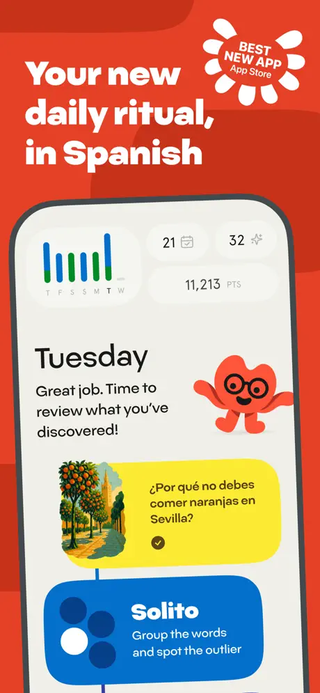
On-frame caption: “Your new daily ritual, in Spanish

The sequence opens on a saturated vermillion field, approximately #E84A3C, with an abstract darker red blob bleeding from the upper left corner. The headline 'Your new daily ritual, in Spanish' is set in massive white rounded letterforms, while a white starburst seal in the upper right reads 'BEST NEW APP App Store' in red text. The device occupies the lower two-thirds, showing a bone-white dashboard UI. At the top of that UI, a streak counter displays '21' beside a calendar icon, '32' beside a sparkle glyph, and '11,213 PTS' in a lighter sans-serif weight. A small bar chart with vertical green and blue lines tracks days labeled T F S S M T W. Below, the word 'Tuesday' anchors the screen in a bold dark face, followed by the sentence 'Great job. Time to review what you've discovered!' The orange mascot waves from the right, partially overlapping a yellow rounded card that asks '¿Por qué no debes comer naranjas en Sevilla?' and carries a small circular illustration of an orange-tree-lined street. Beneath that, a saturated blue rounded rectangle introduces 'Solito' with the sub-line 'Group the words and spot the outlier.' The density is high but hierarchical: the eye travels from the red headline to the mascot, then to the yellow story card, then down to the blue game prompt. The decision to show two distinct feature archetypes—story and puzzle—in the very first frame is an aggressive declaration of scope.
Unedo App Store screenshot 2 — Explain the mechanic
02

Explain the mechanic

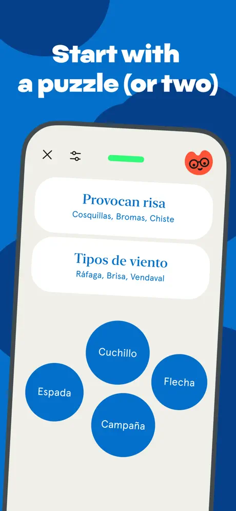
On-frame caption: “Start with a puzzle (or two)

The background switches to a deep cobalt, roughly #1565C0, with darker navy abstract shapes pooling in the top-left and bottom-right corners. The caption 'Start with a puzzle (or two)' sits high in the same white rounded typeface. Inside the device, the UI simplifies to a clean off-white canvas. A dark 'X' close button and a sliders icon flank a bright green progress pill at the top, while the orange mascot appears as a small circular avatar in the upper right. Two large white rounded cards dominate the upper half: the first reads 'Provocan risa' with the words 'Cosquillas, Bromas, Chiste' beneath it in a lighter blue, and the second reads 'Tipos de viento' followed by 'Ráfaga, Brisa, Vendaval.' Below, four oversized blue circles float like tokens, reading 'Cuchillo,' 'Espada,' 'Flecha,' and 'Campaña.' The circles use the same blue as the exterior background, creating a subtle rule that brand color equals interactive element. The mockup is cropped below the vertical midpoint, eliminating any tab bar or bottom navigation and forcing full attention onto the categorization mechanic. The puzzle is immediately legible even at thumbnail size, though the low crop leaves the outcome of the interaction unexplained.

Unedo App Store screenshot 3 — Sell the story layer
03

Sell the story layer

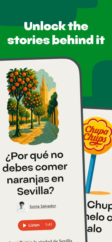
On-frame caption: “Unlock the stories behind it

Now the backdrop is a rich forest green, approximately #008037, divided by layered shapes that reveal an even darker green shadow layer. The caption 'Unlock the stories behind it' is stacked in two lines. The composition is the most complex of the set: the main device is positioned slightly left of center, while a second device intrudes from the right edge, showing only a sliver of its screen. On the primary screen, the illustration from Frame 1 returns at larger scale—a textured painting of orange trees lining a Sevilla street with the Giralda tower visible in warm ochres and teals. Below the art, the headline '¿Por qué no debes comer naranjas en Sevilla?' repeats in bold dark type. A small circular author photo sits above the name 'Sonia Salvador' and a red 'Listen' pill button showing '1:41.' On the partial right-hand device, a Chupa Chups lollipop illustration and the classic red script wordmark are visible, suggesting brand-name cultural stories. The frame argues editorial quality, but the second-device sliver introduces noise; at small scale it reads as a compositional mistake rather than a promise of additional content.

Unedo App Store screenshot 4 — Introduce the writers
04

Introduce the writers

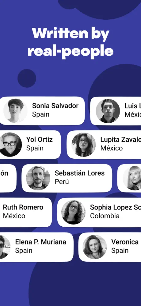
On-frame caption: “Written by real-people

The palette swings to an indigo field, around #303F9F, with lighter lavender blob shapes drifting behind the caption 'Written by real-people.' Notably, there is no device frame in this shot. Instead, a masonry grid of white rounded-rectangle author cards floats against the purple field, each pairing a black-and-white circular headshot with a name and country. Visible names include 'Sonia Salvador / Spain,' 'Yol Ortiz / Spain,' 'Sebastián Lores / Perú,' 'Ruth Romero / México,' 'Sophia Lopez S[...] / Colombia,' 'Elena P. Muriana / Spain,' and 'Veronica / Spain,' with partial cards for 'Luis [L...] / México' and 'Lupita Zavale[ta] / México.' The cards carry subtle drop shadows and are arranged in an irregular brick pattern. Removing the device after three frames of UI is a deliberate credibility maneuver: the shot insists on the human infrastructure behind the app. The black-and-white photography against the hyper-saturated brand palette creates a mature, journalistic tension. However, the caption's hyphen in 'real-people' is a typographic stutter, and the truncation of several names and portraits at the frame edges undermines the very authenticity the frame is trying to prove.

Unedo App Store screenshot 5 — Demonstrate scaffolding
05

Demonstrate scaffolding

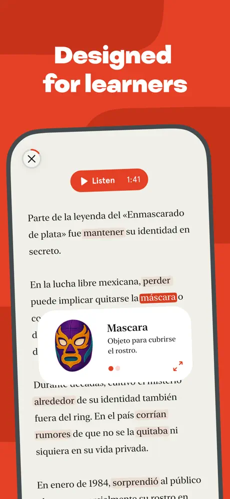
On-frame caption: “Designed for learners

We return to the vermillion red (#E84A3C) background for Frame 5, establishing red as the color of comprehension and study. The caption reads 'Designed for learners.' Inside the device, the UI shows a long-form text screen with a story about the 'Enmascarado de plata' and Mexican lucha libre. The typography is editorial—dark gray text with comfortable line height on an off-white ground. Mid-paragraph, the word 'máscara' is highlighted with a soft red pill background. Overlapping the text is a bottom-sheet-style popup displaying a colorful lucha libre mask illustration beside the vocabulary term 'Mascara' and the definition 'Objeto para cubrirse el rostro.' Beneath the definition, two pagination dots appear—one red, one pale pink—alongside a small expand-arrows icon. At the top of the screen, a red 'Listen' button again shows '1:41,' and a circular close button with a red ring sits in the upper left. This is the most information-dense frame, and it succeeds because the interaction pattern—inline vocabulary rather than detached dictionary—is instantly readable. The cultural specificity of the example term reinforces that the app teaches context, not just translations.

Unedo App Store screenshot 6 — Promise retention
06

Promise retention

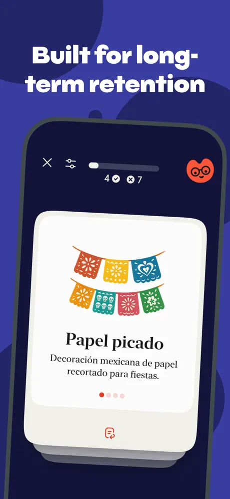
On-frame caption: “Built for long-term retention

The background reverts to deep indigo, around #1A237E, darker and more muted than Frame 4. The caption 'Built for long-term retention' spans two lines. The device now shows a dark-mode interface—a stark visual departure from the previous off-white screens. The phone canvas is a near-black navy, and a white rounded card floats in the center displaying a colorful 'Papel picado' illustration with festive cut-paper banners in red, yellow, blue, orange, and green. The term 'Papel picado' sits in a large dark serif, with the definition 'Decoración mexicana de papel recortado para fiestas.' underneath. A pagination indicator shows four dots—red, pale, pale, pale—suggesting a review stack. At the top of the dark screen, a progress bar shows a gray track with a white fill, the metrics '4' with a checkmark and '7' with an X, and the orange mascot avatar persists in the upper right. The bottom of the white card reveals a small red icon resembling a document stack. By introducing dark mode here, the team signals that the app respects system themes or offers a nighttime review flow. The stacked cards visible behind the main card imply a deck, a familiar mental model for flashcard users. The surrounding indigo is so dark, however, that the device bezel loses its physical separation from the background.

Unedo App Store screenshot 7 — Close with social proof
07

Close with social proof

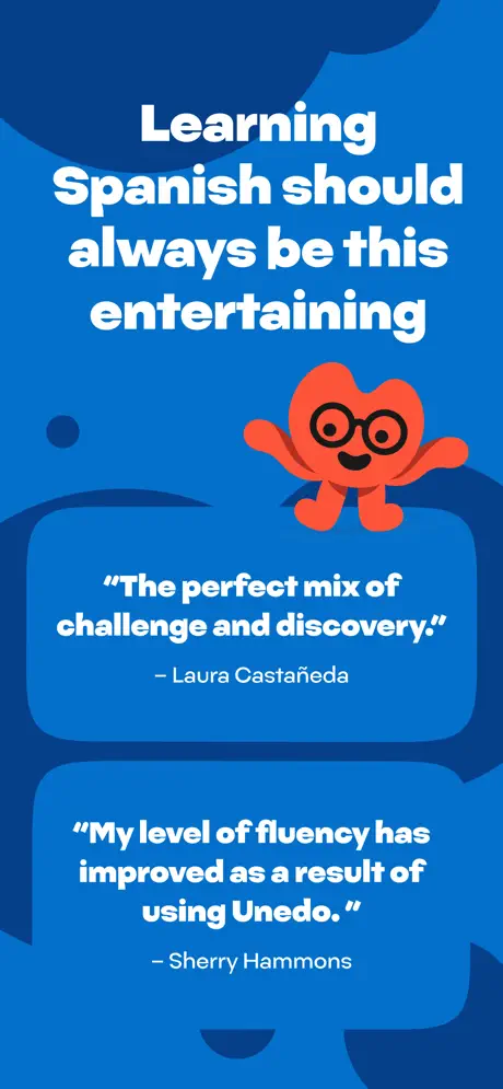
On-frame caption: “Learning Spanish should always be this entertaining

The sequence closes on a bright blue field, approximately #1976D2, with darker blue abstract shapes curling from the top and bottom edges. The orange mascot waves from the upper right, positioned directly beneath the four-line caption 'Learning Spanish should always be this entertaining.' There is no device frame—only brand color, mascot, and voice-of-customer. Two large blue speech-bubble cards contain testimonials in white rounded type. The first reads: 'The perfect mix of challenge and discovery.' — Laura Castañeda. The second reads: 'My level of fluency has improved as a result of using Unedo.' — Sherry Hammons. The quotes are large enough to parse at thumbnail scale, and the bubble tails point loosely toward the mascot as if the character itself delivered the endorsement. This is a classic reassurance play, shifting the argument from product mechanics to emotional outcome. The blue ties back to Frame 2's puzzle color, bookending the sequence with playful tones after the editorial and learning beats in the middle.

05The craft

Captions, colour and the mechanics of the sell

Caption pattern

Every caption uses sentence-case white text, roughly 48–64pt equivalent, with parentheses used for conversational aside: 'Start with a puzzle (or two).' The line breaks are always chosen to keep the longest line to four or five words, which creates a rhythmic, center-weighted column in the upper third.

Visual system

The background colors follow an emotional rather than functional logic. Vermillion (#E84A3C) frames lifestyle and learning. Cobalt (#1565C0) frames gameplay. Forest green (#008037) frames editorial stories. Indigo (#303F9F) frames credibility and retention. This chromatic restlessness keeps the swipe engaging but risks brand fragmentation; the shopper might not instantly recognize Frame 3 and Frame 4 as the same app without the consistent device bezel and mascot.

The thumbnail test

At small scale, the red Frame 1 and blue Frame 2 remain highly legible because the white captions contrast brutally against the saturated grounds. The green Frame 3 and indigo Frame 4 lose some of their secondary detail—author names and story subheads fuzz out—but the headline and the general color block still register as a distinct beat in the sequence. The dark Frame 6 is the riskiest at thumbnail size because the device bezel melts into the indigo surround.

Conversion mechanics

The arc is strategically sound: habit, mechanic, story, authority, pedagogy, retention, proof. By placing the puzzle before the story, the team ensures that shoppers understand the interaction model before they evaluate the content depth. The omission of a dedicated audio-player frame is notable, given that Listen buttons appear in Frames 3 and 5; auditory learners have to infer the playback experience from a small red pill.

06Where it slips

What we would change

The Frame 3 compositional gamble

Showing a partial second device to tease additional stories is compositionally ambitious but structurally vague. At App Store thumbnail size, that sliver of Chupa Chups and truncated text will register as visual noise rather than a promise of brand-name cultural content. The fix is to return to a single-device rule for the frame, using a small carousel-dot indicator or a content card peeking from the right edge within the same screen bounds, rather than introducing a second phone bezel that competes with the primary frame.

Frame 4's typographic and cropping slippage

The caption 'Written by real-people' carries an unnecessary hyphen that breaks typographic polish. More critically, the author cards are truncated at the left and right margins—'Luis L[...]' and 'Lupita Zavale[ta]' are literally cut off. If the purpose of this frame is to prove that real humans wrote the material, partially erasing their names and faces works directly against the message. The fix is to scale the entire card grid down by roughly 8 to 10 percent and enforce a 40-pixel safe margin inside the screenshot canvas, keeping every portrait and name fully visible.

Frame 6's vanishing bezel

Frame 6 introduces dark mode, but the exterior background is already so close to the device's dark chrome—near-black navy against deep indigo—that the physical phone object begins to disappear. The mockup loses the 'floating device' effect that stabilizes the other frames. The fix is to lighten the surrounding background by one shade—for instance, shifting from #1A237E to #303F9F—or to add a subtle radial glow behind the phone so the bezel re-establishes its edge.

The missing audio interface

Red 'Listen' pills appear in Frames 3 and 5, yet no frame actually shows the audio player—no waveform, scrubber, speed toggle, or transcript sync. For a product that clearly invests in editorial audio, this is a strategic omission. A shopper interested in listening practice has to buy on faith. The fix is to replace one mid-sequence frame—likely Frame 5 or Frame 6—with a dedicated listening-screen mockup that visualizes the playback experience, closing the loop on a feature that the captions only imply.

Color fragmentation vs. brand recognition

The rotating palette—red, blue, green, indigo, red, indigo, blue—keeps the swipe journey lively but fragments brand cohesion. A user speed-scrolling through search results sees each frame as a potentially different app. While the mascot and device bezel provide continuity, the team might benefit from anchoring at least one persistent color swatch—perhaps the orange mascot in every frame, or a small red logo bug—to maintain family resemblance across the chromatic jumps.

07The recipe

How to apply this to your own app

  1. Sequence your value propositions like a story arc: hook with context, prove the mechanic, then earn trust with authorship or data.

    Unedo does not lead with reviews or feature lists; it leads with the dashboard and the puzzle. Only after you understand the loop does it show you the writers. Map your screenshots to the shopper's skepticism curve, not your internal feature hierarchy.

  2. Use background color as a scene-change device, not just decoration.

    Each Unedo frame is effectively a new act in a play, signaled by a full-bleed color shift. If your app has distinct modes—play, read, review, socialize—consider assigning each mode a poster color so the swipe rhythm feels like progression rather than repetition.

  3. Make your device bezel work harder.

    The thick graphite frame in Unedo's screenshots turns the phone into a physical object. If you use device mockups, treat the bezel as a brand constant; when you drop it, as Unedo does in Frames 4 and 7, do so intentionally to signal a shift from 'product' to 'people.'

  4. Show the interaction outcome, not just the setup.

    Frame 2 shows the puzzle setup but not the reward or completion state. If your core loop has a satisfying payoff—an animation, a revealed definition, a completed streak—consider showing the post-interaction state rather than the pre-tap state, because emotion converts better than potential.

  5. Audit every crop for truncation errors.

    A screenshot is a fixed canvas; partial text is a broken promise. Before you export, check every name, label, and caption at 100 percent and at thumbnail scale. If an element is cut off, either recompose or remove it entirely.

08Takeaways

Five things worth stealing

  • A rotating poster palette keeps the swipe journey lively, but requires a strong tether—like a recurring device bezel or mascot—to prevent brand fragmentation.
  • Showing two feature types in Frame 1 (story card + puzzle card) is high-risk, high-reward: it declares scope immediately, but demands precise visual hierarchy so the screen does not feel crowded.
  • Removing the device frame to highlight human faces (Frame 4) or quotes (Frame 7) is a powerful pattern interruption, yet it should be paired with extra typographic care because the UI chrome is no longer there to structure the composition.
  • If your product has an audio layer, do not rely on small pill buttons alone; dedicate a frame to the player interface so the shopper can imagine the sensory experience.
  • Every screenshot frame should pass the thumbnail truncation audit: if names, faces, or key UI are clipped at the canvas edge, the frame undermines its own credibility.
09The verdict

What the set actually achieves

The team landed on a poster-system approach: treat every frame as an individually art-directed print, unified only by the device bezel and the recurring mascot. By rotating the exterior background color to match the mood of each feature—red for ritual and learning, blue for play, green for editorial depth, indigo for credibility and retention—they kept the swipe journey from going monochrome. The result is a set that reads as confident, culturally specific, and mechanically transparent, though it occasionally privileges style over immediate legibility.

This case study is for product designers and growth leads building screenshot sets for content-rich education or lifestyle apps, especially those with editorial voices, human authorship, or puzzle-like mechanics that need to be explained visually rather than through copy.

10Questions

Frequently asked

Why does the color change on every Unedo screenshot?

The team uses color as a scene-change device. Red signals ritual and learning; blue signals play; green signals editorial stories; indigo signals credibility and retention. This keeps the swipe sequence from looking like repetitive product grabs, though it risks brand fragmentation if not anchored by consistent elements like the device bezel or mascot.

Should I drop the device frame for some screenshots?

Unedo drops the device in Frames 4 and 7 to shift focus from UI to humans and testimonials. This works because the other five frames establish the phone object so strongly that its absence feels intentional. If you do this, maintain the same background system and typography so the set still feels related.

How does Unedo balance mascot presence without looking childish?

The orange mascot appears in only four of seven frames, and always at a scale smaller than the content. It functions as a progress avatar, a greeter, and a testimonial host—not as the primary storyteller. By keeping the editorial text and author photos in black-and-white or sophisticated illustration styles, the content maintains maturity despite the friendly character.

What is the biggest risk in this screenshot set?

The biggest risk is compositional overreach in Frame 3, where a second partial device introduces visual noise, and truncation in Frame 4, where author names and faces are clipped. Both issues damage clarity at thumbnail size and could be fixed with tighter cropping rules and a single-device policy.

11Keep reading

Build your own screenshot set

Guides

The full set

7 shots
Unedo App Store screenshot 1Unedo App Store screenshot 2Unedo App Store screenshot 3Unedo App Store screenshot 4Unedo App Store screenshot 5Unedo App Store screenshot 6Unedo App Store screenshot 7

About the app

FOR LEARNERS WHO ARE DONE WITH BEGINNER STUFF You don't need another lesson on ordering coffee or asking how to go to the train station. You need a Spanish app that opens up your Unedo LLC, via the App Store listing.

Screenshots and store metadata belong to Unedo LLC. They are shown here for design commentary and criticism. The analysis on this page is original work by floow.design. View the original listing.

More Education teardowns

Browse all →