Unwind app icon
Health & FitnessScreenshot teardown12 min read

Unwind App Store screenshots

Most mindfulness apps on the App Store look like they were dipped in the same lavender bucket: soft gradients, white serif type, and a single lotus stock photo. Unwind’s screenshot set deliberately breaks that monoculture by cycling through three distinct palettes—amber, cyan, and indigo—while keeping the typography and fauna illustration system consistent. The challenge, however, is that this chromatic rhythm only works if each frame earns its place; a shopper swiping in under four seconds must feel a reason to stop at every second screenshot.

Set published by Mystical Bits, LLC · 9 frames analysed

4.8 · 586 ratingsFreev3.5.4Updated 8mo ago
Unwind App Store screenshot 1
01At a glance

The set in one screen

Framing
Alternating 30-degree rotations (Frames 1–2) and flat frontal crops (Frames 3–8). Frame 3 uniquely stacks two cropped devices vertically.
Captions
Large sans-serif headlines with one keyword trapped inside a rounded pill; secondary sentences in a lighter weight and lower opacity.
Backdrop
Solid gradients. Amber reads near #F2C94C to #E5B13A; cyan near #81D5E5; indigo near #2E2656.
Type
Heavy geometric sans (SF Pro Display–adjacent) at large display sizes; body copy inside devices at 14–16 pt with muted contrast.
UI / copy split
Roughly 60:40. Device chrome occupies the majority of the canvas, but the marketing headline and subhead anchor the negative space.
Frame 1 job
Category claim and outcome list. The headline "Best [crown] Breathing App" owns the top-left quadrant.

Sampled palette

#F2C94C#F2C94C
#E5B13A#E5B13A
#81D5E5#81D5E5
#2E2656#2E2656
#FFD1A1#FFD1A1
#0A1929#0A1929
02The challenge

What this screenshot set had to solve

Unwind is competing in Health & Fitness, a category where the top twenty apps have trained users to expect pastel gradients, white sans type, and a generic woman meditating on a beach. The design challenge is therefore twofold: signal calm without falling into cliché, and prove functional depth before the shopper reaches the end of the gallery. The screenshots must communicate that this is not just another ambient-sound wrapper, but a tool with structured breathing cadences, customizable blocks, streak statistics, journal entries, and home-screen widgets. That is a lot of surface area to cover in eight static frames, especially when Apple truncates portrait captions above the fold on an iPhone 15 Pro Max. Every frame therefore needs a single, scannable thesis: one headline, one supporting clause, and one piece of UI evidence that does not require a magnifying glass.

"The set alternates palettes like clockwork—amber, cyan, indigo, amber—which creates rhythm but also predictability by the seventh frame."
03The approach

How the set argues its case

The team uses palette as a navigational cue. Odd frames (1, 4, 7) return to amber; even frames (2, 5, 8) settle into cyan; the mid-point frames (3, 6) drop into indigo. This gives the impression that the app itself contains distinct 'modes'—day, night, twilight—even though the UI inside the devices does not strictly match those backgrounds. The marketing layer and the app layer are allowed to diverge chromatically, which is a risky but visually effective choice. Typography follows a rigid headline pattern: one to two words in a heavy sans, one keyword trapped inside a filled rounded pill, and a subheadline at roughly 65% opacity. This pattern appears in Frames 4 (Custom), 5 (Reflect), 6 (Progress), 7 (Quotes), and 8 (Widgets), creating a节拍-like consistency. Device framing alternates between aggressive rotation and flat frontal presentation to modulate energy: Frames 1 and 2 feel cinematic; Frames 4 through 8 feel like direct product photography. The fauna motif—deer, whales, camels—extends past the device bounds, turning the phone into a window rather than a self-contained object.

Unwind positions itself as the breathing app for people who want control, not just atmosphere. Frames 4 and 6 do the heavy lifting here: the custom exercise builder shows exact second counts and block math, while the stats screen shows streaks and bar charts. This is not an app that whispers vaguely about wellness; it plots BPM deltas and 46-day streaks. The positioning is therefore utility-first mindfulness, backed by quantified-self proof.

04Frame by frame

Every screenshot, and the job it does

Unwind App Store screenshot 1 — Value Prop & Category Claim
01

Value Prop & Category Claim

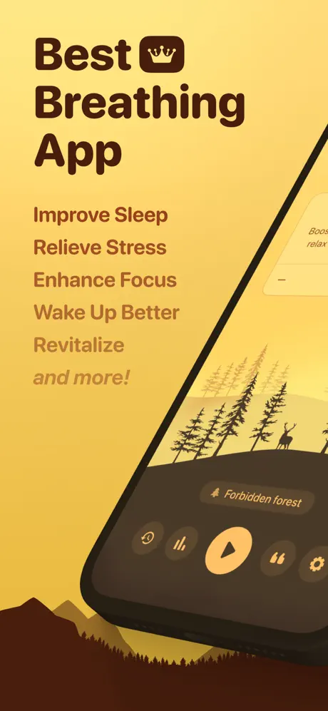
On-frame caption: “"Best [crown glyph] Breathing App" followed by a vertical list: Improve Sleep, Relieve Stress, Enhance Focus, Wake Up Better, Revitalize, and more!

Frame 1 opens with a heavy headline in a very dark brown (#3E2723) set against a warm amber background that grades from roughly #F2C94C at the top to a deeper marigold near the bottom. The word 'Best' is paired with a crown icon locked inside a solid dark-brown square, giving the lockup a badge-like authority. Beneath the headline, a vertical stack of benefit statements descends in both size and opacity, starting at a dark sepia (#5D300E) and fading toward a muted tan, with the final line 'and more!' italicized for cadence. The device enters from the lower-right at approximately a 30-degree counter-clockwise rotation, its bezel and bottom edge cropped by the canvas. On-screen, the app UI reveals a chocolate bottom sheet (#3B2318) containing a pill label that reads 'Forbidden forest' and a large peach play button (#FFD1A1) inside a circular container of about 64 pt. Behind the UI, stylized conifers and a deer silhouette march across an illustrated ridge, while dark brown mountain silhouettes anchor the bottom-left corner, extending the in-app world into the marketing layer.
Unwind App Store screenshot 2 — Soundscapes & Catalog
02

Soundscapes & Catalog

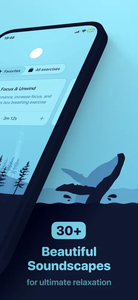
On-frame caption: “"30+" inside a cyan pill, "Beautiful Soundscapes", "for ultimate relaxation"

The palette pivots to a cool cyan wash near #81D5E5. A device hangs from the upper-left at a shallow clockwise tilt, its status bar reading '19:46' in dark navy. Two filter chips—'Favorites' and 'All exercises'—appear as outlined pills beneath the status bar. A visible card is titled 'Focus & Unwind' with partially readable body copy ('...mance, increase focus, and ... box breathing exercise') and a duration string ('...3m 12s'). The lower half of the canvas is given over to typographic hierarchy: a rounded badge containing '30+' in near-black (#0A1929) against a lighter cyan (#A8E6F0), then the headline 'Beautiful Soundscapes' in heavy sans at roughly 40 pt, followed by 'for ultimate relaxation' in a smaller, lighter weight. The bottom fifth of the frame drops into a deep navy illustration band (#0C1A2B) where a whale fluke and conifer silhouettes mirror the fauna motif from Frame 1, but in a nocturnal, aquatic register.

Unwind App Store screenshot 3 — Exercise Breadth & Mood Filtering
03

Exercise Breadth & Mood Filtering

On-frame caption: “"15+", "Breathing Exercises", "to transform your life"

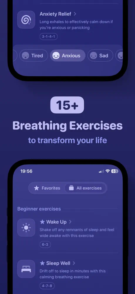
Frame 3 switches to a matte indigo background (#2E2656) and abandons rotation in favor of two front-facing devices stacked vertically with a large typographic centerpiece sandwiched between. The top device is cropped to reveal the 'Anxiety Relief' exercise: a spiral icon, the exact description 'Long exhales to effectively calm down if you're anxious or panicking', the cadence tag '3-1-4-1', and a row of mood chips reading 'Tired', 'Anxious' (selected and filled), and 'Sad'. The center lockup places '15+' inside a soft lavender pill (#C4B5E0), followed by 'Breathing Exercises' in oversized light violet (#E8E0F5) and 'to transform your life' in desaturated lilac. The bottom device, cropped at the top, shows the status bar '19:56', the 'Favorites / All exercises' filter pills, a 'Beginner exercises' section header, and two list items transcribed exactly: 'Wake Up' with the body 'Shake off any remnants of sleep and feel wide awake with this exercise' and the tag '6-3'; and 'Sleep Well' with 'Drift off to sleep in minutes with this calming breathing exercise' tagged '4-7-8'.

Unwind App Store screenshot 4 — Custom Exercise Builder
04

Custom Exercise Builder

On-frame caption: “"Build Custom Exercises" with 'Custom' inside a dark-brown pill

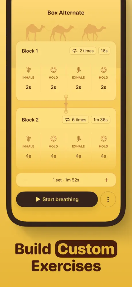
The amber palette returns. The device is perfectly vertical and centered, showing a screen titled 'Box Alternate'. Across the top third, camel silhouettes in a low-opacity tan (#D4A056 at roughly 25% opacity) march behind the UI. The interface presents two rounded rectangular blocks. Block 1 lists INHALE 2s, HOLD 2s, EXHALE 2s, HOLD 2s, with a chip noting '2 times' and a total '16s'. Block 2 scales each phase to 4s, repeats '6 times', and tallies '1m 36s'. Thin vertical divider lines separate the four phases, and a small circular bead on a vertical line connects the two blocks. Below, a stepper reads '- 1 set · 1m 52s +'. The primary CTA is a dark-brown (#3B2318) filled capsule with a play glyph and the words 'Start breathing'. Beneath the device, the headline 'Build Custom Exercises' traps the word 'Custom' inside the same dark-brown pill used for the CTA, locking the marketing typography to the UI's button language.

Unwind App Store screenshot 5 — Journal & Emotional Logging
05

Journal & Emotional Logging

On-frame caption: “"Reflect" inside a near-black pill, "and Grow", "Capture your daily emotions and personal insights"

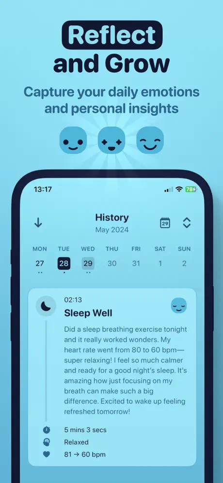
Frame 5 reverts to cyan. At top, 'Reflect' sits inside a near-black pill (#0A1929) with white text; directly beneath, 'and Grow' appears in the same dark hue. The subhead reads 'Capture your daily emotions and personal insights'. Three circular emoji icons—neutral smile, star-eyed, content—act as a bridge between the text and the device. The phone displays the 'History' screen, timestamped '13:17' and dated 'May 2024'. A calendar strip (MON through SUN) shows the 28th highlighted. Below, an entry begins at '02:13' with the title 'Sleep Well' and a body paragraph transcribed exactly: 'Did a sleep breathing exercise tonight and it really worked wonders. My heart rate went from 80 to 60 bpm—super relaxing! I feel so much calmer and ready for a good night's sleep. It's amazing how just focusing on my breath can make such a big difference. Excited to wake up feeling refreshed tomorrow!' Bottom metadata lists '5 mins 3 secs', 'Relaxed', and '81 → 60 bpm', converting the abstract idea of a journal into a quantified, emotional receipt.

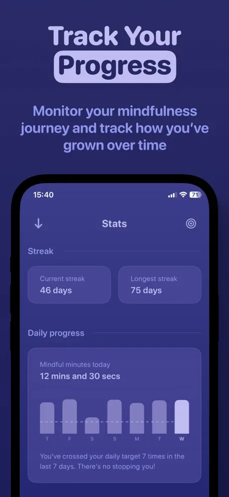
Unwind App Store screenshot 6 — Stats & Streak Tracking
06

Stats & Streak Tracking

On-frame caption: “"Track Your Progress", "Monitor your mindfulness journey and track how you've grown over time"

Indigo returns. 'Track Your' appears in pale lavender (#D1C4E9), while 'Progress' sits inside a filled light-violet pill (#D1C4E9 with #2E2656 text). The subhead spans three lines. The device shows '15:40' and a 'Stats' header. A 'Streak' section presents two rounded cards: 'Current streak 46 days' and 'Longest streak 75 days'. Below, 'Daily progress' introduces 'Mindful minutes today 12 mins and 30 secs' above a seven-day bar chart with labels T, F, S, S, M, T, W, rendered in desaturated violet bars with the final bar highlighted in a lighter tint. A micro-copy footer states: 'You've crossed your daily target 7 times in the last 7 days. There's no stopping you!' The density of data here attempts to prove habit formation, though the bars lack numerical labels or a goal threshold line.

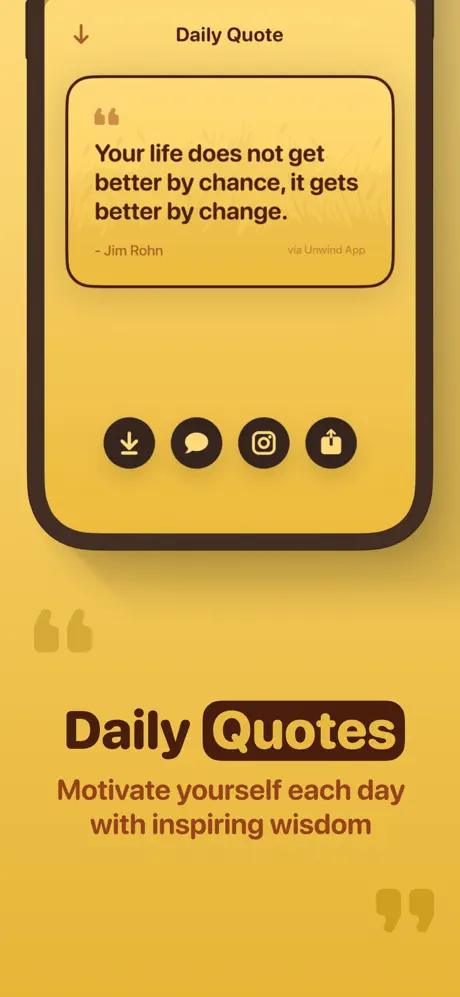
Unwind App Store screenshot 7 — Daily Quotes
07

Daily Quotes

On-frame caption: “"Daily Quotes", "Motivate yourself each day with inspiring wisdom"

Amber again. The device, framed vertically, shows a 'Daily Quote' screen. A rounded card contains opening quotation marks, the text 'Your life does not get better by chance, it gets better by change.' in dark brown, then '- Jim Rohn' left-aligned and 'via Unwind App' right-aligned in smaller type. Below the card, four dark-brown circular action buttons carry white glyphs: download, message, Instagram, and share/upload. The background gradient matches Frames 1 and 4. The lower headline reads 'Daily' in open text and 'Quotes' in a dark-brown pill, followed by the subtitle 'Motivate yourself each day with inspiring wisdom'. Ghosted quotation-mark watermarks at roughly 8% opacity float in the bottom-left and bottom-right corners, reinforcing the theme without competing for attention.

Unwind App Store screenshot 8 — iOS Widgets
08

iOS Widgets

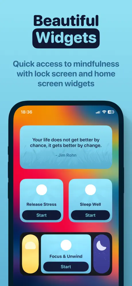
On-frame caption: “"Beautiful Widgets", "Quick access to mindfulness with lock screen and home screen widgets"

The final frame returns to cyan. 'Beautiful' in #0A1929 sits above 'Widgets' in a black rounded pill. The subhead explains: 'Quick access to mindfulness with lock screen and home screen widgets'. The device displays an actual iOS home screen with a vibrant red-orange-yellow wallpaper. Four widgets are arranged: a large rectangular quote widget repeating the Jim Rohn text against the app's signature cyan; two medium square widgets labeled 'Release Stress' and 'Sleep Well', each with a white circle visualization and a dark 'Start' button; and a lower row partially revealing a 'Focus & Unwind' widget. By showing the app's branding outside the app container, this frame attempts to prove system-level integration, though the repeated quote undermines the sense of variety.

05The craft

Captions, colour and the mechanics of the sell

Caption pattern

Headline + pill-locked keyword + subheadline. Example: 'Build [pill]Custom[/pill] Exercises'. Frames 1 and 3 break this slightly by using the pill only for numerical badges ('30+', '15+'). The subheadlines tend to be functional ('for ultimate relaxation') rather than emotional, keeping the copy grounded.

Visual system

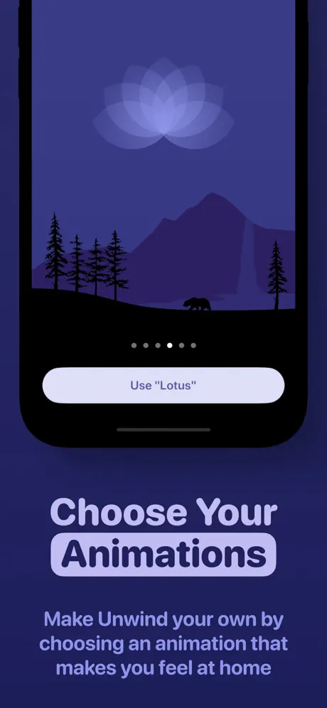
Three flat-color gradients serve as stage backdrops. Overlaid illustrations (mountains, whales, camels, trees) are rendered in silhouettes that share the same hue family as the background but at much darker or more saturated values. Inside the devices, the app UI uses soft cards with 12 pt corner radii, thin divider lines, and low-contrast icons. The external marketing typography is much heavier and darker than the in-app typography, creating a foreground/background hierarchy that pushes the phone back into the canvas while pulling the headline forward.

The thumbnail test

At thumbnail size, Frame 1 reads as a yellow rectangle with bold dark type. It is readable. Frame 2 reads as cyan with a dark footer. Frame 3 risks collapsing into a dark purple blob because the two devices are small and the center text is tall. Frame 4 returns to the high-contrast yellow and is instantly legible. Frames 5 and 6 are moderate. Frame 7 is strong. Frame 8 is moderate. The strongest thumbnails are 1, 4, and 7 because they share the amber background, which means a shopper scrolling the search-results page might actually think those are the same app repeated. The lack of a persistent brand mark or logotype on every frame is a missed opportunity for thumbnail continuity.

Conversion mechanics

Frame 4 is the strongest conversion asset for power users because it shows specific second-level control that competing apps often hide behind paywalls. Frame 5 is the strongest emotional converter because the journal entry reads like a real user review embedded inside the product. Frame 3 is the weakest because the double-crop sandwich makes both devices feel like fragments rather than proof.

06Where it slips

What we would change

The rotation in Frame 1 sacrifices too much UI legibility.

The 30-degree rotation crops the bottom control cluster and truncates the right bezel. The 'Forbidden forest' pill and play button are visible but feel glimpsed rather than composed. Fix: reduce rotation to 15 degrees or enlarge the device so the controls sit fully inside the safe area.

Frame 3's stacked devices obscure the interface.

Both phones are aggressively cropped; neither reads as a complete screen. The mood chips and exercise list are compelling, but they fight the oversized '15+' centerpiece. Fix: replace the sandwich with one full-height device on the left and use the right rail for the typographic lockup, or crop only one edge, not two.

The palette cadence becomes mechanically predictable.

Amber, cyan, indigo, amber, cyan, indigo, amber, cyan. By Frame 7 a shopper can predict the next background. Fix: break the pattern at Frame 7 or 8 with an unexpected true-black or dark-mode treatment to re-engage the eye.

Frame 6's bar chart is decorative rather than informative.

There are no Y-axis labels, no target line, and no values above the bars. In a static screenshot, 'Track Your Progress' needs verifiable proof. Fix: add a dashed '10 min goal' line and label at least the tallest bar so the data reads as achievement, not texture.

The Jim Rohn quote is repeated verbatim across Frames 7 and 8.

When a shopper moves from the in-app quote screen to the widget preview and sees identical text, the widget frame feels like a resized screenshot rather than a distinct ecosystem feature. Fix: swap the widget quote for a different attribution or show a breath-timer widget instead.

07The recipe

How to apply this to your own app

  1. Alternate palettes to create swipe rhythm, but break the pattern before it becomes a metronome.

    Use color as a chapter marker—warm for creation, cool for consumption, dark for reflection—but introduce an outlier frame near the end to disrupt expectation.

  2. Use pill-shaped emphasis as a typographic grammar, not a decoration.

    If one keyword per headline gets the pill treatment, define a rule for why: is it the verb? The noun? The metric? Consistency makes the pattern readable.

  3. Show real numbers in screenshots, not filler.

    Unwind's '1m 52s' and '46 days' work because they look like real user data. If your app tracks anything—time, reps, streaks—populate the screenshot with specific, believable figures rather than round placeholders.

  4. Allow illustration to bleed past the device bezel.

    The whales, camels, and deer extend the app world into the marketing layer, turning the phone into a window. This is cheaper than 3D renders and more distinctive than a gradient alone.

08Takeaways

Five things worth stealing

  • Unwind’s set proves that palette rotation can replace photography as a differentiator in a crowded category.
  • The strongest frames are the most specific—Frame 4’s second-level timing and Frame 5’s heart-rate journal entry outperform generic 'relax' promises.
  • The set would benefit from a single persistent brand mark or icon treatment so that thumbnails in search results read as family members, not competitors.
  • Honest data beats aspirational blur: a bar chart with no labels asks the shopper to trust; a bar chart with numbers gives them a reason.
  • Repetition across frames is a content-production risk that static screenshots cannot hide; vary copy and assets between adjacent contexts.
09The verdict

What the set actually achieves

The resulting set establishes immediate category authority in Frame 1, proves breadth of content in Frames 2–3, demonstrates advanced utility in Frame 4, emotional logging in Frame 5, behavioral proof in Frame 6, ancillary lifestyle content in Frame 7, and platform integration in Frame 8. The alternating color system keeps the thumb from swiping past out of boredom, while the repeated pill-shaped emphasis treatment creates a recognizable headline grammar across every frame.

Mid-weight designers and solo founders building Health & Fitness or wellness apps who need a systematic approach to color, device framing, and feature proof without relying on stock photography or generic lifestyle shots.

10Questions

Frequently asked

Why does Frame 3 use two devices?

To show both a specific exercise and the broader library simultaneously. However, the execution crops both devices so aggressively that neither screen feels complete.

What is the headline font?

The external marketing type appears to be a heavy geometric sans, likely SF Pro Display Heavy or a similar weight, set at display scale with tight leading.

Why are some pills dark with light text and others light with dark text?

There is no consistent semantic rule visible. Frame 4 and 5 use dark pills; Frame 6 uses a light pill. This inconsistency weakens the brand system.

Does the set show the paywall or subscription tier?

No frame in the visible set explicitly surfaces pricing, premium badges, or subscription prompts.

11Keep reading

Build your own screenshot set

Guides

The full set

9 shots
Unwind App Store screenshot 1Unwind App Store screenshot 2Unwind App Store screenshot 3Unwind App Store screenshot 4Unwind App Store screenshot 5Unwind App Store screenshot 6Unwind App Store screenshot 7Unwind App Store screenshot 8Unwind App Store screenshot 9

About the app

Unwind is a refreshing, delightful, and distraction-free mindful breathing companion to help you with meditation and get you through the day. Unwind combines beautiful Mystical Bits, LLC, via the App Store listing.

Screenshots and store metadata belong to Mystical Bits, LLC. They are shown here for design commentary and criticism. The analysis on this page is original work by floow.design. View the original listing.

More Health & Fitness teardowns

Browse all →