
Voiced AI app icon
Health & FitnessScreenshot teardown15 min read

Voiced AI App Store screenshots

Few categories punish visual sameness as brutally as Health & Fitness. Scroll the storefront and you will drown in sage greens, lavender gradients, and mandala-adjacent calmness. Voiced AI enters this space with an 8-frame screenshot set that trades the usual spa-tone sobriety for burnt terracotta, heavy newsprint grain, and editorial typography. The result is a distinctly warm, human proposition, though the sequence is not without structural wounds.

Set published by Myrtle · 8 frames analysed

4.7 · 485 ratingsFreev1.0.29Updated 6mo ago
Voiced AI App Store screenshot 1
01At a glance

The set in one screen

Framing
Mixed: three frames are device-free collages (1, 6, 8); five use an iPhone 15 Pro chassis (2, 3, 4, 5, 7).
Captions
A two-line headline lockup: a bold sans-serif functional statement, followed by an italic high-contrast serif for emotional payoff.
Backdrop
Two alternating surround colors: a textured terracotta-to-apricot gradient with paper grain for emotional frames, and a warm off-white (#F2F0EA) for device UI frames.
Type
Geometric sans-serif for the imperative; high-contrast italic serif for the resolution. The serif weight appears lighter, creating a deliberate decrescendo in each headline.
UI / copy split
Heavy on realistic UI text—long chat transcripts, timeline summaries, and reflective essays—rather than marketing slogans. The copy reads like actual therapy or journaling excerpts.
Frame 1 job
Set emotional temperature without showing a single interface element.

Sampled palette

Deep rust with grain vignette#8B3A1F
Terracotta mid-tone#D66C3F
Warm peach#E89B68
Cream surround#F2F0EA
Charcoal type#2C2C2C
Mint live indicator#34C759
02The challenge

What this screenshot set had to solve

The product is an AI voice journal. Its value lives in intangibles: emotional release, privacy, and the feeling of being heard by something patient. Static screenshots cannot play audio, so the designer must make 'voice' visible through waveforms and conversational density. At the same time, the app asks users to be vulnerable; the storefront must immediately signal that this is a private, human space, not a data-harvesting chatbot. The competitive set in Health & Fitness is visually numb, so any warmth is welcome, but warmth without credibility reads as unserious. The challenge, then, is to alternate between feeling and proof—between collage and interface—without dropping the shopper's attention across eight frames.

Every screenshot must earn its place in the swipe. Repeating a frame does not reinforce a message; it telegraphs a lack of depth.
03The approach

How the set argues its case

The art direction relies on a binary rhythm. Emotional, device-free collage frames (1, 6, 8) use the textured terracotta gradient and layered photography to sell the 'why.' Interface frames (2, 3, 5, 7) sit on warm cream so the phone bezel reads as an object of study rather than a floating rectangle. Frame 4 breaks this rhythm unintentionally by duplicating Frame 3. The typography never deviates: the sans-serif handles the practical promise ('Voice your feelings,' 'Talk. Reflect.'), while the italic serif delivers the emotional benefit ('Discover peace,' 'Grow.'). This predictability is an asset; a shopper swiping at speed learns the cadence and trusts the authorship. The UI itself mirrors this duality: raw user transcripts in quotation blocks sit beside AI summaries in plain prose, proving the app listens and distills.

Voiced positions itself not as a meditation utility or a clinical therapy platform, but as an intimate conversation. The polaroids in Frame 1, the glassmorphic waveform pills in Frame 6, and the vulnerable chat copy ('embarrassing that I used to just scroll when i felt anxious') all reinforce a diary-like privacy. The set avoids quantified-self metrics—no streaks, no graphs, no mood sliders—and instead sells frequency through sheer list density in Frame 7. The positioning is emotional-archival rather than performance-tracking.

04Frame by frame

Every screenshot, and the job it does

Voiced AI App Store screenshot 1 — 'Little moments that bring clarity.'
01

'Little moments that bring clarity.'

On-frame caption: “Little moments that bring clarity.

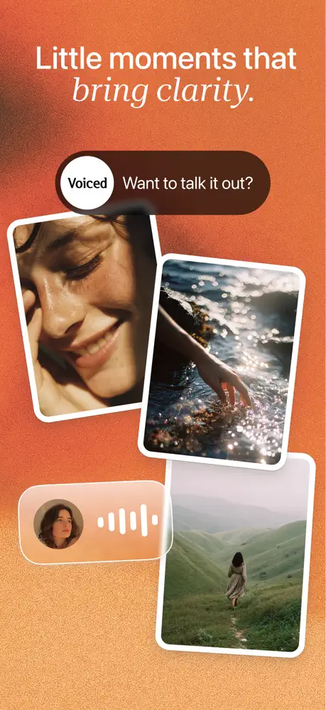
The opening frame refuses to show a device. Instead, it presents a terracotta-to-apricot gradient field, dense with paper grain and a vignette that sinks to deep rust (~#8B3A1F) in the upper left. The headline is split across two lines: 'Little moments that' in a bold, tightly-tracked white sans-serif, and 'bring clarity.' in a high-contrast italic serif. Below, a dark chocolate pill (~#4A2E23) reads 'Want to talk it out?' in white, but the real compositional anchor is a white circular 'Voiced' badge overlapping the pill's left edge, casting a faint drop shadow that lifts the stack. Three polaroid-style rectangles with thick white borders and roughly 16pt corner radii tumble down the frame—a close-up face tilted slightly left, a hand breaking sunlit water, and a solitary figure in green hills. A small, frosted peach-transport card at lower left contains a circular portrait and a five-bar audio waveform. The frame is entirely emotional. It establishes the thermal palette, the editorial typography, and the central metaphor: human media—photos, voice, memory—rather than data dashboards.
Voiced AI App Store screenshot 2 — 'Voice your feelings. Discover peace.'
02

'Voice your feelings. Discover peace.'

On-frame caption: “Voice your feelings. Discover peace.

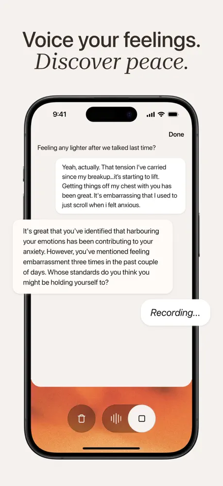
Here the sequence pivots to proof. The surround switches to warm off-white (~#F2F0EA), and an iPhone 15 Pro with Dynamic Island appears, status bar reading 9:41. The headline above the device repeats the sans/italic serif pairing: 'Voice your feelings.' in dark charcoal (~#2C2C2C), 'Discover peace.' in matching italic. Inside the screen, a conversational UI unfolds with uncommon realism. A grey system bubble asks, 'Feeling any lighter after we talked last time?' The user's response fills a long white bubble: 'Yeah, actually. That tension I've carried since my breakup...it's starting to lift. Getting things off my chest with you has been great. It's embarrassing that I used to just scroll when i felt anxious.' A longer system bubble below pattern-spots the anxiety: 'It's great that you've identified that harbouring your emotions has been contributing to your anxiety. However, you've mentioned feeling embarrassment three times in the past couple of days. Whose standards do you think you might be holding yourself to?' At the bottom right, a white oval pill reads 'Recording...' The bottom chrome is a full-width orange gradient bar textured to match Frame 1, holding an asymmetrical triad of controls: a dark umber (~#6B3020) trash circle, a waveform capsule, and a white stop square. The density is high, but it answers the shopper's question: this is not a chatbot that spams affirmations; it listens and reflects.

Voiced AI App Store screenshot 3 — 'Thoughtful reflections, shaped by you.'
03

'Thoughtful reflections, shaped by you.'

On-frame caption: “Thoughtful reflections, shaped by you.

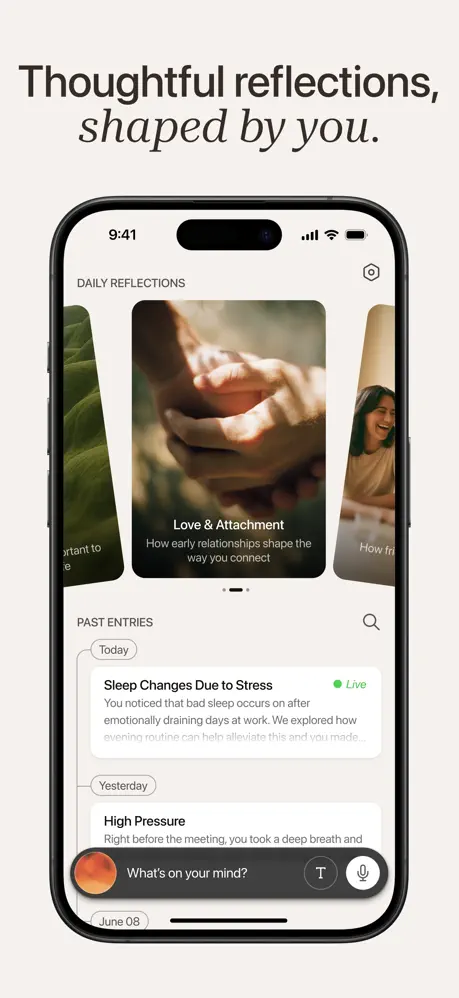
The device remains on the warm cream surround. The headline above is unchanged in treatment. The screen shows a content hub: 'DAILY REFLECTIONS' in small caps at top left, a hexagonal settings icon at top right. A horizontal carousel dominates the upper half, centering a card titled 'Love & Attachment' with the subtitle 'How early relationships shape the way you connect' over an image of interlaced hands. Partial cards bleed off left and right. A two-dot pagination indicator sits centered below. Under this, 'PAST ENTRIES' is anchored left with a search magnifier right. A vertical timeline begins with a thin grey connector line. A 'Today' pill tags an entry headlined 'Sleep Changes Due to Stress,' flagged by a bright mint-green (~#34C759) 'Live' dot, followed by a truncated body paragraph. A 'Yesterday' pill introduces 'High Pressure,' also truncated. The floating bottom bar is a dark charcoal pill (~#3A3A3A) with an iridescent orange sphere at left, placeholder text 'What's on your mind?', a text icon, and a microphone icon. This frame teaches architecture: carousels for exploration, a timeline for history, and a persistent input that never disappears.

Voiced AI App Store screenshot 4 — Duplicate of Frame 3
04

Duplicate of Frame 3

On-frame caption: “Thoughtful reflections, shaped by you.

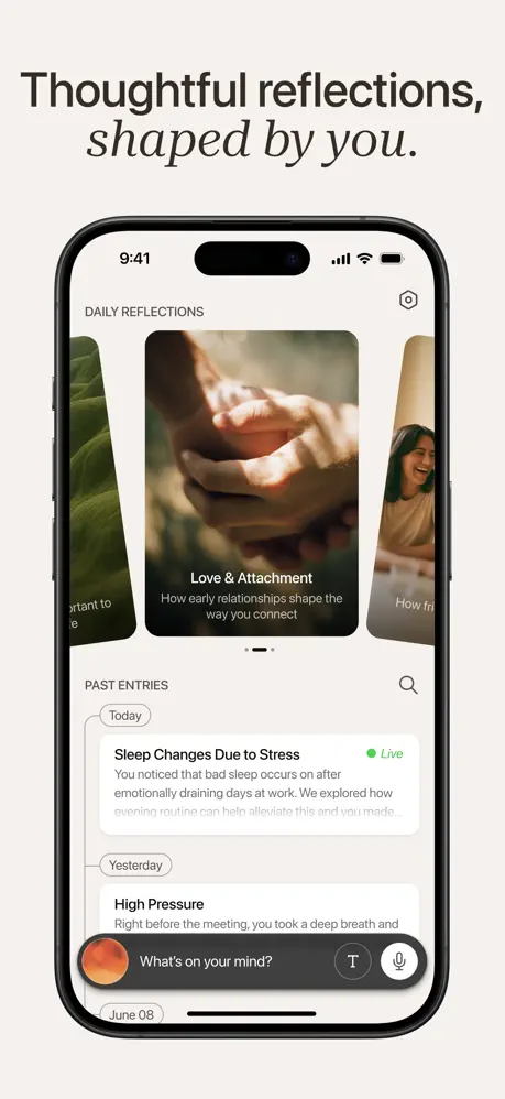
This frame is structurally identical to Frame 3. It repeats the same headline 'Thoughtful reflections, shaped by you.' with the same typographic weights and positioning. Inside the device, the carousel still centers 'Love & Attachment' with the same hand photograph and subtitle 'How early relationships shape the way you connect.' The same partial card bleeds from the right edge, showing the same woman smiling. The dot indicator shows the same state. The 'PAST ENTRIES' list preserves the same 'Today' pill above 'Sleep Changes Due to Stress' with the mint 'Live' badge and identical truncation point, and the same 'Yesterday' pill above 'High Pressure.' The floating bottom bar carries the same 'What's on your mind?' placeholder, the same text and microphone icons, and the same orange orb. There is no state change, no alternate flow, no variation in crop. It is a duplicate screenshot occupying a slot in an eight-frame narrative, and it stops the sequence cold.

Voiced AI App Store screenshot 5 — 'Talk. Reflect. Grow.'
05

'Talk. Reflect. Grow.'

On-frame caption: “Talk. Reflect. Grow.

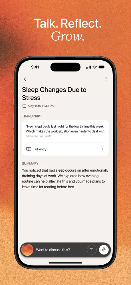
The surround returns to the textured terracotta gradient, bookending the set with Frame 1's warmth. The headline uses period-separated imperatives ('Talk. Reflect.') in white sans-serif, with 'Grow.' in italic serif beneath. The device screen shows an individual entry detail for 'Sleep Changes Due to Stress.' The navigation shows a back chevron left and a vertical ellipsis right. Metadata reads 'May 15th 6:43 PM' beside a calendar icon. The content is bifurcated into labeled sections: 'TRANSCRIPT,' in uppercase 12pt tracked lettering, contains a quoted user block—'Hey, I slept badly last night for the fourth time this week. Which makes the work situation even harder to deal with because I'm tired.'—followed by a 'Full entry' chevron row. Below, 'SUMMARY' offers AI-generated synthesis: 'You noticed that bad sleep occurs on after emotionally draining days at work. We explored how evening routine can help alleviate this and you made plans to leave time for reading before bed.' The floating bottom bar persists, now reading 'Want to discuss this?' with the same orange-gradient sphere and action icons. This frame answers the output question: the user gets both raw transcript and structured insight.

Voiced AI App Store screenshot 6 — 'Fully private, always yours.'
06

'Fully private, always yours.'

On-frame caption: “Fully private, always yours.

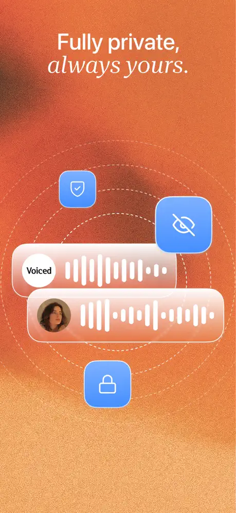
No device frame. The background is the peach-grain texture again, slightly lighter toward the center. The headline 'Fully private,' in white sans-serif sits above 'always yours.' in italic serif. At center, two frosted-glass pills overlap: the upper carries the 'Voiced' wordmark in a white circle and a waveform strip; the lower contains the same circular user portrait seen in Frame 1 and a longer waveform. Behind them, three dashed concentric circles create a radar or sonar field. Three rounded-square icons (~22pt corner radii) filled with cool cornflower blue (~#6FA8FC) anchor the composition: a shield with checkmark upper left, an eye-slash upper right, and a lock at bottom center. The icons contain white line glyphs. There is no supporting text explaining the privacy mechanics; the frame relies entirely on symbol and metaphor. The glassmorphism uses a white fill at roughly 25% opacity with thin white strokes, catching the warm backlight. The only color problem in the entire set appears here: the blue is the first cool tone introduced, and it jars against the warm terracotta ecosystem, reading as system-default rather than brand-intentional.

Voiced AI App Store screenshot 7 — '5 minutes a day for a lighter you.'
07

'5 minutes a day for a lighter you.'

On-frame caption: “5 minutes a day for a lighter you.

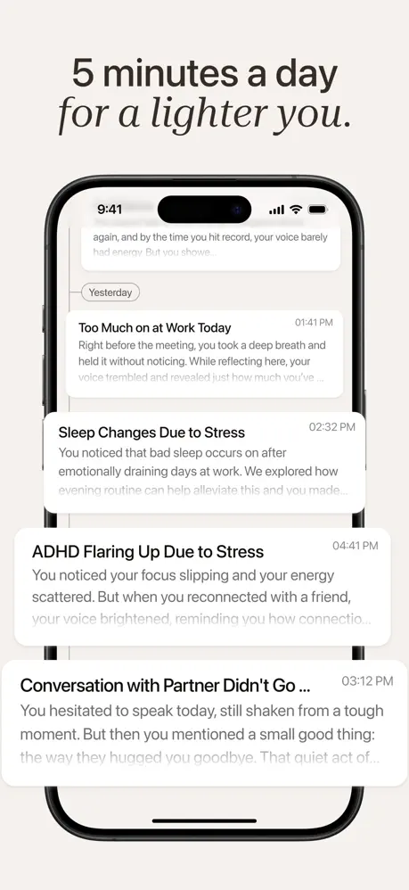
The device returns to the cream surround. The headline '5 minutes a day' is set in bold charcoal sans-serif, with 'for a lighter you.' in the italic serif below. The screen displays a dense chronological feed. A truncated entry peeks from the top: '...again, and by the time you hit record, your voice barely had energy. But you showe...' A 'Yesterday' separator pill introduces 'Too Much on at Work Today' at 01:41 PM, with body text about a deep breath held unconsciously. Below, 'Sleep Changes Due to Stress' at 02:32 PM, then 'ADHD Flaring Up Due to Stress' at 04:41 PM ('You noticed your focus slipping and your energy scattered. But when you reconnected with a friend, your voice brightened, reminding you how connectio...'), and finally 'Conversation with Partner Didn't Go ...' at 03:12 PM ('You hesitated to speak today, still shaken from a tough moment. But then you mentioned a small good thing: the way they hugged you goodbye. That quiet act of...'). The timestamps sit flush right in secondary grey. A thin vertical connector line runs behind the date pills. The cropping at top and bottom implies an infinite archive. This is the frequency proof: the app is designed to accumulate meaning over time.

Voiced AI App Store screenshot 8 — 'Support for all areas of life.'
08

'Support for all areas of life.'

On-frame caption: “Support for all areas of life.

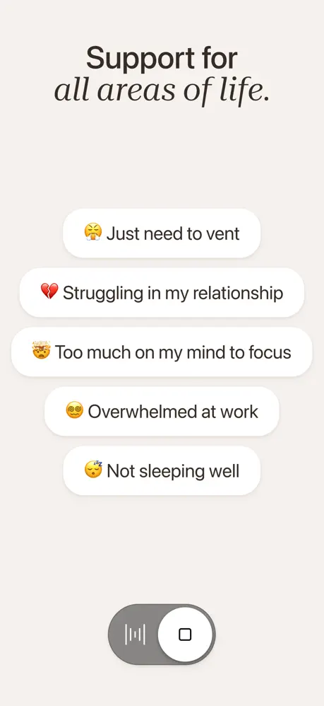
The closing frame drops the device again and sits on the warm off-white background. The headline reads 'Support for' in charcoal sans-serif and 'all areas of life.' in italic serif. The body is a vertical stack of five large white pill buttons, roughly 85% of the canvas width, with soft drop shadows and 28pt corner radii. Each pill leads with a native Apple emoji and left-aligned text: '😤 Just need to vent,' '💔 Struggling in my relationship,' '🤯 Too much on my mind to focus,' '😵‍💫 Overwhelmed at work,' and '😴 Not sleeping well.' The type is centered vertically within each 56pt-tall pill. At bottom center sits a grey toggle capsule (~#8E8E93) approximately 88pt wide, with a white disc on the right containing a square stop icon; to the left of the disc is a small waveform glyph. The relationship between the toggle and the pills is unexplained. As a final frame, it reads like a category-selection onboarding screen rather than a concluding argument, leaving the swipe journey on a functional rather than emotional note.

05The craft

Captions, colour and the mechanics of the sell

Caption pattern

Each headline follows a strict poetic meter. Frames 1, 2, 3, 6, and 7 use a two-part sentence: the first clause in bold sans-serif, the second in italic serif. Frames 5 and 8 shorten this to imperatives or fragments ('Talk. Reflect. Grow.' and 'Support for all areas of life.'). The punctuation is careful—Frame 5 uses periods between verbs; Frame 1 uses a full stop only at the end. This creates a verbal rhythm that matches the visual alternation between collage and device.

Visual system

The grain texture is the single most consistent visual artifact. It appears in Frames 1, 5, and 6, giving the terracotta a printed, risograph quality that resists the flatness of vector gradients. The off-white surround in device frames is not neutral; it carries a subtle warmth that prevents the phone from looking like it is floating in a void. Inside the UI, orange is used sparingly but deliberately: the bottom chrome in Frame 2, the gradient orb in the floating input bar (Frames 3, 4, 5), and the sphere in Frame 5 all rhyme with the exterior terracotta. The one outlier is Frame 6's cornflower blue (~#6FA8FC) used for privacy icons, which sits in near-complementary tension against the warm ground.

The thumbnail test

At thumbnail scale, the terracotta frames (1, 5, 6) arrest the eye because they are darker and warmer than the surrounding store listings. The white headlines on orange remain legible down to small sizes. The cream-backed device frames (2, 3, 7) are quieter and risk disappearing; their saving grace is the dark charcoal headline type and the black phone bezel, which create enough contrast to slow the scroll. Frame 8, however, is almost entirely white-on-white pills and may scan as blank noise in a grid of thumbnails.

Conversion mechanics

The set is strongest when it pairs the terracotta texture with vulnerable copy. Frame 2's chat transcript and Frame 7's dense history list are genuine conversion assets because they prove the product's voice. The alternating device/no-device rhythm keeps the eye from fatiguing, though the lack of any device frame in the final two slides (6 and 8) means the last proof of UI the shopper sees is Frame 7. For a product asking users to record their voice, ending on an abstract emoji list may undercut the credibility built by the earlier interface shots. The 'Live' badge in Frame 3 is a subtle but effective trust signal, implying real-time processing. The floating input bar that persists across Frames 3, 4, and 5 is a good piece of visual consistency; it teaches the primary action without needing a CTA arrow.

06Where it slips

What we would change

The Duplicate Frame

Frame 4 is an exact replica of Frame 3. In an eight-frame set, this is not redundancy; it is a dead stop. A shopper swiping rapidly may not register the duplication immediately, but the information density of the set drops by 12.5% instantly. The fix is to replace Frame 4 with a different product state—perhaps an insights screen, a settings or data-export view, or a different reflection category—to prove breadth.

The Cool-Blue Intrusion

Frame 6 introduces cornflower blue (~#6FA8FC) privacy icons that have not appeared anywhere else in the sequence. The established palette is warm terracotta, cream, and charcoal. The blue reads as iOS system default or third-party security branding rather than an owned color. The fix is to recolor these icons in a deep umber, muted coral, or even desaturated terracotta so they harmonize with the grain background while still signaling protection through iconography alone.

The Closure Problem

Frame 8 places a categorical onboarding screen at the end of the journey. Shoppers who swipe through to the final frame are looking for a concluding benefit—privacy, transformation, or a summary of value. Instead they receive a list of use cases that would have been more useful in Frame 2 or 3. The fix is to swap Frame 8 with Frame 6 (privacy as the final reassurance) or to redesign the last frame as a transformation recap, perhaps using the summary/detail layout from Frame 5 to show growth over time.

Text Density at Small Scale

Frame 2's therapist response bubble is approximately forty words in a single block. At App Store thumbnail size, this becomes an undifferentiated grey rectangle. The fix is to break the monologue into two shorter bubbles, which would improve scannability and visually reinforce the conversational back-and-forth that the app promises.

The Ambiguous Toggle

Frame 8's grey capsule toggle is unclear. The square icon inside the white disc usually means 'stop,' yet the disc is positioned on the right as if the switch is 'on.' The waveform glyph to its left does not clarify whether this is a recording toggle, a mic permission, or a decorative graphic. The fix is to either contextualize it inside a device bezel so the interaction is grounded, or replace it with a simple primary button that frames the action more explicitly.

07The recipe

How to apply this to your own app

  1. Pity the duplicate

    Audit every frame as a unique chapter. If two frames show the same screen state, one must evolve or be cut. A repeated screenshot signals a thin product.

  2. Anchor alternation

    If you alternate between collage and device framing, establish the rule early and stick to it. Voiced's rhythm works because the terracotta frames act as emotional breaths between dense UI proofs.

  3. Let real copy sell

    The genuine vulnerability of the chat transcripts ('embarrassing that I used to just scroll when i felt anxious') builds more trust than any tagline. Use real or realistic user content, not marketing speak.

  4. Tether your outliers

    If you introduce a new color for a specific concept like privacy, derive it from your existing palette rather than importing a system default. Chromatic unity matters more than literal color symbolism.

  5. End on transformation

    Your final frame should answer 'What will I feel?' not 'What categories do you support?' Lead with use cases early; close with emotional resolution.

08Takeaways

Five things worth stealing

  • A distinctive background texture (paper grain, risograph noise) can separate a wellness app from its pastel competitors more effectively than any headline.
  • Typographic pairing—tight sans for function, italic serif for emotion—creates a cadence that shoppers learn in two frames and expect by frame eight.
  • Realistic, emotionally specific UI copy outperforms slogans in the Health & Fitness category because vulnerability signals safety.
  • One duplicate frame can deflate an otherwise polished set; treat each screenshot as unrecoverable real estate.
  • The final frame should deliver the emotional closing argument, not a feature list.
09The verdict

What the set actually achieves

The set establishes a memorable visual system and a believable product surface. The terracotta grain background is ownable, the serif italic gives the headlines an editorial pulse, and the realistic chat transcripts build trust. However, the sequence is marred by a duplicate frame, a late-stage categorical slide that feels like onboarding rather than a finale, and a single cool-blue accent that fractures the warm palette. The set is 80% finished, with clear, fixable gaps.

Designers building screenshot sets for intimate, conversation-driven, or AI companion apps—especially those in saturated categories where emotional differentiation matters more than feature checklists. The lessons on chromatic consistency and the cost of duplicate frames apply universally.

10Questions

Frequently asked

Why does the terracotta grain background work better than a flat gradient?

The noise texture adds a tactile, printed quality that resists the sterile vector feel of most wellness apps. It reads as analog and human, which supports the app's promise of intimate conversation.

Should every screenshot include a device bezel?

No. Voiced proves that device-free collage frames can establish emotion and brand tone before the shopper ever sees a UI element. The key is to alternate deliberately so the set never feels like a loose collection of mockups.

How do you avoid text feeling too dense in chat-based screenshots?

Break long bubbles into shorter ones, increase internal padding, or crop to the most poignant lines. At thumbnail scale, dense paragraphs become grey blocks. Legibility is conversion.

What is the most critical fix for this set?

Replace Frame 4. A duplicate screenshot in an eight-frame sequence signals either a sparse product or an export error. Any alternate screen—insights, settings, a different reflection card—would restore narrative momentum.

11Keep reading

Build your own screenshot set

The full set

8 shots
Voiced AI App Store screenshot 1Voiced AI App Store screenshot 2Voiced AI App Store screenshot 3Voiced AI App Store screenshot 4Voiced AI App Store screenshot 5Voiced AI App Store screenshot 6Voiced AI App Store screenshot 7Voiced AI App Store screenshot 8

About the app

Voiced is your private space to speak freely, reflect deeply, and feel lighter in just a few minutes a day. With one tap, you can start talking about what’s on your mind. Voiced Myrtle, via the App Store listing.

Screenshots and store metadata belong to Myrtle. They are shown here for design commentary and criticism. The analysis on this page is original work by floow.design. View the original listing.

More Health & Fitness teardowns

Browse all →