
Walkie Talkie app icon
SocialScreenshot teardown12 min read

Walkie Talkie App Store screenshots

The sequence makes frequency tangible: a seven-frame sprint that translates push-to-talk audio into Y2K stickers, LCD numerals, and scrapbook density.

Set published by Picslo Corp · 7 frames analysed

4.6 · 91K ratingsFreev5.1.1Updated 4mo ago
Walkie Talkie App Store screenshot 1
01At a glance

The set in one screen

Framing
iPhone 15 Pro-style device with Dynamic Island on five of seven frames; Frame 1 and Frame 7 are frameless.
Captions
Imperative uppercase grotesque (MAKE, MEET, CONNECT) plus sentence-case subtitle.
Backdrop
Warm cream (#FFF5E6) on Frames 2–7; pure black (#000000) on Frame 1 only.
Type
Ultra-tight, heavy sans for headlines; lighter weight for subheads; segment-display LCD for in-app numerals.
UI / copy split
Five frames show live UI inside the device; two frames are pure marketing/social proof with no chrome.
Frame 1 job
Emotional pattern-interrupt. No product, only people and a trust lock-up.

Sampled palette

#000000#000000
#FFF5E6#FFF5E6
#0A0A0A#0A0A0A
#FF8C42#FF8C42
#9B7CF0#9B7CF0
#FF7A6C#FF7A6C
02The challenge

What this screenshot set had to solve

The app is an audio-first social utility built around topic-based voice conversations, yet the App Store is a silent, static medium. The design team had to solve a translation problem: how do you make 'tuning into a frequency' and 'push-to-talk' feel instantly legible to a thumb-scrolling shopper who cannot hear a single sample? On top of that, the product targets a young demographic that treats corporate minimalism as a signal to swipe away. The set needed to communicate four distinct layers—discovery, matching, group creation, and private chat—without collapsing into a generic grid of blue bubbles and microphone icons. Every frame had to earn its place in a swipe carousel that auto-advances in roughly three seconds, which meant the visual system needed to be recognizable at the size of a postage stamp yet still reward close inspection.

They turned a silent storefront into a sticker book: every frame is dense enough to feel discovered rather than advertised.
03The approach

How the set argues its case

The team built the set around a rigid narrative arc that mirrors the user journey from intent to retention. Frame 1 is pure emotional priming—friends, faces, and social proof—deliberately withholding the product so the shopper asks, 'What app produces this outcome?' Frames 2 through 6 then reveal the machinery: public feeds, duo matching, group creation, private chat, and avatar customization. Frame 7 closes with social validation. To keep the seven frames from feeling like seven different apps, they anchored every UI frame to the same warm cream canvas and the same headline formula: a heavy, all-caps imperative followed by a lighter subtitle. Inside the device, they color-coded each major mode, allowing the shopper to associate a specific hue with a specific feature. The art direction leans hard into early-2000s digital nostalgia—chunky black strokes, seven-segment LCD type, blobby custom avatars, and sticker-pile layering—to signal that this is a playground, not a productivity tool.

Positioned as a Gen Z alternative to polished video-chat platforms, the screenshots emphasize messiness, personality, and subcultural references (One Piece, Arcane, Roblox) over polish. The app is framed as a place to hang out, not a tool to optimize.

04Frame by frame

Every screenshot, and the job it does

Walkie Talkie App Store screenshot 1 — MAKE new friends
01

MAKE new friends

On-frame caption: “MAKE / new friends / +3M happy users

The set opens on a pure black field (#000000) with no device frame at all. The top third is occupied by 'MAKE' in a massive, white, tightly tracked sans-serif, followed immediately by 'new friends' in a noticeably lighter weight and smaller point size. Between the type and the photography sits a centered social-proof lock-up: five yellow stars (#FFD700) bracketed by symmetrical teal laurel wreaths (#00D09C), with the line '+3M happy users' set in white directly beneath. The bottom half is a full-bleed, tightly cropped group selfie showing four subjects in saturated streetwear—safety-orange knit vest, lavender turtleneck, acid-green faux-fur bucket hat, and raw-denim overalls. The lighting is flat and social-native, not studio-lit. Structurally, this frame is a deliberate bait-and-switch: it sells the emotional outcome before revealing the product. The black background acts as a hard pattern-interrupt against the cream frames that follow, but the transition is so severe that it risks feeling like two different apps.
Walkie Talkie App Store screenshot 2 — MEET in frequencies
02

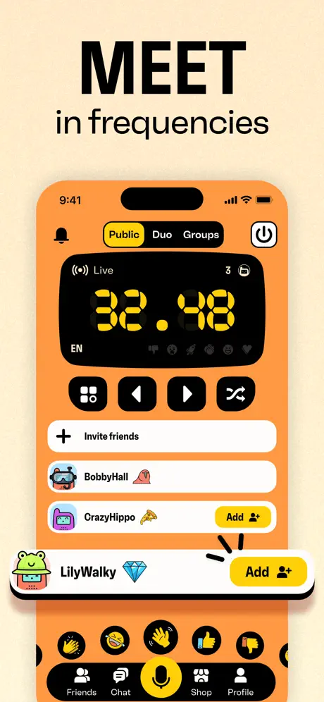
MEET in frequencies

On-frame caption: “MEET / in frequencies / Public / Duo / Groups / Live / 32 . 48 / EN / Invite friends / BobbyHall / CrazyHippo / Add / LilyWalky / Add / Friends / Chat / Shop / Profile

Frame 2 introduces the warm cream canvas (#FFF5E6) that will persist through the rest of the set. 'MEET' and 'in frequencies' sit in black above the device. Inside the iPhone, the app background is a saturated tangerine-orange (#FF8C42). A segmented control at the top reads 'Public | Duo | Groups,' with 'Public' selected inside a rounded yellow pill (#FFE135) set against a black track. The hero element is a dark, almost-black rounded rectangle containing '32 . 48' rendered in a yellow seven-segment LCD typeface—a direct visual metaphor for radio tuning. Below it sits a row of black pill buttons (grid, skip-back, play, shuffle) with white glyphs, followed by a white '+ Invite friends' cell and three user rows: 'BobbyHall' with a snorkel-mask avatar and peach emoji; 'CrazyHippo' with a pizza emoji and a yellow 'Add' pill; and 'LilyWalky' with a cactus avatar, diamond emoji, and a yellow 'Add' pill that has a hand-drawn black arrow pointing at it. The bottom of the screen shows a thick black rounded tab bar—Friends, Chat, a central microphone button in a yellow circle, Shop, Profile—and a row of circular reaction buttons. The density is aggressive: every pixel inside the device is tasked with communicating interactivity, which reads as energetic at full size but will muddy in thumbnail view.

Walkie Talkie App Store screenshot 3 — CONNECT over your interests
03

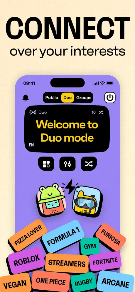
CONNECT over your interests

On-frame caption: “CONNECT / over your interests / Public / Duo / Groups / Welcome to Duo mode / EN / PIZZA LOVER / FORMULA 1 / FURIOSA / GYM / ROBLOX / STREAMERS / FORTNITE / VEGAN / ONE PIECE / RUGBY / ARCANE

The headline 'CONNECT' maintains the typographic drumbeat. Inside the device, the background shifts to lavender (#9B7CF0), signaling that the 'Duo' tab is now selected in the yellow pill. A dark panel at the top reads 'Welcome to Duo mode' in yellow sans-serif, with '((o)) Duo' and a '10' count beside a shuffle icon. Below the panel are three black pill buttons: grid, split-link, and shuffle. Two oversized avatars dominate the midsection—a frog-hat character and the returning snorkel-mask character—facing each other with a lightning bolt between them, literalizing a one-to-one connection. The lower portion breaks the phone boundary with a chaotic pile of interest tags in bright, clashing colors: 'PIZZA LOVER' in orange (#FF9A5C), 'FORMULA 1' in cyan (#7FDBFF), 'ROBLOX' in purple (#B681F7), 'GYM' in teal (#39CCCC), and others, each rotated between roughly minus five and plus eight degrees. The tags act as cultural shorthand for discovery mechanics without showing a search field, though at small scale the pile risks reading as indistinct visual noise rather than legible categories.

Walkie Talkie App Store screenshot 4 — CREATE your groups
04

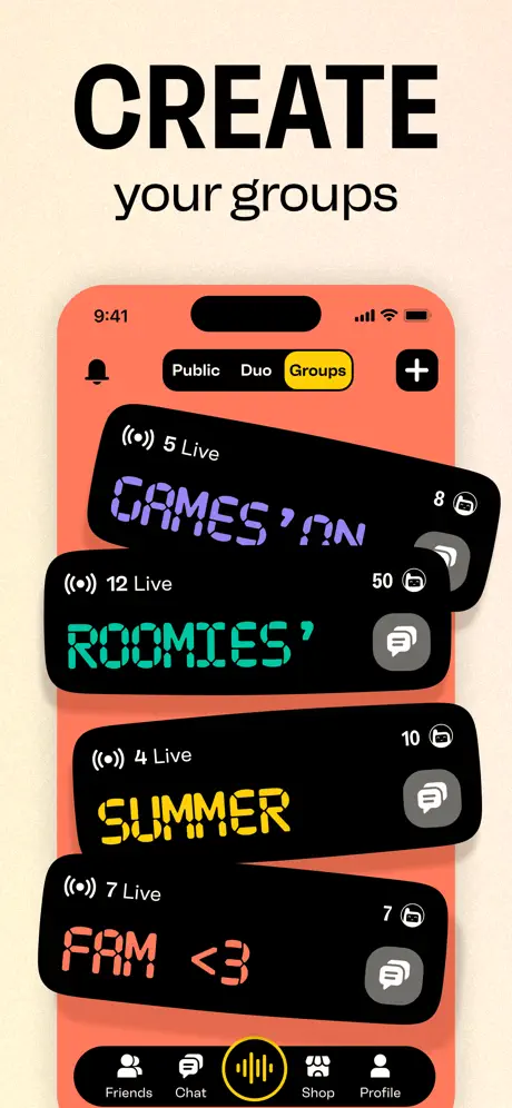
CREATE your groups

On-frame caption: “CREATE / your groups / Public / Duo / Groups / 5 Live / GAMES' ON / 12 Live / ROOMIES' / 4 Live / SUMMER / 7 Live / FAM <3 / Friends / Chat / Shop / Profile

Here the device background turns coral-red (#FF7A6C) with the 'Groups' tab selected in yellow. The top-right corner swaps the power icon for a plus icon. Instead of a flat list, the content area shows a fanned stack of four black rounded rectangles, each slightly rotated to suggest a deck of cards. The first reads '((o)) 5 Live' with 'GAMES' ON' in a purple digital font (#B381F9) and a lock icon with '8.' The second reads '((o)) 12 Live' with 'ROOMIES'' in teal (#00E5C9) and a chat bubble with '50.' The third reads '((o)) 4 Live' with 'SUMMER' in yellow (#FFE66D) and '10.' The fourth reads '((o)) 7 Live' with 'FAM <3' in coral-pink (#FF8A80) and '7.' The tab bar returns, though the center icon now shows an audio waveform inside the yellow circle rather than a microphone, indicating an active transmission state. The stacking implies user-generated abundance, but the rotations are so subtle—roughly two to three degrees—that the cards can read as a single skewed panel rather than four separate spaces. A more pronounced shadow drop or z-axis offset would clarify the layering.

Walkie Talkie App Store screenshot 5 — CHAT privately
05

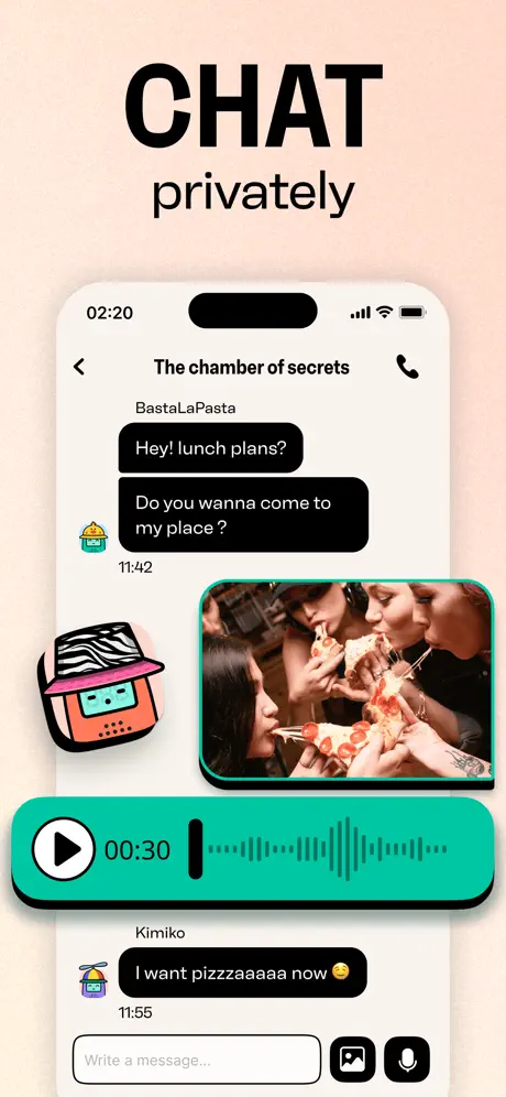
CHAT privately

On-frame caption: “CHAT / privately / The chamber of secrets / BastaLaPasta / Hey! lunch plans? / Do you wanna come to my place ? / 00:30 / Kimiko / I want pizzaaaaaa now 😊 / Write a message...

After four frames of broadcast and matching, the set pivots to the private payoff. 'CHAT privately' sits above a device showing a conversation screen titled 'The chamber of secrets.' The background is a clean off-white (#F9F9F9). BastaLaPasta, represented by a small cactus avatar, sends two black message bubbles: 'Hey! lunch plans?' and 'Do you wanna come to my place ?' Beneath that, a photograph of four people eating pizza appears inside a rounded rectangle with a thick teal border (#00BFA5). Below the photo sits a large teal audio message bubble containing a white play button, a '00:30' counter, and a waveform visualization. Kimiko (aviator avatar) replies, 'I want pizzaaaaaa now 😊' in a black bubble, timestamped 11:55. The input field at bottom reads 'Write a message...' with image and microphone attachments. A zebra-print avatar sticker floats on the left, partially overlapping the device bezel. This frame is structurally necessary because it proves the app closes the loop into 1:1 relationship building. The teal audio bubble reinforces the voice identity, though the waveform detail may collapse into abstract texture when the image is scaled down in search results.

Walkie Talkie App Store screenshot 6 — EXPRESS your style
06

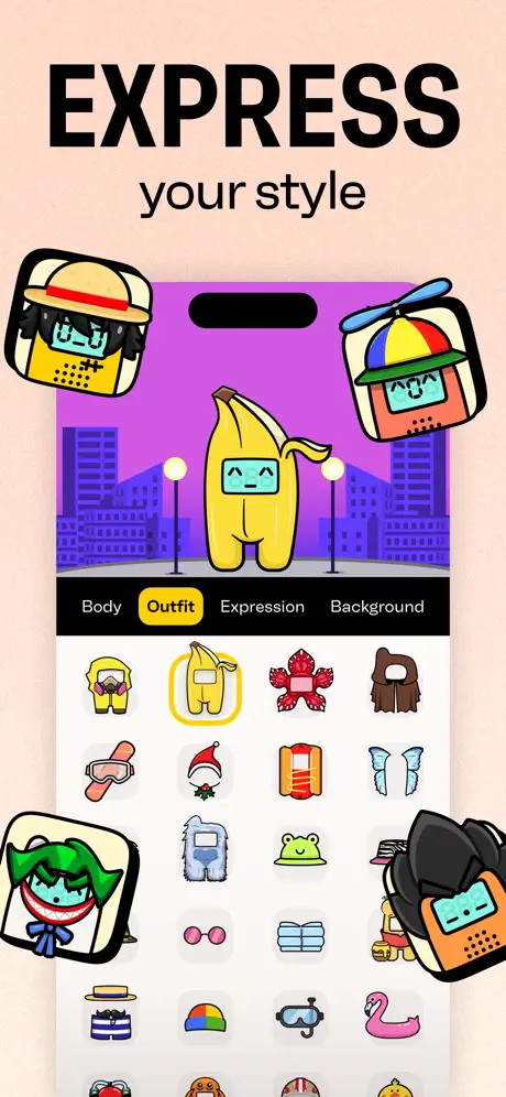
EXPRESS your style

On-frame caption: “EXPRESS / your style / Body / Outfit / Expression / Background

The sixth frame introduces the avatar editor under the headline 'EXPRESS your style.' Inside the device, the background is a flat purple (#A855F7) with a simplified city skyline silhouette and two white streetlamp orbs. Center stage is a full-body banana costume avatar—yellow peel, stubby limbs, deadpan face. A horizontal tab bar below reads 'Body | Outfit | Expression | Background,' with 'Outfit' selected in a yellow pill. The grid shows twelve-plus thumbnails: a yellow hoodie, the selected banana suit ringed in yellow, a red crab shell, a brown cloak, ski goggles, Santa hat, orange vest, ice-blue wings, a yeti suit, a frog hat, pink glasses, a striped sailor shirt, a propeller cap, snorkel mask, and a flamingo float. Four additional avatars float outside the phone frame—top-left straw-hat character, top-right propeller-hat character, bottom-left Joker-green-hair character, bottom-right black-hood character. While the frame effectively sells customization depth, the floating debris creates a compositional problem: the top-left and top-right floaters partially obscure the status bar and Dynamic Island area, undermining the device's authority as the product vessel.

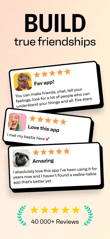
Walkie Talkie App Store screenshot 7 — BUILD true friendships
07

BUILD true friendships

On-frame caption: “BUILD / true friendships / Fav app! / You can make friends, chat, tell your feelings, look for a lot of people who can understand your things and all. five stars / Love this app / i met my bestie here 💕 / Amazing / I absolutely love this app I've been using it for years now and I haven't found a walkie-talkie app that's better yet . / 40 000+ Reviews

The closer returns to the cream canvas and abandons the device entirely, mirroring Frame 1's frameless approach but now using review cards as social proof. Three white cards with thick black strokes (~3px) and rounded corners (~20px) are stacked with slight rotations. The top card, tilted roughly minus three degrees, shows a dinosaur avatar, five orange stars, the headline 'Fav app!,' and the review: 'You can make friends, chat, tell your feelings, look for a lot of people who can understand your things and all. five stars.' The middle card, tilted plus two degrees, shows a laughing woman with green hair, five orange stars, 'Love this app,' and 'i met my bestie here 💕.' The bottom card, tilted minus two degrees, shows a pug dog, five orange stars, 'Amazing,' and 'I absolutely love this app I've been using it for years now and I haven't found a walkie-talkie app that's better yet .' Beneath the stack, the familiar five yellow stars and green laurels reappear with '40 000+ Reviews.' The unpolished voice of the reviews—grammatical looseness, lowercase 'i,' trailing spaces—gives them an authentic feel. However, the exact laurel motif from Frame 1 returns unchanged, making the two social-proof moments feel copy-pasted rather than architecturally bookended.

05The craft

Captions, colour and the mechanics of the sell

Caption pattern

Every frame follows an identical syntactic pattern: one commanding verb in oversized all-caps, then a two-to-four-word subtitle in lighter weight sentence case. This creates a drumbeat rhythm when swiped horizontally: MAKE new friends → MEET in frequencies → CONNECT over your interests → CREATE your groups → CHAT privately → EXPRESS your style → BUILD true friendships.

Visual system

The set runs on three rails: (1) the cream canvas that houses every frame after the opener; (2) the black grotesque headline that never changes weight or color; and (3) the thick, rounded, black-stroke UI components inside the device. Even the floating avatars and review cards adhere to the same visual rules—white fills, heavy black outlines, rounded corners—so that the chaos feels systematized rather than accidental.

The thumbnail test

At thumbnail scale, the cream background unifies the set into a single beige block in the search feed, while the giant black headlines (MAKE, MEET, CONNECT) remain readable. However, the dense UI inside the phones collapses into undifferentiated texture; the segment-display numerals and small list text disappear entirely below a certain resolution.

Conversion mechanics

The set front-loads emotion (Frame 1) and back-loads trust (Frame 7), sandwiching the feature tour in between. This structure assumes the shopper is willing to swipe four to five times before seeing social proof, which may be optimistic in a search-results context where only the first two frames are guaranteed visibility. The absence of a clear 'push to talk' or 'live now' call-to-action on the first two UI frames means the conversion logic relies on curiosity rather than explicit instruction.

06Where it slips

What we would change

The Frame 1 black hole breaks the warm system.

Opening on pure black (#000000) and then snapping to cream (#FFF5E6) on Frame 2 is visually jarring. Because six of seven frames live on cream, the black hero reads as an outlier rather than an anchor. Fix: Either introduce a black accent bar or stroke into Frames 2–7 to bridge the two worlds, or shift Frame 1's background to cream with a black headline so the set reads as one continuous object.

UI density exceeds thumbnail legibility.

Frames 2, 3, and 4 are packed with list rows, tab bars, and segment-display numerals that dissolve into noise at App Store search-result sizes. The '32 . 48' and 'Add' buttons lose definition. Fix: Reduce on-screen content by roughly 20% per frame, increase the padding around the focal element, and magnify the primary action so it survives downscaling.

Floating avatars obscure the device chrome.

In Frame 6, the straw-hat and propeller-hat avatars overlap the top corners of the phone, hiding the status bar and Dynamic Island. This weakens the screenshot's ability to signal 'real iOS app' at a glance. Fix: Reposition the top floaters to break the frame bounds lower down, or reduce their opacity to 60% so the device silhouette remains intact.

The laurel motif is repeated verbatim.

The teal laurel wreaths appear in Frame 1 and again in Frame 7 with no variation. Because the set is only seven frames deep, the repetition feels like a template reuse rather than a deliberate motif. Fix: Remove the laurels from Frame 1 and keep them only for the finale, or redesign Frame 7's lock-up to use a different container shape so the gesture feels fresh.

The audio waveform lacks a functional glyph.

Frame 5's teal audio bubble shows a waveform and a play button, but without a microphone icon or progress scrubber it could be mistaken for a music clip rather than a voice note. Fix: Add a small microphone glyph inside the play button or a simple progress dot to clarify the push-to-talk mechanic for silent shoppers.

07The recipe

How to apply this to your own app

  1. Use a verb-first headline taxonomy

    Every frame leads with an imperative action so the swipe sequence reads as a to-do list the user wants to complete: MAKE, MEET, CONNECT, CREATE, CHAT, EXPRESS, BUILD.

  2. Color-code your modes, not just your buttons

    The designers treat the entire device background as a mode indicator—orange for Public, purple for Duo, coral for Groups—so shoppers learn the app's architecture chromatically before they read a single label.

  3. Tether chaos to a rigid canvas

    Despite the sticker-bomb aesthetic, every frame after the opener sits on the same cream background and uses the same headline weight. If your UI is dense, lock the external frame down so the interior can be loose.

  4. Show the private payoff after the public promise

    The set waits until Frame 5 to reveal private chat, proving that the broadcast features lead to real relationships. If your app has both public and private layers, sequence the screenshots so the intimacy escalates rather than starting small.

08Takeaways

Five things worth stealing

  • A consistent canvas color can unify wildly different UI states into a single recognizable set.
  • Imperative verbs create narrative momentum across a horizontal swipe carousel.
  • Mode-specific background colors train the eye to distinguish app states faster than text labels.
  • Social proof works best when the voice of the review is unpolished and specific.
  • Maximum density inside the device requires maximum restraint outside it.
09The verdict

What the set actually achieves

A maximalist, Y2K-inflected screenshot sequence that uses color-coded modes (orange for Public, purple for Duo, coral for Groups), verb-headline taxonomy, and stuffed UI compositions to turn a voice utility into a tactile, collectible-looking social space.

Product designers, App Store optimizers, and brand leads building social or community apps for audiences under 25 who need to stand out in a feed of sanitized, corporate UI. The case study is especially useful for teams debating whether to show UI or lifestyle in their hero frame.

10Questions

Frequently asked

Why does Frame 1 avoid showing the product?

It is a classic emotional-lead strategy: sell the outcome (friends, laughter, belonging) before selling the mechanics. The risk is that shoppers may not understand what category the app lives in until Frame 2.

How does the set handle color accessibility?

The palette is high-contrast inside the device (black on orange, yellow on black), but the cream background against white review cards in Frame 7 may fail non-text contrast checks for UI boundaries. Teams with accessibility requirements should test the frameless cards on low-brightness displays.

What is the structural purpose of Frame 6?

It is a retention hook. After showing discovery, matching, groups, and chat, the set pauses to prove the user can invest identity into the platform through avatar customization—a proven engagement driver for Gen Z social products.

Why use a seven-frame set instead of three?

The product has four distinct mechanics (Public, Duo, Groups, Chat) plus onboarding, customization, and social proof. Trimming to three would force the team to collapse modes, which would misrepresent the app's depth. However, shoppers rarely swipe past frame three in search, so the first three frames must carry the full pitch alone.

11Keep reading

Build your own screenshot set

The full set

7 shots
Walkie Talkie App Store screenshot 1Walkie Talkie App Store screenshot 2Walkie Talkie App Store screenshot 3Walkie Talkie App Store screenshot 4Walkie Talkie App Store screenshot 5Walkie Talkie App Store screenshot 6Walkie Talkie App Store screenshot 7

About the app

Welcome to Walkie Talkie, the go-to spot for real topic-based audio conversations. Wanna debrief a season finale ? Practice a new language? Or just looking for a late night Picslo Corp, via the App Store listing.

Screenshots and store metadata belong to Picslo Corp. They are shown here for design commentary and criticism. The analysis on this page is original work by floow.design. View the original listing.

More Social teardowns

Browse all →