Establishment
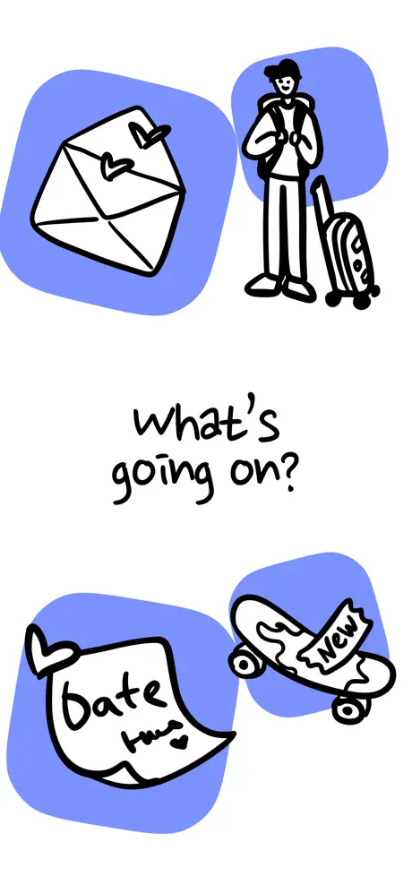
On-frame caption: “what's going on?”
The cover shot is pure illustration. Four periwinkle-blue squircles—roughly 180–220 pt in diameter, filled with #7B8CFF—tilt gently around the central logotype. Each squircle houses a thick black line drawing: a sealed envelope with two heart seals; a backpacker with rolling luggage; a fluttering note reading 'date' followed by a small heart; and a skateboard emblazoned with the word 'New'. The image establishes the app's emotional domain—correspondence, travel, romance, hobbies—without stating a single feature. White negative space dominates roughly two-thirds of the canvas. The squircles sit in a loose 2×2 grid, but the top-left and bottom-right pairs are offset by roughly 20–30 pt, breaking any danger of rigidity. The handwritten phrase 'what's going on?' sits dead center, vertically equidistant between the two rows, rendered in black ink with casual descenders and no terminal punctuation. The layout mimics a scrapbook page or a cafe napkin sketch, opting for emotional immediacy over information density. There is no visible call-to-action, no 'Download' badge, no UI navigation. The only text is the brand name itself, functioning simultaneously as a greeting, a value proposition, and a question the app promises to answer. The absence of explanatory copy forces the shopper to lean in or swipe forward. This is a high-risk, high-reward opener. It sacrifices clarity for character, betting that a shopper jaded by corporate gradients will pause for something human. It works stylistically, but conversion-minded designers should note that zero UI means zero functional context on frame one.