Yazio app icon
Health & FitnessScreenshot teardown12 min read

Yazio App Store screenshots

When a health app tries to squeeze calorie counting, fasting, barcode scanning, water logging, recipes, and two layers of social proof into eight portrait frames, the real design challenge becomes continuity: how do you keep a shopper from mentally checking out between swipe one and swipe eight? Yazio’s App Store gallery attacks this with a strict light-gray stage, a recurring electric-mint accent, and a turquoise mascot that functions as a visual comma between dense data screens. The result is a set that feels unmistakably part of the same family—until it doesn’t.

Yazio App Store screenshot 1
01At a glance

The set in one screen

Framing
Portrait iPhone chassis with rounded corners and soft drop shadows; partial crops in frames 2, 4, 5 and full containment in frames 3, 6, 7, 8.
Captions
Large bold sans-serif headlines positioned top-left or bottom-left; no subtitle body copy outside the phone screen.
Backdrop
Uniform light-gray gallery wall that lets dark UI and vivid food photography levitate.
Type
Single weight, oversized sans for external headlines; SF-style typography inside the UI with monospaced numerals for timers and calorie counts.
UI / copy split
Approximately 60/40 in favor of rendered UI chrome over marketing copy; food photography and mascot graphics fill the remaining negative space.
Frame 1 job
Establish the product thesis—fasting, calories, weight loss—while introducing the dark dashboard and brand mascot in a single split composition.

Sampled palette

Headlines#111316
Canvas#E8ECF0
Mint accent#00E5B0
Phone UI ground#1C1C1E
AI badge#8B5CF6
Warning pill#FF5BD1
02The challenge

What this screenshot set had to solve

Designing a screenshot set for a nutrition-tracking application is, at its core, a sequencing problem. Yazio bundles calorie counting, intermittent fasting, barcode scanning, water logging, recipe filtering, and social proof into one listing, which means the designer must corral eight distinct propositions into a continuous narrative without letting any single frame dissolve into visual noise. The environment is a near-neutral light-gray canvas—an airy, almost clinical void—that has to support dark-mode UI mockups, high-saturation food photography, a fluorescent brand mascot, and user-generated before-and-after imagery simultaneously. Each frame has roughly two seconds to communicate its message, so the information architecture must work at the speed of a swipe: headline, image, device, meaning. Compounding this is the emotional temperature of the category; health tracking can read as punitive or overwhelmingly technical. The set therefore needs to balance data density—macro rings, calorie budgets, barcode tags, elapsed fast timers—with enough warmth that the product registers as a companion rather than a ledger. Finally, the frames must feel like chapters of one story, not independent billboards pasted side by side.

The set behaves like a collection of eight strong standalone posters rather than a single scrollable argument.
03The approach

How the set argues its case

The response is a three-pole system. First, the canvas: every frame sits on an identical cool light-gray ground near #E8ECF0, which functions as a matte gallery wall and lets dark phone bezels and charcoal UI surfaces float. Second, typography: a single extra-bold geometric sans is used for every external headline, always in near-black #111316 and positioned in the upper-left or lower-left third to build a predictable scan path. Third, color discipline: a single electric mint near #00E5B0 threads through progress rings, scan brackets, weight-loss badges, testimonial stars, and mascot gradients. Device framing is standardized around black iPhone chassis with subtle drop shadows, and food photography is treated as an editorial layer—often bleeding behind the phone or cropped asymmetrically—to soften the engineering of the UI. The turquoise monster mascot is deployed as an emotional anchor, surfacing in frames 1, 4, 7, and 8 to punctuate data with personality. Together these choices produce a recognizable aisle presence: high-contrast, dark-UI-forward, mint-highlighted, and photography-rich.

Approachable precision. The gallery does not pitch hardcore athletic performance; it pitches everyday weight loss through logging, fasting, and recipes, using food porn and human transformation photos to offset the austerity of calorie math.

04Frame by frame

Every screenshot, and the job it does

Yazio App Store screenshot 1 — All-in-one thesis
01

All-in-one thesis

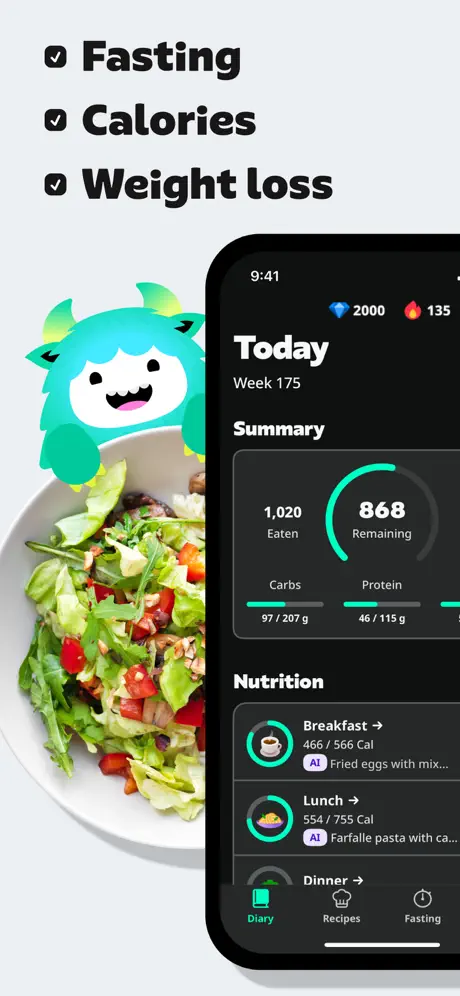
On-frame caption: “Fasting, Calories, Weight loss

The opener establishes the visual grammar of the entire set. The canvas is split roughly 50/50. On the left, a bowl of green salad and tomatoes bleeds up from the bottom edge, providing organic texture against the sterile background. Floating above the bowl, a turquoise gradient monster mascot with small horns breaks the boundary between photography and negative space. Top-left, three checklist lines read “Fasting,” “Calories,” and “Weight loss” in oversized black sans-serif, each prefixed by a bold black checkmark glyph. On the right, an iPhone with a thick black bezel displays the home dashboard; the screen shows a “Today” header, “Week 175” subtext in gray, a circular calorie summary ring in mint near #00E5B0, and a “Nutrition” list with breakfast and lunch entries tagged by purple “AI” badges near #8B5CF6. The bottom of the device is cropped, pushing the interface upward and inviting the eye to treat the phone as a portal rather than a finished artifact. The contrast between matte light gray and jet UI chrome is extreme and deliberate.
Yazio App Store screenshot 2 — Trust + photo-scanning
02

Trust + photo-scanning

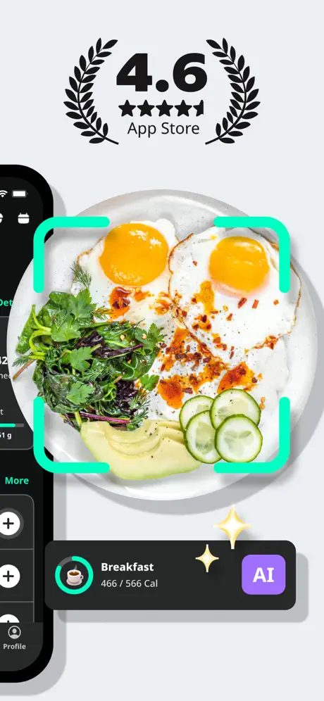
On-frame caption: “4.6 App Store

This frame pivots from feature introduction to trust signaling. Dominating the top is a vector laurel wreath surrounding a massive “4.6” App Store rating, rendered in solid black with five stars. Below, a top-down photograph of fried eggs, herbs, avocado, and cucumber fills the center, encircled by a mint corner-bracket overlay near #00FFC2 that implies a scanning frame without obscuring the food. A sliver of iPhone bezel intrudes from the left, showing only the edge of a list UI with circular add buttons and a “Profile” label. Most notably, a dark floating card is detached entirely from the phone, hovering over the lower right. It contains a coffee icon inside a mint ring, the word “Breakfast,” the caption “466 / 566 Cal,” and a purple “AI” badge. Two sparkle glyphs hover between the card and badge. The card’s soft shadow separates it into a third layer, creating a composite that suggests photo-logging and automated recognition in a single glance.

Yazio App Store screenshot 3 — Feature isolation
03

Feature isolation

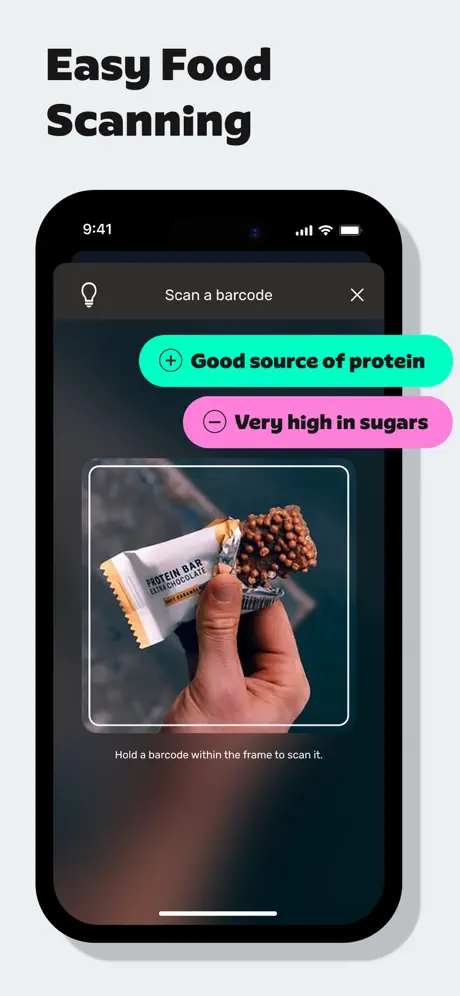
On-frame caption: “Easy Food Scanning

The headline “Easy Food Scanning” sits in the upper-left with generous padding, establishing a clear one-message-per-frame discipline. The phone is centered and fully contained, showing a live barcode scanner. The header contains a lightbulb icon, the text “Scan a barcode,” and an “X” close control. Two rounded pill badges float above the camera feed: a mint pill reading “+ Good source of protein” and a vivid pink pill near #FF5BD1 reading “− Very high in sugars.” Both use black text for legibility against their fluorescent grounds. Inside the viewfinder, a hand holds a half-open protein bar against a blurred background, framed by a white rounded rectangle. A caption below reads: “Hold a barcode within the frame to scan it.” The bezel is thick black, giving the visual impression of a dedicated hardware camera, while the phone status bar at top shows 9:41 with standard signal and battery glyphs.

Yazio App Store screenshot 4 — Fasting as a state
04

Fasting as a state

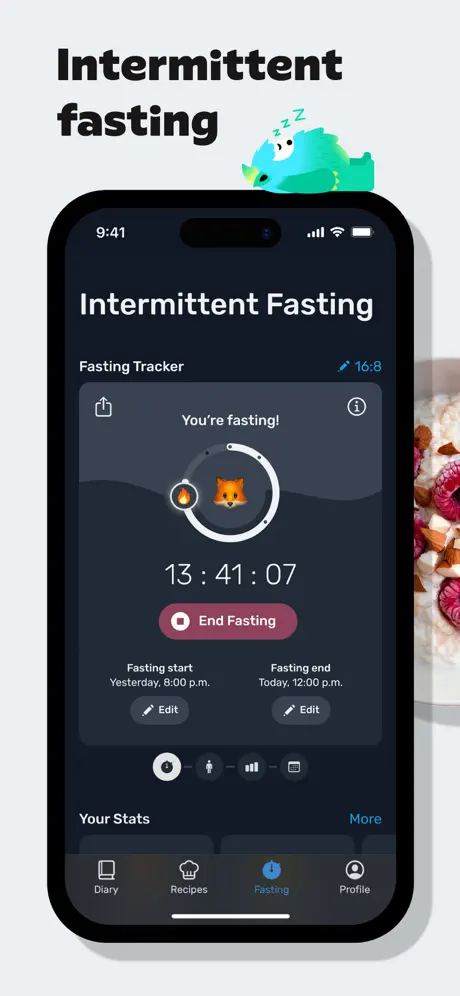
On-frame caption: “Intermittent fasting

The headline “Intermittent fasting” occupies the upper-left, while a small sleeping monster mascot with “Zzz” floats to its right, adding emotional texture without interfering with the type. The phone shows a dedicated fasting tracker in dark mode. The status bar reveals the Dynamic Island, anchoring the mockup to a current-generation device. Inside, the screen title is matched by a “16:8” protocol link in system blue. A central charcoal card near #2C2C2E houses the tracker: a share icon and information icon flank the text “You’re fasting!” A circular progress ring centers an orange fox emoji, with a flame glyph riding the ring’s left edge. Beneath, a monospaced timer reads “13 : 41 : 07” in large white figures. A muted rose button— “End Fasting”—interrupts the cool palette, signaling a stop action. Metadata pairs below (“Fasting start Yesterday, 8:00 p.m.” / “Fasting end Today, 12:00 p.m.”) each carry an “Edit” ghost button. A tab bar at the bottom marks “Fasting” in blue. A sliver of oatmeal-and-berry food photography enters from the right edge.

Yazio App Store screenshot 5 — Hydration & activity
05

Hydration & activity

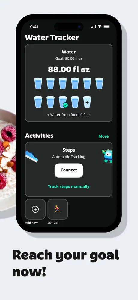
On-frame caption: “Reach your goal now!

Here the phone is pushed high in the frame, leaving room below for the headline “Reach your goal now!” The screen shows the Water Tracker: a bold “88.00 fl oz” dominates the dark card, above a grid of eleven small water-glass icons rendered in light blue near #5AC8FA. Ten glasses are filled; one carries a checkmark and another a plus sign, indicating manual control. A sub-caption notes “+ Water from food: 0 fl oz.” Below, an “Activities” section introduces a steps card with a mint sneaker glyph, a white “Connect” button that pops against the dark ground, and the brand mascot in blue. A cropped food photograph—oatmeal with raspberries and almonds—intrudes from the left, warming the clinical data. The phone is cropped just beneath a “361 Cal” activity mini-card, keeping attention on water and steps rather than navigation. The tab bar is completely omitted by the crop.

Yazio App Store screenshot 6 — Content depth
06

Content depth

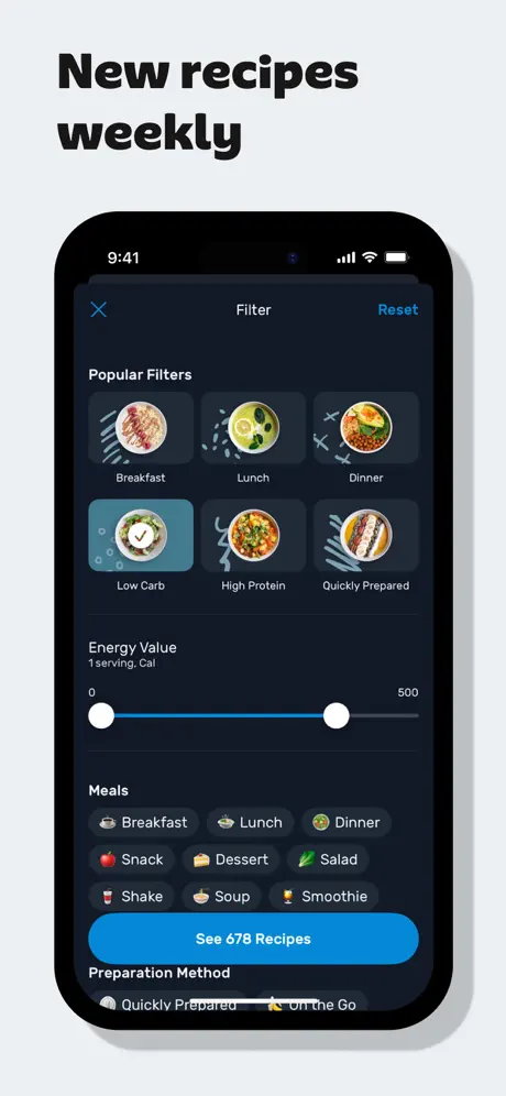
On-frame caption: “New recipes weekly

“New recipes weekly” announces the frame’s purpose from the upper-left. The phone displays a Filter modal: an “X” dismiss button left, “Filter” centered, and a “Reset” text action right in blue near #0A84FF. The “Popular Filters” grid presents six circular food thumbnails; the “Low Carb” option displays a white checkmark on a teal overlay, clarifying selection state. A dual-handle slider labeled “Energy Value” spans 0 to 500 calories, drawn with a blue track and white knobs. Below, a “Meals” cluster uses emoji-prefixed pills in low-contrast gray fills near #3A3A3C. A primary blue button reads “See 678 Recipes,” occupying the full width in a rounded rectangle. The bottom of the screen begins to show “Preparation Method” pills before the crop cuts them off, implying scroll depth. The entire composition sells content abundance and fine-grained control without leaving the modal context.

Yazio App Store screenshot 7 — Social proof
07

Social proof

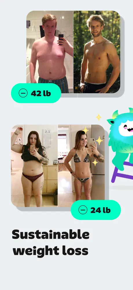
On-frame caption: “Sustainable weight loss

This frame abandons the device entirely. Two sets of before-and-after photographs stack vertically with rounded corners near 20px radius. The top pair shows a male transformation; the bottom pair shows a female transformation. Mint badges overlay each set: “− 42 lb” and “− 24 lb,” set in bold black sans-serif against the same electric mint used in the app’s UI accents. To the right, the turquoise monster mascot climbs a purple ladder amid sparkle glyphs, recycling brand equity from frame one. The headline “Sustainable weight loss” sits beneath the imagery in the same heavy black typeface used throughout. By removing the phone, the frame forces the viewer to look at human results rather than interface chrome, though the loss of device context makes it read more like an Instagram story than an App Store product frame.

Yazio App Store screenshot 8 — Review wall
08

Review wall

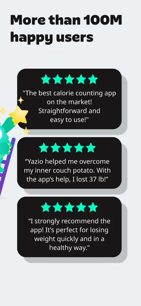
On-frame caption: “More than 100M happy users

The closer is a testimonial wall. The headline “More than 100M happy users” sets scale. Three dark cards stack with tight spacing, each rounded and softly shadowed. Every card opens with five mint stars near #00E5B0 and encloses a centered quote in white. The first reads: “The best calorie counting app on the market! Straightforward and easy to use!” The second: “Yazio helped me overcome my inner couch potato. With the app's help, I lost 37 lb!” The third: “I strongly recommend the app! It's perfect for losing weight quickly and in a healthy way.” A partial mascot and yellow sparkles intrude from the left margin, preventing the stack from feeling like a static list. The palette remains disciplined: light gray ground, dark card surfaces, mint and white accents. No phone appears, ending the sequence on community voice rather than interface.

05The craft

Captions, colour and the mechanics of the sell

Caption pattern

Every frame uses a 2–4 word bold headline: 'Fasting, Calories, Weight loss', 'Easy Food Scanning', 'Intermittent fasting', 'Reach your goal now!', 'New recipes weekly', 'Sustainable weight loss', 'More than 100M happy users'. There is no secondary descriptive sentence outside the phone UI itself.

Visual system

The set relies on four repeating ingredients: (1) the off-white ground, (2) the black iPhone vessel, (3) the mint accent, and (4) the turquoise mascot. Where it deviates is in headline placement—top-left in most frames, bottom in frame 5, absent in frame 2—and in device containment, which alternates between full phone portraits and partial off-canvas crops.

The thumbnail test

Frame 1 is the strongest thumbnail: the split composition of mascot-plus-salad on the left and dark calorie dashboard on the right telegraphs both personality and function in one glance. The heavy headline stack also reads at postage-stamp scale.

Conversion mechanics

The sequence front-loads utility (calorie dashboard, scanning, fasting) and back-loads emotion (transformations, testimonials). This mirrors a classic conversion flow: show what the app does, then prove that it works. The 4.6 rating in frame 2 is placed early to intercept comparison shoppers before they hit the recipe or social-proof frames.

06Where it slips

What we would change

Inconsistent device grammar

Frames 3 and 6 present fully contained phones; frames 2 and 5 bleed devices off edges or float detached cards. The alternating containment breaks spatial continuity. A shopper swiping rapidly registers the inconsistency as visual noise. Fix: commit to a single framing rule—either every phone floats partially off-canvas or every phone sits inside a safe margin.

Headline drift

Frame 1 places the headline top-left; frame 4 does the same; frame 5 drops it to the bottom; frame 7 drops it below the image. The vertical eye-line bounces. Fix: lock all headlines to the same inset from the top edge, using the bottom only for secondary captions or brand marks.

Mint overload

The #00E5B0 accent appears in the calorie ring, scan brackets, weight-loss badges, testimonial stars, and mascot gradients. By frame 8 it has lost its semantic coding and becomes decorative noise. Fix: reserve mint exclusively for primary actions and positive metrics; use a secondary hue for social-proof stars or testimonial cards.

Invisible borders in frame 5

The “Activities” card borders are nearly invisible against the dark phone background, causing the steps module to melt into the water tracker above it. Fix: add a 1px #3A3A3C stroke or increase internal shadow elevation to articulate the card boundary.

Pink anomaly in frame 3

The “Very high in sugars” pill introduces a hot magenta near #FF5BD1 that is the only warm, saturated hue in the entire set. It reads as an alien element. Fix: desaturate the warning to a rose that nods toward the “End Fasting” button in frame 4, or introduce warm accents earlier in the sequence so the temperature shift doesn’t shock.

07The recipe

How to apply this to your own app

  1. Use a single paper-gray stage ground

    Drop a product screenshot onto a near-white window and it disappears; drop it onto a vibrant gradient and it fights. The near #E8ECF0 ground here is bright enough to feel clean, yet neutral enough to let both dark UI and food photography read instantly.

  2. Carry the accent like a chorus, not a solo

    Pick one fluorescent hue and repeat it in at least three places per frame—header decoration, UI element, and floating badge—but vary the scale so it guides rather than screams. When every star, ring, and bracket shares the same mint, the set sings. When you add a random hot pink with no tonal support, it screams.

  3. Crop the device to control pacing

    Showing a full phone gives the shopper a complete mental model; cropping the phone forces attention onto a single UI element or a floating card. Decide per frame which goal matters. Never alternate arbitrarily.

  4. Insert a mascot as punctuation

    If your brand has a character, use it to break up data-heavy frames. Yazio places the monster between UI shots and transformation photos so that the eye gets an emotional reset. Treat it like a piece of punctuation: comma, not paragraph.

08Takeaways

Five things worth stealing

  • A restrained single-color stage (#E8ECF0) lets dark-mode UI and vivid food photography share the same frame without competition.
  • Headlines must lock to a consistent grid edge; drifting placement between frames fractures the swipe experience.
  • Repetition of one accent color builds brand recognition, but over-applying it to every element type strips it of navigational meaning.
  • Social proof is most effective when it borrows the same UI materials—badges, cards, corner radius—as the product frames.
  • Final note: treat the mascot as emotional infrastructure, not decoration. Its recurrence turns clinical trackers into a branded system.
09The verdict

What the set actually achieves

A visually recognizable 8-frame sequence with heavy black type, recurring mint accents, dark-mode UI staging, and a mascot-led personality layer. Strong aisle differentiation, but uneven spatial discipline between frames.

Designers building screenshot sets for health, finance, or productivity apps where multiple dense features must be staged in sequence without exhausting the viewer. The set is especially instructive for teams using dark-mode UI that needs to feel friendly rather than forensic.

10Questions

Frequently asked

Why does frame 2 show a detached card instead of a full phone screen?

The floating breakfast card is a composite device meant to communicate AI recognition and photo logging simultaneously. However, because it is neither fully inside the phone nor fully outside it, the visual relationship is ambiguous.

How does the set handle social proof without looking like a generic testimonial page?

It reuses the app’s material language: the same mint badge color for weight loss, the same dark card surfaces for reviews, and the same mascot graphics. This keeps social proof inside the product world rather than importing a foreign template.

What is the weakest frame in the sequence?

Frame 5, the water tracker, suffers from invisible card borders and a bottom-placed headline that breaks the top-left scan pattern established in the surrounding frames.

What is the strongest visual hook?

Frame 1’s split composition: the mascot, salad, and dark calorie dashboard communicate personality plus function in under a second, which is exactly what a thumbnail needs.

11Keep reading

Build your own screenshot set

The full set

8 shots
Yazio App Store screenshot 1Yazio App Store screenshot 2Yazio App Store screenshot 3Yazio App Store screenshot 4Yazio App Store screenshot 5Yazio App Store screenshot 6Yazio App Store screenshot 7Yazio App Store screenshot 8

About the app

Screenshots and store metadata belong to Yazio. They are shown here for design commentary and criticism. The analysis on this page is original work by floow.design. View the original listing.

More Health & Fitness teardowns

Browse all →