
Learn UI with Pakistani app screen exercises
Learn UI through Pakistani mobile screen exercises: bilingual flows, Android-first constraints, and a Figma tutorial routine for a focused portfolio.

To learn ui for mobile apps in Pakistan, recreate one focused screen at a time from familiar flows: mobile-number sign-in, bill payment, parcel tracking, and Urdu help. Start Android-first, because Android holds an overwhelming share of Pakistan’s mobile web usage in StatCounter reporting, then document each decision in Figma before iterating the screen.
Key takeaways
- •Practise mobile flows that Pakistani users recognise instead of generic dashboard mock-ups.
- •Design Android-first constraints, then test how English labels and Urdu support work together.
- •Use floow.design to generate a focused brief, build one screen, and revise it from a clear usability goal.
- •A small set of well-explained screens is stronger for a junior portfolio than many unrelated visual experiments.
What's on this page
- •A Pakistani practice sequence to learn UI
- •Design Android-first without making the interface feel generic
- •Use English and Urdu as a real interface constraint
- •Turn exercises into portfolio evidence
A Pakistani practice sequence to learn UI
The fastest way to learn ui is to repeat realistic mobile decisions, not to copy a polished screen without understanding it. Build a sequence of small exercises around patterns users encounter locally:
- •Phone-number sign-in: country code, number field, OTP state, resend timing, and error state.
- •Wallet or bill-payment home: balance visibility, a prominent payment action, saved billers, and a receipt.
- •Parcel tracking: tracking-number entry, shipment status, delivery address, and support contact.
- •Mobile package purchase: data, call, and SMS options, selected-package state, confirmation, and transaction history.
- •Urdu help screen: search, frequently asked questions, and a route back to support.
The Pakistan Telecommunication Authority regulates Pakistan’s mobile subscribers, so telecom-related exercises are a credible local pattern rather than a made-up portfolio scenario. Use the terminology carefully: a screen can ask for a mobile number, but it should not imply that a subscriber identity check has happened unless the brief explicitly requires it. Read PTA’s consumer and telecom context at PTA.
Design Android-first without making the interface feel generic
StatCounter reporting has consistently shown Android with the overwhelming majority of mobile operating-system web-usage share in Pakistan. That makes Android behaviour the sensible default for a beginner exercise: test dense screens on compact devices, leave comfortable touch targets, account for the on-screen keyboard, and use clear back-navigation states. Check the current country view directly in StatCounter Global Stats.
Android-first does not mean copying a stock component library without judgment. In a bill-payment screen, the primary action should remain visible when a user has selected a biller and typed an amount. In an OTP screen, the keyboard should not hide the resend or continue action. In a transaction receipt, the reference number and status need stronger hierarchy than decorative illustrations.
For each exercise, make a simple test list: empty state, loading state, network failure, invalid number, successful completion, and back navigation. This is where a figma tutorial becomes useful: use Auto Layout, components, variants, and prototype links to expose state changes rather than producing a single static artboard.
Use English and Urdu as a real interface constraint
Pakistani app interfaces commonly combine English labels with Urdu support. Treat that as a content and layout problem, not as a translation layer added at the end. A familiar English action such as “Continue” may sit beside Urdu help copy, while a full Urdu-support route needs right-to-left reading order, aligned icons, and room for changed line lengths.
For typography, begin with a small system: one readable Latin text style set, one Urdu-capable typeface chosen for legibility, defined sizes for headings and body text, and predictable line spacing. Do not assume a Latin font will render Urdu well. Test real Urdu strings early, especially in buttons, cards, error messages, addresses, and mixed-script amounts.
A useful exercise is to create the same support screen in English-first and Urdu-first versions. Compare scan order, line wrapping, icon direction, and whether numerals remain understandable. Keep payment amounts and dates visually distinct; do not solve mixed-script content by shrinking text. Your portfolio explanation should state what language mode the screen supports and what changes when the reading direction changes.
Turn exercises into portfolio evidence
Give every screen a narrow product brief: user goal, screen state, required content, constraint, and success condition. For example: “A prepaid user must select a data package, see its price in PKR, and confirm the purchase without losing the selected package after a connection error.” This produces work that can be reviewed, not just admired.
Use floow.design to practise this loop. Generate a brief, make one mobile screen in Figma, compare it against the brief, then iterate one issue at a time: hierarchy, copy length, touch target, empty state, or bilingual layout. Avoid asking for a whole banking app at once. A focused receipt screen or package-selection screen gives you enough room to demonstrate judgement.
When you publish the work, show the brief, the first version, the revision, and two or three reasons for the changes. Mention the local constraint: Android-first layout, PKR amounts, a Pakistani mobile-number flow, or English labels with Urdu support. Recruiters can then see how you think through a mobile interface instead of only seeing a final mock-up.
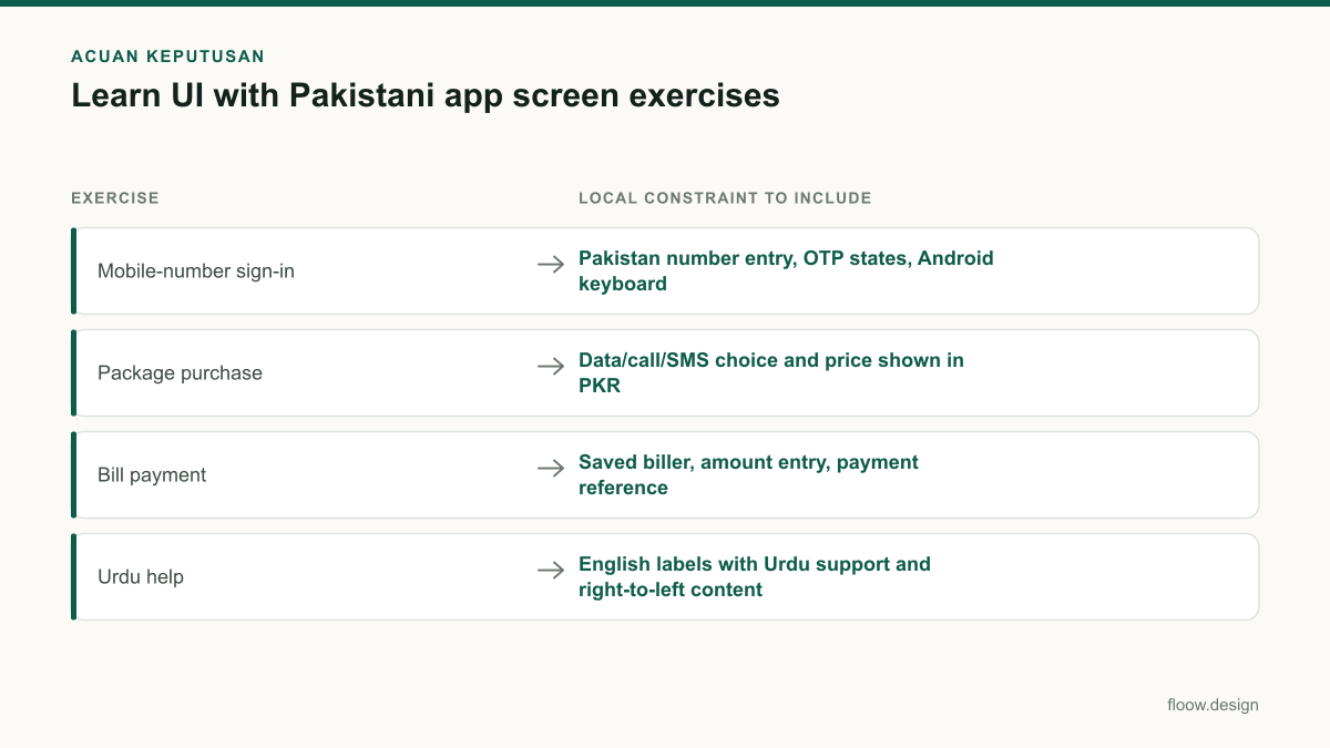
Pakistani mobile exercise sequence
| Exercise | Local constraint to include | Evidence of completion |
|---|---|---|
| Mobile-number sign-in | Pakistan number entry, OTP states, Android keyboard | Error, loading, resend, and success states |
| Package purchase | Data/call/SMS choice and price shown in PKR | Selected state, confirmation, and receipt |
| Bill payment | Saved biller, amount entry, payment reference | Empty, validation, processing, and completed states |
| Urdu help | English labels with Urdu support and right-to-left content | English-first and Urdu-first screen versions |
Common mistakes
Starting with a desktop dashboard or a full multi-screen app.
Choose one mobile task with a measurable end state, such as entering an OTP or confirming a PKR payment.
Treating Android-first design as a reason to ignore smaller screens and keyboards.
Prototype compact-height states and verify that the current action remains reachable when the keyboard opens.
Adding Urdu only after the visual design is finished.
Place real Urdu content in early layouts and test direction, wrapping, numerals, and icon placement before finalising components.
Showing only a polished final frame in a portfolio.
Show the brief, state coverage, first attempt, revision, and the reason behind one or two changes.
Frequently asked questions
How can I learn UI for mobile apps?
You can learn UI for mobile apps by rebuilding small task-based flows, then testing each screen state: empty, input, error, loading, and success. In Pakistan, practise Android-first screens such as mobile-number sign-in, bill payment, package purchase, and parcel tracking. Use Figma components and prototypes, then revise screens against a written user goal.
Which mobile screens should beginners practise?
Beginners should practise sign-in, OTP verification, home, search, list, detail, form, payment confirmation, receipt, tracking, settings, and support screens. For a Pakistani portfolio, add PKR amounts, mobile-number entry, telecom package selection, and English labels with Urdu support. Practise connected states of one flow before starting unrelated screens.
Should I learn Urdu UI typography?
Yes, learn Urdu UI typography if you plan to design mobile apps for Pakistan. Pakistani interfaces often pair English labels with Urdu support, so you need to test right-to-left reading order, mixed-script lines, numeral treatment, wrapping, and legibility. Use real Urdu content early; a Latin-only placeholder layout will not reveal these interface issues.
How should I use floow.design for UI practice?
Use floow.design to generate a narrow mobile-app brief, such as an Android-first PKR bill-payment receipt or Urdu-support help screen. Build one screen in Figma, include its key states, and compare the result with the brief. Then make a targeted revision to hierarchy, copy, navigation, or bilingual layout and save both versions for your portfolio.
Where this leaves you
Build your learning plan around screens Pakistani users would recognise, not generic desktop concepts. Start with one brief in floow.design, design the screen in Figma, test its states and language support, then iterate with a documented reason. Repeating that cycle across four or five local flows will give you a credible mobile UI portfolio.
Design the screens first
Describe the app in plain language and floow.design draws the iOS and Android screens for you, ready to refine and hand off.
Sources
Related reading
Design your mobile app with AI.
Generate pixel-perfect iOS and Android screens in seconds, then export to Figma or code.
You might also like…
 Insights20 September 2026ui ux design course for Pakistan: mobile career guideCompare a ui ux design course in Pakistan by mobile-app practice, portfolio depth, Figma skills, feedback, pricing in PKR, and career outcomes.By floow.design Team, Mobile Design
 Insights20 September 2026Freelance graphic designer to mobile UI specialistA practical Pakistan-focused path for visual designers to turn branding, layout and typography skills into mobile UI portfolio screens and paid work.By floow.design Team, Mobile Design
 Insights20 September 2026ui ux jobs in lahore: mobile portfolio guideBuild a mobile portfolio for Lahore product roles: case-study proof, review-ready screens, and a focused application plan for UI UX designers locally.By floow.design Team, Mobile Design