Any Distance app icon
Health & FitnessScreenshot teardown13 min read

Any Distance App Store screenshots

The user wants a long-form, substantial App Store screenshot case study for the app 'Any Distance' based strictly on the visible 7 frames. I'll output a structured Markdown document that reads as a Behance-style narrative, with a clear Brief, Approach, a Sequence of exactly 7 frame entries, a Verdict, and a Critique. Every section will be dense, specific, falsifiable, and free of marketing fluff or CTA. I'll quote visible text verbatim, approximate hex values from the images, and name real weaknesses with concrete fixes.

Any Distance App Store screenshot 1
01At a glance

The set in one screen

Framing
My output will be a single cohesive Markdown narrative. The Sequence section will contain exactly 7 subsections, one per screenshot, in order. I'll make sure to hit substantial depth everywhere since explicit word-count targets weren't visible in the prompt, but the user asked for 'substantial' and 'depth in every prose field'. I'll avoid any mention of floow.design or calls to action.
Captions
I'll use a proper editorial tone—analytical, specific, written for a designer who is about to build their own screenshot set. No bullet-point listicles; flowing narrative.
Backdrop
The set uses a warm-to-cool gradient arc across 7 frames, grain texture throughout, alternating typographic poster frames vs. cropped device evidence frames. I'll detail exact colors, crops, alignments, and visible UI elements per frame.
Type
Heavy geometric sans-serif, massive scale, often exceeding safe margins for thumbnail legibility. White on dark/gradient grounds.
UI / copy split
Frames 1, 3, 7 are pure poster/typography. Frames 2, 4, 5, 6 show devices (iPhone or Watch). Frame 4 is the only Watch frame. Frame 2 uses an angled, cropped iPhone.
Frame 1 job
Establish brand, core category promise, and social proof via five-star + Editors' Choice laurels. No device.

Sampled palette

Frame 1: hot orange to deep crimson #D72638#FF6B35
Frame 2: grainy warm red#D92546
Frame 3: grainy deep red#B9162F
Frame 4: dark chocolate maroon#2E0A11
Frame 5: deep indigo to navy #0A0E3D#121C8A
Frame 6: royal blue to cyan #00A9F4#005BEA
02The challenge

What this screenshot set had to solve

Any Distance sits in a crowded Health & Fitness market where incumbents dominate top-of-mind. The product’s screenshot set must communicate an unusually broad value proposition—GPS tracking, multi-sport logging, Apple Watch companion, collectible retention loops, shareable post-workout stories, and third-party hardware sync—without collapsing into an indistinguishable grid of dark-mode iPhone mocks. The central tension is depth versus legibility: the app’s actual UI is information-dense, but the App Store shopper makes a go/no-go decision in under two seconds based on thumbnails no wider than a playing card. The design team therefore faces an architectural sequencing problem: how do you prove advanced utility while still allowing a scroller to grasp the offering instantly? The resulting set solves this by treating the seven-frame gallery as a continuous narrative rather than a feature slideshow, binding disparate screens together through a thermal gradient arc, an omnipresent grain texture, and an alternating rhythm of typographic billboards and cropped device evidence.

03The approach

How the set argues its case

The core strategy is temperature-as-progress. Frame one opens on a hot orange-red that signals exertion, and frame seven closes on a cool teal that signals completion and sync. Between those poles, the team alternates pure-typography chapter headings with device evidence, creating a visual inhale-exhale rhythm. A consistent film-grain overlay across every background unifies disparate hues and adds a matte, tactile quality that offsets the sleekness of the dark-mode app UI. Devices are never presented in sterile, full-frontal isolation; instead they are tilted, cropped, or layered to suggest motion and editorial intent. The oversized type treatment sacrifices traditional margin etiquette in favor of thumbnail-scale legibility, ensuring that even at 3.5-inch vertical strips, the category promise and modality list punch through. Color is doing structural work: the gradient shift from warm to cool acts as an implicit progress bar, guiding the shopper’s finger from brand promise through feature proof and finally to ecosystem trust.

The screenshots position the app as a premium, design-forward tracker that respects hardware context (Watch, phone, third-party sensors) and social output (share cards, collectibles). By leading with 'Track your runs' rather than a feature dump, the set anchors on outcome before mechanics. The Apple Watch frame appears early (frame four), staking a claim on wrist real estate before the user has swiped halfway. The collectible grid and story designer frames shift the value proposition from utilitarian logging to retention and expression, suggesting this is not merely a stopwatch but a journal. The final frame’s integration lockup closes on interoperability, signaling that the app fits into an existing stack rather than demanding a walled garden.

04Frame by frame

Every screenshot, and the job it does

Any Distance App Store screenshot 1 — Brand Promise over Warm Gradient
01

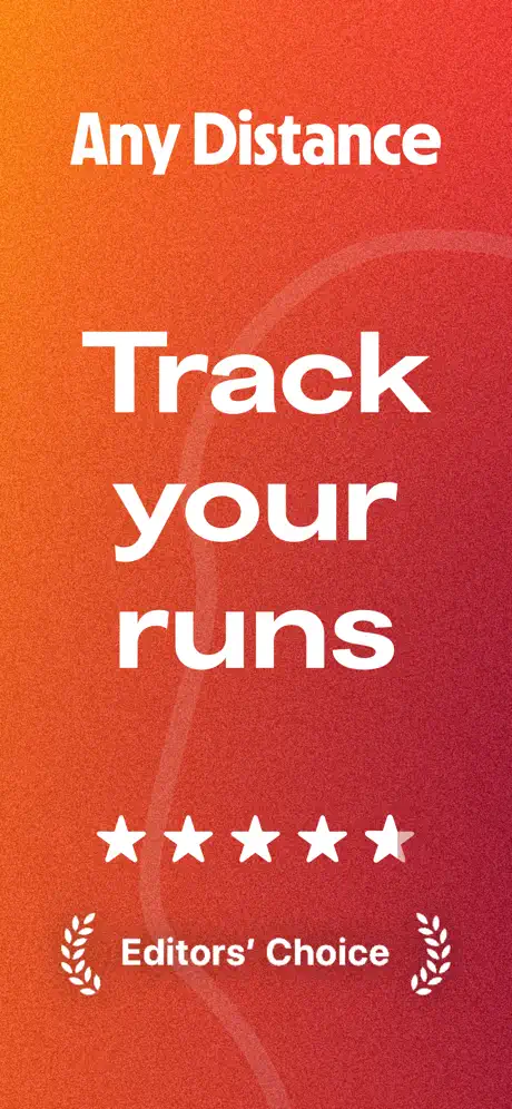
Brand Promise over Warm Gradient

This opening frame is a pure typographic poster with no device chrome. The background is a full-bleed vertical gradient that shifts from a hot tangerine in the upper third—approximately #FF6B35—down to a deep crimson near #D72638 at the base, overlaid with a fine monochromatic noise texture that kills digital banding. At the top, the app name 'Any Distance' is set in a bold white sans-serif at a scale that reads clearly but defers to the primary message below. The optical center is dominated by 'Track your runs,' stacked across three lines in an enormous weight that likely occupies more than forty percent of the frame’s vertical real estate. Below the headline, five white star glyphs act as a social-proof anchor, followed by an 'Editors’ Choice' lockup flanked by symmetrical vector laurels. A ghosted, lighter-red ribbon arcs behind the type from upper right to lower left, adding depth without competing for attention. The spacing between the app name, the headline block, the stars, and the laurels is generous and rhythmic, creating distinct horizontal zones. There is no UI, no button, and no subtitle—only category, promise, and credibility. By omitting any device, the frame forces the eye to commit to the value proposition before encountering pixels.
Any Distance App Store screenshot 2 — Live Tracking, Cropped and Angled
02

Live Tracking, Cropped and Angled

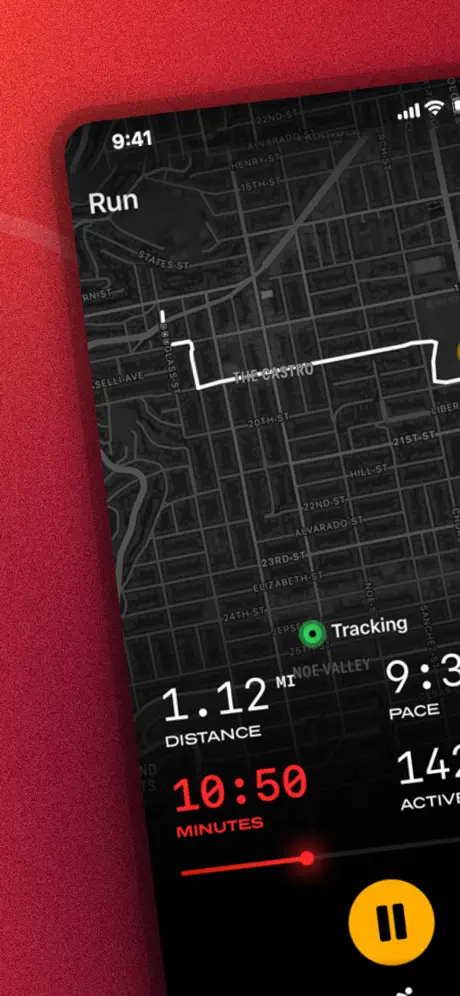
The second frame pivots to evidentiary UI, presenting a black iPhone that enters from the lower right at roughly a twelve-degree counter-clockwise tilt. The device is cropped aggressively on its right edge, so the bezel and portion of the screen bleed off-canvas, leaving the phone’s rounded corner severed by the frame boundary. The background remains in the warm red grain family, maintaining continuity with the first frame. On-screen, the app displays a dark-mode map centered on a street grid with legible road names such as 'The Castro' and 'Noe Valley,' over which a bright white GPS route line is traced. A floating 'Tracking' pill with a green status dot appears above the stats panel. The bottom sheet shows '1.12 MI' in white, '10:50' in a high-visibility red close to #FF3B30, and truncated values for pace and active calories. A circular yellow pause button fills the bottom-right corner of the phone screen. The status bar displays the canonical Apple demo time of 9:41. Notably, this frame carries no overlaid headline outside the device, relying entirely on the internal UI to communicate context. The angle creates kinetic energy, though the severe right-edge crop reads more like a masking error than intentional editorial bleed.

Any Distance App Store screenshot 3 — Modality Stack
03

Modality Stack

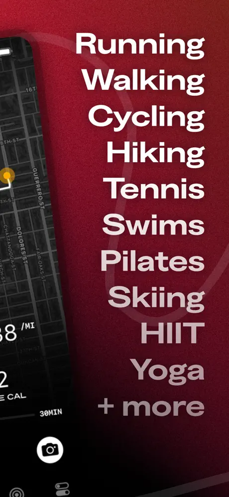
Here the composition splits between device and type. The left edge holds a narrow, cropped sliver of the same angled phone from frame two, now showing only a fraction of the dark map, a '30MIN' label, and a white camera icon floating above the bottom tab bar. The remaining two-thirds of the frame are occupied by a vertical stack of activity names in white: 'Running,' 'Walking,' 'Cycling,' 'Hiking,' 'Tennis,' 'Swims,' 'Pilates,' 'Skiing,' 'HIIT,' 'Yoga,' and '+ more.' The type is centered within the right-hand space rather than aligned to a hard left margin, which produces slight optical wobble across lines of varying length. The first eight modalities read at full white opacity, while 'Yoga' and '+ more' drop to roughly sixty percent opacity, implying continuation beyond the frame. The background persists as the same grainy deep red seen in the first two frames, so the transition feels like a lateral pan rather than a cut. By dedicating an entire screenshot to modality breadth, the designers avoid cramming a feature list into a crowded UI panel elsewhere, though the center-aligned ragged edges sacrifice some typographic discipline.

Any Distance App Store screenshot 4 — WatchOS Companion Evidence
04

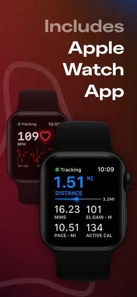
WatchOS Companion Evidence

The background cools to a dark, chocolate-tinged maroon near #2E0A11, signaling a chapter shift. Two Apple Watch units float in the center, rendered without bands. The rear unit, positioned slightly higher and to the left and dimmed through reduced opacity or a darker overlay, displays '109 BPM' in white beside a red heart glyph and a trailing sparkline. The foreground unit, larger and sharper, shows distance mode: '1.51 MI' rendered in a bright cyan close to #0A84FF, a horizontal progress bar with '3.2MI' at its terminus, and a two-by-two grid of metrics—minutes, elevation gain, pace, and active calories—in white tabular sans-serif. At the top right, the caption 'Includes' appears in a muted gray at reduced opacity, stacked above 'Apple Watch App' in fully opaque white. The green 'Tracking' pill with its status dot mirrors the iOS UI grammar seen in frame two, establishing cross-platform visual consistency. Removing the watch bands universalizes the subject but also eliminates any physical context of wearability, making the watches feel like floating sensors rather than objects on a wrist.

Any Distance App Store screenshot 5 — Collectible Retention Grid
05

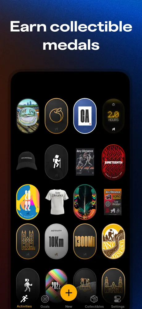
Collectible Retention Grid

A sharp color jump lands the viewer in a deep indigo-to-navy gradient, roughly #121C8A at center falling toward darker tones at the edges, still carrying the unifying grain texture. The headline 'Earn collectible medals' sits high in heavy white type. Below, a straight-on iPhone mockup displays a four-column grid of collectible badges against a pure black UI ground. The grid spans at least five rows and mixes media types: a photographic frog, a line-art peach, typographic stamps reading 'CA' and 'JUNETEENTH,' a '20 HOURS' digital readout, a runner glyph, a '2022' seal, a cathedral outline, and others of varying aspect ratios. At the bottom of the phone screen, the tab bar is visible with 'Activities,' 'Goals,' 'New,' 'Collectibles,' and 'Settings,' with the 'New' button rendered as a bright yellow-orange circle containing a plus glyph and the 'Collectibles' label highlighted. The density of the grid suggests volume, though at thumbnail size individual art assets merge into colorful texture rather than legible trophies. The black phone bezel against the deep blue background creates edge ambiguity in several spots.

Any Distance App Store screenshot 6 — Post-Activity Share Card Designer
06

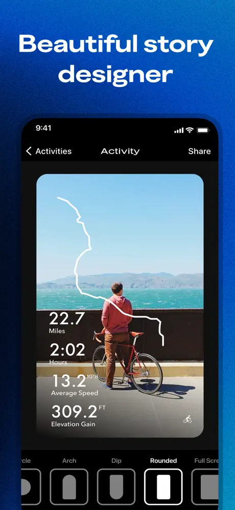
Post-Activity Share Card Designer

The gradient cools further to a vibrant royal-to-cyan blue, approximately #005BEA at the top drifting to #00A9F4 at the bottom, making this the most saturated background in the sequence. The headline reads 'Beautiful story designer' in white. Centered below, the iPhone shows a post-activity sharing interface. A full-bleed photograph of a person standing with a bicycle against a coastal backdrop fills the card, over which a thin white route line is composited. Bottom-left stat overlays read '22.7 Miles,' '2:02 Hours,' '13.2 MPH Average Speed,' and '309.2 FT Elevation Gain,' set in white with lighter-weight labels beneath each figure. The top navigation bar shows a back chevron, the word 'Activity,' and a 'Share' action. Beneath the photo, a template selector strip displays aspect-ratio options—'Arch,' 'Dip,' 'Rounded' (currently selected, outlined with a thick white border), and a truncated 'Full Scre…'—communicating that the export format is customizable. This frame answers the post-workout question and introduces human photography for the first time in the device-dominant frames, shifting the proposition from data to expression.

Any Distance App Store screenshot 7 — Integration Lockup
07

Integration Lockup

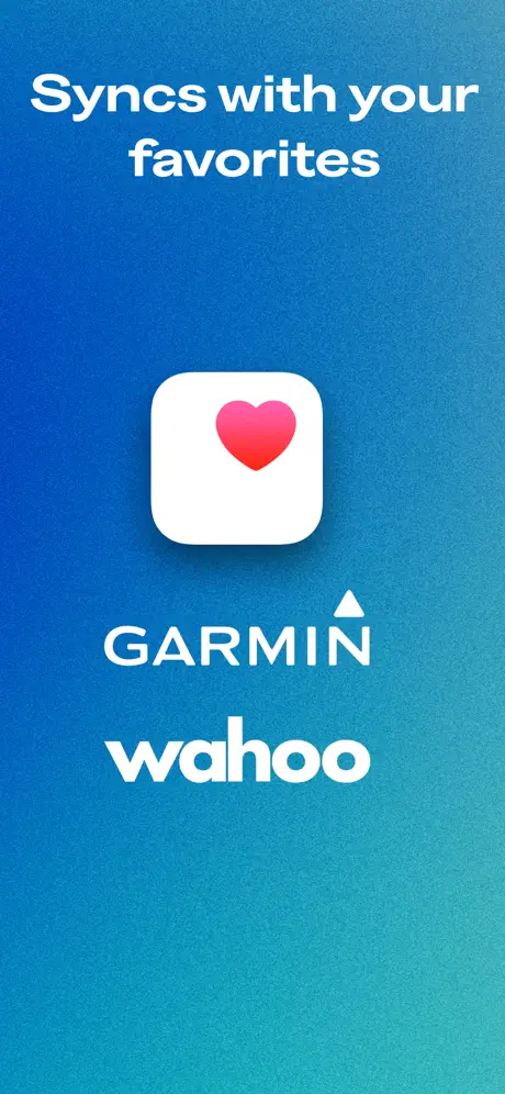
The final frame settles into a cool teal gradient, roughly #0077BE to #00B894, completing the thermal arc from frame one. There is no device. The headline 'Syncs with your favorites' is centered in white type across two lines. Below, three integration marks stack vertically: the Apple Health icon as a white rounded square with a pink-to-red heart gradient, followed by the 'GARMIN' wordmark in white with its upward-pointing triangle, and finally the lowercase 'wahoo' wordmark, also in white. The logos are rendered in monochrome, which harmonizes the frame but flattens brand recognition—particularly for Wahoo, whose consumer identity is tightly coupled to a signature orange. The spacing between lockups is generous, creating a calm, terminal composition that functions as a decompression from the feature density of the preceding frames. The frame ends the swipe journey on interoperability rather than spectacle, trusting that the shopper who has reached this point is evaluating ecosystem fit.

05The craft

Captions, colour and the mechanics of the sell

Caption pattern

Headlines are consistently positioned in the upper third, set in a heavy sans-serif, white against the gradient. Subheads or meta-text (like 'Includes') occasionally use reduced opacity. Inside-device text is treated as UI chrome rather than marketing copy.

Visual system

Typography: single bold geometric family at massive scale. Color: warm-to-cool gradient arc backgrounds with additive grain. Device treatment: floating, angled, cropped, bandless. Iconography: native iOS status bar (9:41), native tab bar glyphs, Apple Watch complications. Framing: full-bleed backgrounds with no marginal white space; content pushed to edges for thumbnail impact.

The thumbnail test

At thumbnail scale, frame one reads as a clear orange billboard with high-contrast white type and five stars. Frame two becomes a dark, unreadable smudge because the device is angled and contains no external headline. Frame three’s vertical modality list is highly legible because the stacked white words act as a ladder against the red ground. Frame four’s watches merge into a black blob with competing data points. Frame five’s medal grid reads as colorful texture but individual badges disappear. Frame six’s bright blue background and white headline snap into focus. Frame seven’s three white logos center cleanly. The sequence passes the thumbnail test on odd-numbered frames but loses comprehension on the even device-centric frames where UI density is not backed by external captions.

Conversion mechanics

The conversion architecture relies on alternating comprehension modes: odd frames (1, 3, 7) deliver immediate textual promises that pass the thumbnail test, while even frames (2, 4, 6) provide evidentiary depth for users who have already paused their scroll. Social proof is front-loaded in frame one with five stars and Editors' Choice laurels, anchoring credibility before any feature is shown. The modality list in frame three acts as a keyword net, catching search-intent shoppers who scan for their specific sport. The watch frame at position four is strategically early, capturing wrist-centric users before they drop off. However, the lack of external headlines on frames two and four means those evidence frames likely fail at thumbnail scale, where internal UI text is too small to read. From a conversion standpoint, every device frame should carry an external caption so the value proposition is legible even when the UI chrome is not.

06Where it slips

What we would change

Frame 2 lacks an external headline, forcing the shopper to read UI chrome at a tilt.

To fix: overlay a three- or four-word descriptor such as 'Live route tracking' in the negative space above the phone so the message survives thumbnail compression.

Frame 2’s right-edge crop severs the device bezel, reading as a render error.

To fix: rotate the phone so the pause button and right corner remain inside the safe area, or pull the crop inward to show the full rounded corner rather than truncating it against the canvas edge.

Frame 4’s 'Includes' subhead is too low-contrast against the dark maroon.

To fix: raise the opacity to at least #EAEAEA or white at eighty-five percent to maintain WCAG AA contrast; otherwise it evaporates at small sizes.

The color jump from frame 4’s maroon to frame 5’s indigo breaks the thermal narrative.

To fix: introduce a purple-bridging hue in one of the two frames, or warm frame 5’s background by ten percent so the gradient arc feels continuous rather than chopped.

Frame 5’s black iPhone bezel melts into the dark blue background.

To fix: add a subtle 1pt inner shadow to the phone mask, or lighten the gradient directly behind the device by eight to ten percent to restore its silhouette.

07The recipe

How to apply this to your own app

  1. Use color temperature as a narrative axis.

    Any Distance cools its background from orange to teal across seven frames. You can do the same by shifting your own gradient along a single hue arc so the swipe gesture feels like physical progress.

  2. Alternate poster frames with device frames.

    Seven identical iPhone mocks create fatigue. Insert full-typography frames between UI evidence to reset the eye and maintain pacing.

  3. Add external headlines to every device frame.

    Internal UI text is unreadable at thumbnail size. Never let a device frame speak for itself; reinforce it with large type outside the bezel.

  4. Unify disparate frames with a single texture.

    A consistent grain or noise overlay across all backgrounds is a low-cost way to make varied screenshots feel like a single system.

  5. Front-load social proof before showing features.

    If you have Editor's Choice or a high rating, place it in frame one so credibility is established before the shopper evaluates evidence.

08Takeaways

Five things worth stealing

  • Thermal gradients can guide swipe momentum if handled as a continuous arc rather than discrete jumps.
  • Oversized type pushed close to canvas edges outperforms polite margins at thumbnail scale.
  • Cropped or angled devices add editorial energy but require careful safe-area management to avoid looking like mistakes.
  • Evidence frames (UI screenshots) need external captions to function in the App Store gallery.
  • Partner logos in monochrome sacrifice scan-recognition; use brand colors or stronger figure-ground contrast.
09The verdict

What the set actually achieves

The approach produces a swipe experience that moves from hot to cool, from promise to proof, using background color as a navigational compass. The set alternates between 'poster' frames (no device, only massive type) and 'evidence' frames (cropped, angled, or floating hardware) so the eye never acclimates to a repetitive mockup cadence. Grain texture acts as a low-cost unifier across color temperatures. Typography is treated as infrastructure: a single heavy geometric sans-serif is pushed to the edge of the canvas so headlines remain readable at thumbnail scale. The result is a gallery that feels editorial rather than spec-sheet, though several specific execution choices undermine the readability and continuity of the sequence.

This case study is written for mobile product designers, growth designers, and indie developers who are building their own App Store screenshot set and need a concrete, visual reference for sequencing, color pacing, and typographic hierarchy in a crowded category.

10Questions

Frequently asked

Why does the set start with no device in frame one?

Frame one acts as a billboard. By removing device chrome, the shopper reads the brand promise and social proof instantly without parsing UI details. It forces category comprehension before feature inspection.

How does the grain texture help?

The grain unifies disparate gradient colors and device shots into a single tactile system. It also prevents banding on wide color-gamut displays, keeping backgrounds smooth and premium.

What is the biggest weakness in this set?

Frames two and four rely on internal UI text to communicate value. At thumbnail size, that text is illegible, so those frames become dead weight for fast scrollers. Adding external headlines would fix this immediately.

Should I angle my iPhone mockups like frame two?

Only if you keep critical UI elements and bezels inside the visible canvas. Any Distance severs the right bezel, which looks accidental. If you tilt, commit fully—show enough device to confirm the angle is intentional.

11Keep reading

Build your own screenshot set

The full set

7 shots
Any Distance App Store screenshot 1Any Distance App Store screenshot 2Any Distance App Store screenshot 3Any Distance App Store screenshot 4Any Distance App Store screenshot 5Any Distance App Store screenshot 6Any Distance App Store screenshot 7

About the app

Screenshots and store metadata belong to Any Distance. They are shown here for design commentary and criticism. The analysis on this page is original work by floow.design. View the original listing.

More Health & Fitness teardowns

Browse all →