Eight Sleep app icon
Health & FitnessScreenshot teardown8 min read

Eight Sleep App Store screenshots

The Eight Sleep App Store gallery opens with a single lifestyle hero, then locks into six framed device shots against a unified dark gradient. The sequence moves from atmospheric bedroom photography to granular controls—temperature, elevation, reports, snoring, heart-rate variability, and Autopilot—using a rigid caption-headline architecture, a near-black iOS UI skin, and a strict two-tone semantic color system.

Set published by Eight Sleep, Inc · 7 frames analysed

4.7 · 15K ratingsFreev7.48.1Updated 4mo ago
Eight Sleep App Store screenshot 1
01At a glance

The set in one screen

Framing
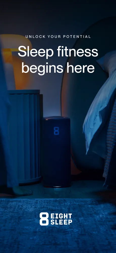
Device framing begins in frame 2 and continues identically through frame 7: a centered iPhone 15 Pro with Dynamic Island visible, set against a gradient shifting from pitch black at the top to roughly #1A2535 at the bottom. Frame 1 is the only full-bleed photograph.
Captions
Every frame after the hero uses a 2-word, all-caps, letter-spaced category label in muted gray (#8E8E93) set in approximately 11pt, followed by a two-line white headline in a bold sans-serif at roughly 34–40pt.
Backdrop
The gradient behind the devices never changes, creating a seamless carousel effect while risking visual fatigue by the fourth swipe.
Type
SF Pro-style grotesk throughout; headlines are bold, white, and flush-center; UI type inside the devices uses standard iOS sizing with heavy reliance on #8E8E93 secondary labels.
UI / copy split
Approximately 70 percent of the frame is dedicated to the device screenshot, with the remaining 30 percent split between the caption-headline block and the gradient margin.
Frame 1 job
Establish atmosphere. The hero frame contains no phone, no feature list, and no UI—only a dark bedroom, a glowing hardware unit, and a category headline.

Sampled palette

#0B1420#0B1420
#1A2535#1A2535
#1C1C1E#1C1C1E
#4A90E2#4A90E2
#34C759#34C759
#FF375F#FF375F
02The challenge

What this screenshot set had to solve

For a hardware-integrated sleep app, the screenshot set faces the classic conversion puzzle: prove the mattress ecosystem is digitally sophisticated without drowning shoppers in medical dashboards. The set opts for restraint, showing only seven frames and keeping every subsequent shot inside an identical iPhone 15 Pro shell set against a dusted navy gradient. This immediately positions the product as night-centric hardware, yet it also means the gallery leans entirely on interface density and typographic hierarchy to convey depth. There is no social proof frame, no pricing context, and no account-setup promise—just hardware, then controls, then data.

Sleep fitness begins here
03The approach

How the set argues its case

The design strategy relies on absolute consistency: a 2-word uppercase category label, a two-line white headline in a sans-serif grotesk, and a vertically centered device floating in a #0F141C-to-#1E293B gradient. All six UI frames crop the Home Bar and keep the Dynamic Island fully visible, anchoring the presentation in current-generation hardware. The color system inside the app itself is near-obsidian with high-contrast white type, punctuated by iOS-system blue toggles and a strict green/pink semantic palette for positive and negative biometrics. The approach treats the gallery as a linear onboarding story: environment first, then manipulation, then retrospection.

The set competes in the luxury wellness hardware aisle. By opening with a cinematic bedroom rather than a phone, it borrows from Dyson and Peloton marketing—sell the room, then sell the remote. The App Store framing therefore functions as a mood board first and a feature list second.

04Frame by frame

Every screenshot, and the job it does

Eight Sleep App Store screenshot 1 — Unlock Your Potential
01

Unlock Your Potential

On-frame caption: “UNLOCK YOUR POTENTIAL

Sleep fitness begins here / Eight Sleep logo lockup centered at bottom / no phone frame / hardware visible / lifestyle photography only frame / warm amber lamp / navy floor / deep shadows hero image dark frame not UI empty foreground bed leg visible emphasizing object scene atmospheric first brand set tone mood establish no interface 100% editorial photography matte cylinder glowing blue 8 at center

Eight Sleep App Store screenshot 2 — Temperature
02

Temperature

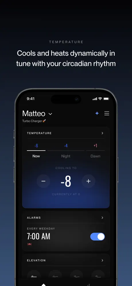
On-frame caption: “TEMPERATURE

Device frame appears iPhone 15 Pro centered vertically same gradient background caption TEMPERATURE in gray 11pt wide tracked uppercase headline two line white bold sans-serif about 34pt device screen shows Matteo profile Turbo Charger subtitle temperature card with Now Night Dawn segments minus plus steppers blue underline on Now value negative eight in large white type alarm section every weekday seven AM blue toggle on elevation section below standard status bar nine forty one visible Dynamic Island visible bottom tab bar partially cropped.

Eight Sleep App Store screenshot 3 — Elevation
03

Elevation

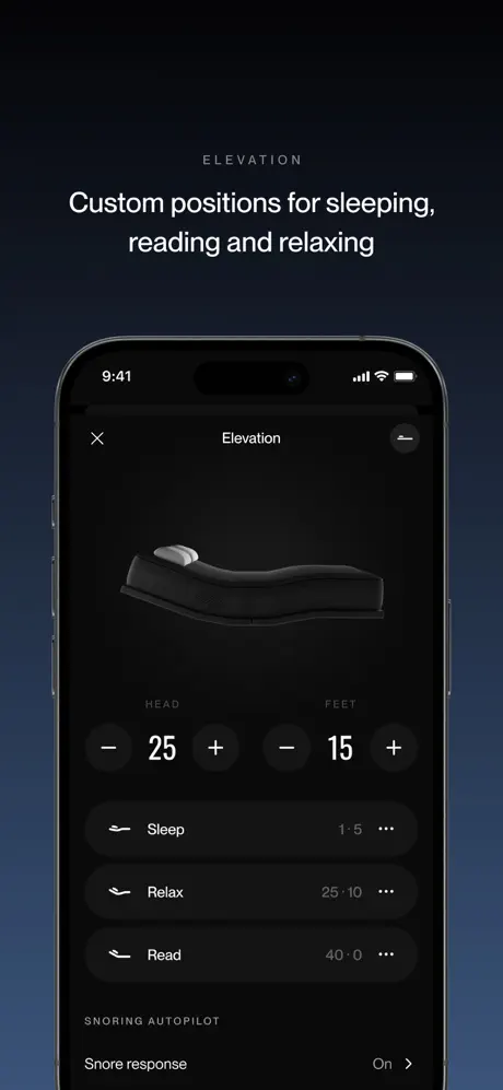
On-frame caption: “ELEVATION

Caption ELEVATION follows identical formula phone shows Elevation modal with X close top left minus icon top right 3D isometric adjustable base in dark graphite head and feet incrementers set to twenty five and fifteen circular dark gray buttons preset list Sleep Relax Read with numeric angle pairs one bullet five twenty five bullet ten forty bullet zero snoring autopilot section snore response toggle set to On right chevron.

Eight Sleep App Store screenshot 4 — Insights
04

Insights

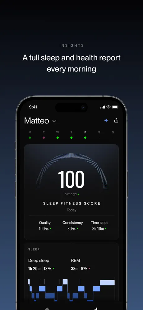
On-frame caption: “INSIGHTS

Caption INSIGHTS headline promises full sleep and health report every morning phone displays Matteo dashboard weekday selector M T W T F S S with green and magenta dots large circular gauge showing one hundred in range sleep fitness score today quality consistency time slept metrics with green up dots deep sleep and REM stats with hypnogram bar chart below blue block stages on black canvas.

Eight Sleep App Store screenshot 5 — Snoring
05

Snoring

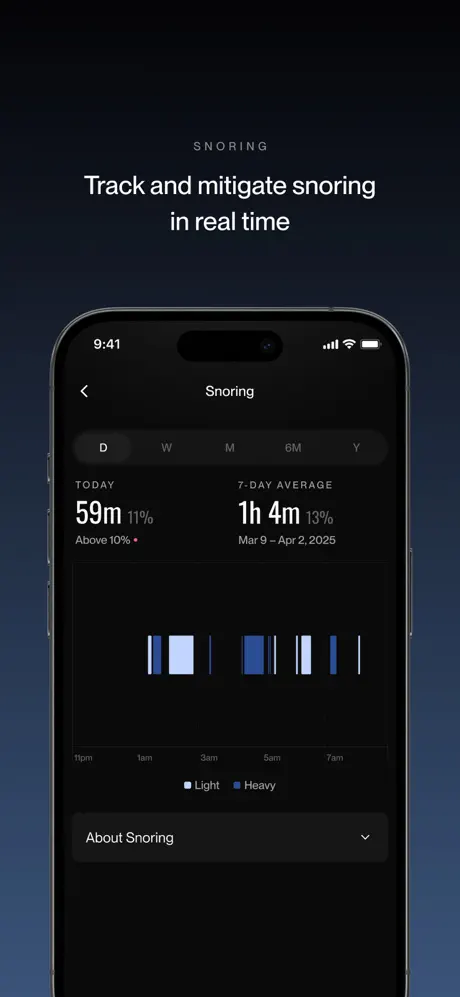
On-frame caption: “SNORING

Caption SNORING headline track and mitigate snoring in real time phone shows Snoring screen back chevron segmented control D W M 6M Y with D selected in charcoal pill today fifty nine minutes eleven percent above ten percent pink dot seven day average one hour four minutes thirteen percent date range bar chart timeline eleven pm to seven am light and heavy blue vertical bars legend accordion about snoring at bottom.

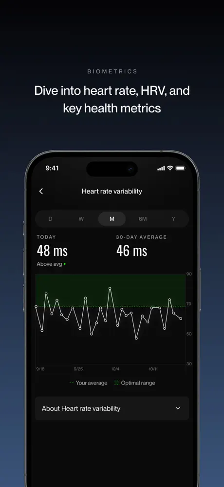
Eight Sleep App Store screenshot 6 — Biometrics
06

Biometrics

On-frame caption: “BIOMETRICS

Caption BIOMETRICS headline dive into heart rate HRV and key health metrics phone shows Heart rate variability screen M selected in gray pill today forty eight ms above average green dot thirty day average forty six ms line chart white on black with green shaded optimal range band x-axis dates nine eighteen nine twenty five ten four ten eleven dashed average line y-axis thirty to ninety about section accordion at bottom.

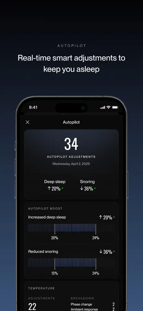
Eight Sleep App Store screenshot 7 — Autopilot
07

Autopilot

On-frame caption: “AUTOPILOT

Caption AUTOPILOT headline real-time smart adjustments to keep you asleep phone shows Autopilot modal X close large thirty four hero number autopilot adjustments date Wednesday April two twenty twenty five summary rows deep sleep up twenty percent snoring down thirty six percent green dots autopilot boost micro tick mark bars showing ranges twenty to twenty four percent and fifteen to twenty four percent temperature adjustments twenty two breakdown phase change two ambient response two visible.

05The craft

Captions, colour and the mechanics of the sell

Caption pattern

Frames 2–7 repeat the same architectural formula. An 11pt all-caps label (‘TEMPERATURE,’ ‘ELEVATION,’ ‘INSIGHTS,’ ‘SNORING,’ ‘BIOMETRICS,’ ‘AUTOPILOT’) sits centered above a 34–40pt headline. The copy always leads with a verb or active noun, keeping the tone instructional rather than promotional.

Visual system

The background gradient, device centering, and caption lockup never deviate. Inside the phone, the UI uses a near-black (#0D0D0D to #111111) canvas with 1px hairline separators, translucent gray (#2C2C2E) stepper buttons, and iOS-native blue toggles. The only chromatic relief comes from semantic health dots—green #34C759 for positive trends and pink #FF375F for warnings—plus a desaturated blue (#4A90E2) used for the Pod logo and selected temperature states.

The thumbnail test

At small scale, the first frame reads as a dark blue rectangle with a white logo and headline—legible but not distinctive. Frames 2–7 collapse into identical black silhouettes with white text bursts. The large numerals inside the interfaces (–8, 100, 59m, 48 ms, 34) become the only readable differentiators, which unintentionally turns the carousel into a game of ‘guess the metric.’

Conversion mechanics

The gallery assumes the shopper already knows what the Pod hardware is. Frame one never names the product category; it simply shows the cylinder. By frame seven, the viewer has seen temperature, elevation, sleep scores, snoring, HRV, and Autopilot, but no frame explicitly shows the purchase path, subscription cost, or family-member setup. For a high-consideration hardware purchase, this is a top-of-funnel mood set rather than a bottom-of-funnel conversion engine.

06Where it slips

What we would change

Visual Monotony in the Back Half

The identical gradient, identical device scale, and identical caption placement from frames 2 through 7 flatten the carousel into a slideshow. By the fourth swipe, the shopper’s eye has nothing new to grab except the UI content. A simple fix: vary the device scale or crop slightly in frames 5–7, or introduce a subtle shift in the background hue to signal narrative progression from control to insight to automation.

Aggressive Bottom Cropping

Every device frame crops the Home Bar, which is acceptable marketing practice, but frame 2 also chops the bottom tab bar mid-glyph, leaving four unidentifiable icon fragments. This reads as accidental rather than intentional. The fix is to either pull the device up by 12–16pt to reveal the tab bar cleanly or darken the bottom gradient to hide the seam entirely.

Lost Logo in Frame 1

The hero photograph pushes toward absolute black in the lower third, swallowing the white Eight Sleep logotype. The white mark is legible, but only just; on OLED displays in bright ambient light, the contrast could fail. Adding a subtle #0B1420 vignette lift behind the logo, or a 1pt hairline keyline, would preserve the midnight mood without sacrificing mark legibility.

Broken Semantic Color Contract

The app establishes green for positive and pink for cautionary, yet frame 4 introduces a magenta dot under Tuesday in the day selector that is never explained or repeated elsewhere. If Tuesday is a rest day or a poor sleep day, the color should align with the established pink warning system; if it is neutral, it should use gray. The fix is to remove the unexplained outlier or align it with the existing green/pink logic.

Absent Closing Beat

The sequence ends on an Autopilot data screen, leaving the shopper staring at internal telemetry rather than a resolution. There is no setup preview, no partner-sharing mention, and no sleep trial promise. Adding an eighth frame that shows a gentle alarm wake-up or a shareable weekly report would provide narrative closure and a final emotional payoff.

07The recipe

How to apply this to your own app

  1. If you sell hardware, open with the room, not the remote.

    Frame 1 proves that showing the physical object in situ builds desire before you ever expose the UI chrome. Resist the urge to front-load screens.

  2. Lock your background gradient and caption grid.

    Frames 2–7 gain authority because the container never changes. Choose one gradient, one device scale, and one caption position, then repeat them ruthlessly so the shopper focuses on the content inside the phone.

  3. Use large numerals as swipe bait.

    The –8, 100, 59m, 48 ms, and 34 figures are the only elements visible at thumbnail size. If your app produces quantified-self data, make the numbers enormous and place them near the vertical center of the device screen.

  4. End with an emotional resolution, not a dashboard.

    Eight Sleep stops on a data screen; you should consider stopping on an outcome—refreshed wake-up, shared achievement, or trial invitation—to convert the narrative into action.

08Takeaways

Five things worth stealing

  • Atmospheric lifestyle photography outperforms UI for frame one in hardware categories.
  • Rigid repetition of caption-headline-device structure creates brand authority but demands internal UI variation to sustain interest.
  • Semantic color systems must be enforced across every screenshot; a single unexplained accent breaks shopper trust.
  • The Home Bar and bottom navigation must be cropped intentionally, not accidentally.
  • A closing frame should resolve the narrative rather than trailing off into telemetry.
09The verdict

What the set actually achieves

The sequence presents a linear onboarding story: environment first, then manipulation (temperature, elevation), then retrospection (insights, snoring, HRV), and finally automation (Autopilot). Each frame is visually identical in its outer structure, forcing the shopper to read the interface itself to detect progression. The result is a gallery that feels like a premium technical manual—precise, dark, and relentlessly consistent—but one that may lose swipe velocity because no frame breaks the established pattern.

Teams launching expensive hardware with sophisticated companion apps who need to signal clinical credibility and luxury restraint without explaining every feature. The set is less effective for pure software or low-cost utilities that must communicate value prop in two seconds.

10Questions

Frequently asked

Why is there no iPhone frame in the first screenshot?

The first frame is a pure lifestyle hero meant to establish mood and show the physical Pod unit. The device frame only appears once the story shifts to software functionality in frame 2.

What typeface is used for the headlines?

The headlines use a bold sans-serif grotesk consistent with San Francisco or a similar neo-grotesk; they are set in pure white at approximately 34–40pt.

Why does the Tuesday dot in frame 4 have a different color?

It appears magenta or pink while other days use green, but the screenshot provides no legend explaining the distinction. This is a consistency gap in the semantic color system.

How does the set handle negative space?

Generously. The gradient background occupies roughly 30 percent of the frame above and below the device, and the UI inside the device uses dark cards with ample padding to prevent clutter.

11Keep reading

Build your own screenshot set

The full set

7 shots
Eight Sleep App Store screenshot 1Eight Sleep App Store screenshot 2Eight Sleep App Store screenshot 3Eight Sleep App Store screenshot 4Eight Sleep App Store screenshot 5Eight Sleep App Store screenshot 6Eight Sleep App Store screenshot 7

About the app

The Eight Sleep Pod is the intelligent sleep system that gives you up to one hour more of sleep every night. It cools. It heats. It elevates. PERSONALIZED SLEEP WITH Eight Sleep, Inc, via the App Store listing.

Screenshots and store metadata belong to Eight Sleep, Inc. They are shown here for design commentary and criticism. The analysis on this page is original work by floow.design. View the original listing.

More Health & Fitness teardowns

Browse all →