Locket Widget app icon
SocialScreenshot teardown13 min read

Locket Widget App Store screenshots

Teaching an invisible, asynchronous social loop through seven static frames without letting the dark UI collapse into sameness.

Set published by Locket Labs, Inc. · 7 frames analysed

4.8 · 505K ratingsFreev2.42.0Updated 4mo ago
Locket Widget App Store screenshot 1
01At a glance

The set in one screen

Framing
Centered iPhone 14 Pro mockups against near-black grounds; top ~20% reserved for icon + category label + bold headline.
Captions
Small muted-grey category wordmark with a 16px SF glyph, followed by a 32–40pt bold white sans-serif declaration in tightly-leaded two-line stacks.
Backdrop
Vertical 9:16 canvases; ground color shifts between warm umber, cool charcoal, and green-black.
Type
Large, heavy sans-serif (likely SF Pro Display) set in negative leaning; no drop shadows, relying entirely on contrast against dark grounds.
UI / copy split
Medium. Four frames show rich in-app UI (camera, chat, feed, rollcall); three frames show system-level context or abstraction.
Frame 1 job
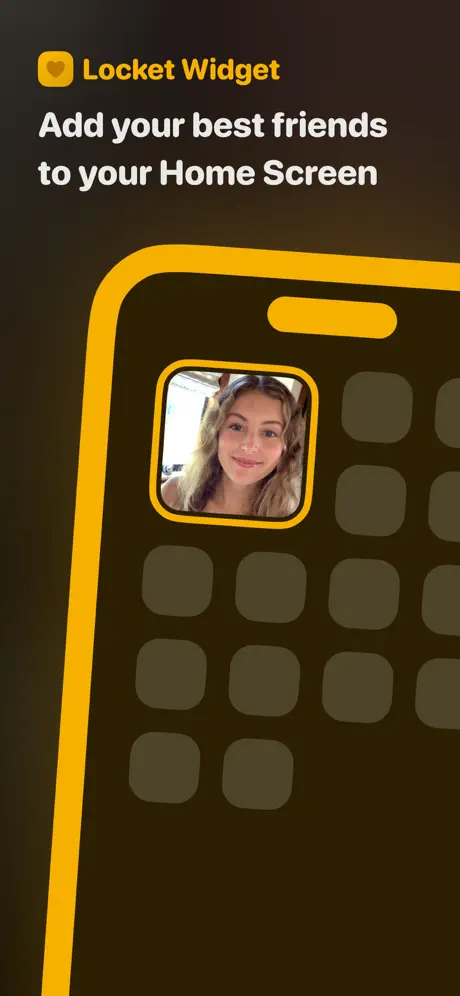
Abstract the widget concept into an iconic poster by replacing a realistic device with a thick yellow outline, but the stylistic break undermines continuity.

Sampled palette

for brand yellow / badges#FFB020
for warm near-black frame grounds#1A120B
for cool charcoal frame grounds#262626
for the outlier green-black chat background#1C2416
at ~85% opacity for primary headlines#FFFFFF
for secondary category labels#8E8E93
02The challenge

What this screenshot set had to solve

The core difficulty is selling an ambient widget experience in static images. Locket’s value proposition is not a full-screen feed you scroll; it is a 2x2 grid cell that mutates throughout the day while your phone is locked. In a store listing, you cannot show the passage of time or the unlock gesture, so the designer must reconstruct causality: widget placement, capture, send, receive, react, and archive. The challenge is compounded by the need to inhabit two visual systems at once—Apple’s bright, textured iOS Home Screen and the app’s own dark-mode chrome—without making the set feel like disjointed exports from two different products. The shopper swipes in approximately 1.8 seconds per frame; the set must teach the loop before the finger lifts.

Frame 1 abstracts the Home Screen into a diagram, but by breaking the photorealistic device convention it accidentally teaches the shopper that visual rules are optional.
03The approach

How the set argues its case

The designer chose a narrative loop over a feature list. Rather than leading with onboarding or sign-up, the sequence opens with a promise (widget on Home Screen), demonstrates bilateral exchange (send/receive), then moves into in-app depth (chat, camera, history). The strategy relies on a single anchored layout: a category glyph and label at top center, a heavy white headline beneath it, and a single iPhone device occupying the lower two-thirds. This repetitive post structure creates rhythm, while the content inside the device alternates between system context (Home Screen) and proprietary UI (dark-mode app screens) to keep the eye moving. The yellow brand accent is used sparingly—app icon, badge counts, shutter ring—which trains the shopper to treat yellow as the functional pulse of the experience.

The screenshots target users who already understand iOS widgets but do not yet associate them with social permanence. By showing real Apple app icons surrounding the Locket widget, the set borrows system trust. The photography is unpolished, sun-drenched, and friend-group oriented, positioning the product as a private channel rather than a broadcast network.

04Frame by frame

Every screenshot, and the job it does

Locket Widget App Store screenshot 1 — The Hook: Poster Abstraction
01

The Hook: Poster Abstraction

On-frame caption: “Add your best friends to your Home Screen

Frame 1 abandons photorealism entirely. The canvas sits on a deep warm black that reads near #1A120B. In the upper-left, the Locket wordmark and yellow heart icon lock up beside the headline 'Add your best friends to your Home Screen' in a heavy, tightly-tracked white sans-serif. Rather than a steel-and-glass device, the phone is rendered as a thick yellow outline—matching the brand yellow at roughly #FFB020—that bleeds off the right edge of the canvas. Inside the schematic, the Home Screen grid is reduced to dark olive placeholders at #4A4035, with a single widget cell activated: a cropped portrait wrapped in the same yellow stroke. The status bar, dock, and wallpaper are omitted entirely. This is the most graphic frame in the set, trading realism for immediate comprehensibility. The asymmetry is intentional: the headline occupies the negative space above the device, while the activated widget cell sits at the optical center of the frame, teaching the shopper exactly where to look on their own Home Screen. By cropping away all system chrome, the designer reduces the concept to a diagram. The risk is that the thick yellow outline looks nothing like the realistic iPhone frames that follow, creating a stylistic rupture before the shopper has even reached Frame 2.
Locket Widget App Store screenshot 2 — Contextual Proof: The Send State
02

Contextual Proof: The Send State

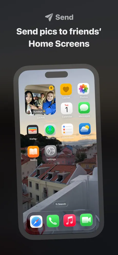
On-frame caption: “Send pics to friends' Home Screens

Frame 2 shifts the ground to a cooler charcoal, approximately #262626. The category label becomes a paper-plane glyph paired with the word 'Send' in #8E8E93. The headline 'Send pics to friends' Home Screens' repeats the white, bold weight established in Frame 1. Inside the now-photorealistic iPhone 14 Pro mockup, the shopper sees an actual iOS Home Screen with a terracotta rooftop wallpaper. The Locket widget occupies the top-left slot, displaying a group selfie overlaid with a yellow badge reading '9' and a small label 'Sundays ✨.' Stock Apple icons orbit the widget: Locket, Photos, Calendar showing 'Tue 1,' Messages, Wallet, Find My, Reminders, Weather, Books, and Settings. The dock holds Safari, Phone, Music, and FaceTime. This frame does the heavy lifting of contextual proof: it tells the shopper that Locket is not a parallel universe but a native iOS citizen. The yellow badge is the only saturated element on the entire Home Screen, making the widget scannable in under a second. The shadow beneath the device is soft and diffused, preventing the grey backdrop from flattening into a void. Compared to Frame 1, the tonal jump is significant: the background cools by several notches, and yellow retreats from structural use to a mere notification accent.

Locket Widget App Store screenshot 3 — Depth: The Rollcall Stack
03

Depth: The Rollcall Stack

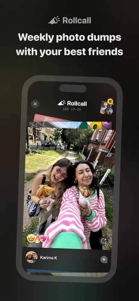
On-frame caption: “Weekly photo dumps with your best friends

Frame 3 drops back into a near-black ground around #181818. The category label switches to a party-horn glyph and 'Rollcall.' The headline reads 'Weekly photo dumps with your best friends.' The device shows an in-app screen titled 'Rollcall' with a date stamp 'JAN 19–25' in small grey caps. A close button sits top-left; top-right shows a stacked avatar pair wearing a yellow badge '6.' The viewport is dominated by a vertical photograph of two people holding pastries on a leafy street, with a fanned stack of photos peeking behind it to suggest a card-stack mechanic. Bottom-left carries three reaction emojis: '🤣🔥💖.' Below the photo, a circular avatar with the name 'Karima K' and a grey plus button sit on a dark sheet. This is the first frame to introduce true depth and layering. The photo consumes roughly 60% of the screen height, prioritizing user-generated content over interface chrome. The date range hints at temporal grouping without demanding reading time. The frame succeeds at showing that the app is not only a widget; it contains a destination worth visiting.

Locket Widget App Store screenshot 4 — Reciprocity: Chat as Reply Surface
04

Reciprocity: Chat as Reply Surface

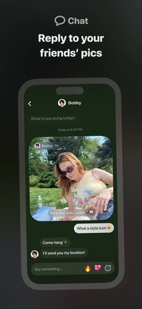
On-frame caption: “Reply to your friends' pics

Frame 4 uses a speech-bubble glyph and the category label 'Chat' above the headline 'Reply to your friends' pics.' The device presents a messaging interface whose background is a dark desaturated green near #1C2416—the only frame in the seven-shot sequence with a noticeable chromatic cast in the UI ground. The header shows a back chevron, an avatar, and the name 'Bobby.' The incoming text 'What're you doing today?' and the timestamp 'Today at 9:40 PM' appear in grey before the photo bubble. The photo itself carries an overlay label 'Bobby 1hr' and a caption 'Park day with Laurel 🌳🧺.' Replies are rendered in grey bubbles: 'What a style icon 😍,' 'Come hang ✨,' and 'I'll send you my location!' The input bar reads 'Say something...' and is flanked by fire, pink heart, and smiley glyphs on a raised dark pill. The posture of the frame is social and reactive, proving that the widget is the beginning of a conversation, not the end. However, the green-black background is a tonal outlier; every other in-app frame uses a warmer, more neutral dark value. The contrast ratio between the grey incoming bubbles and the greenish ground is lower than the white-on-black used elsewhere, which slightly muddles the hierarchy between sender and receiver.

Locket Widget App Store screenshot 5 — Redundant Context: The Receive State
05

Redundant Context: The Receive State

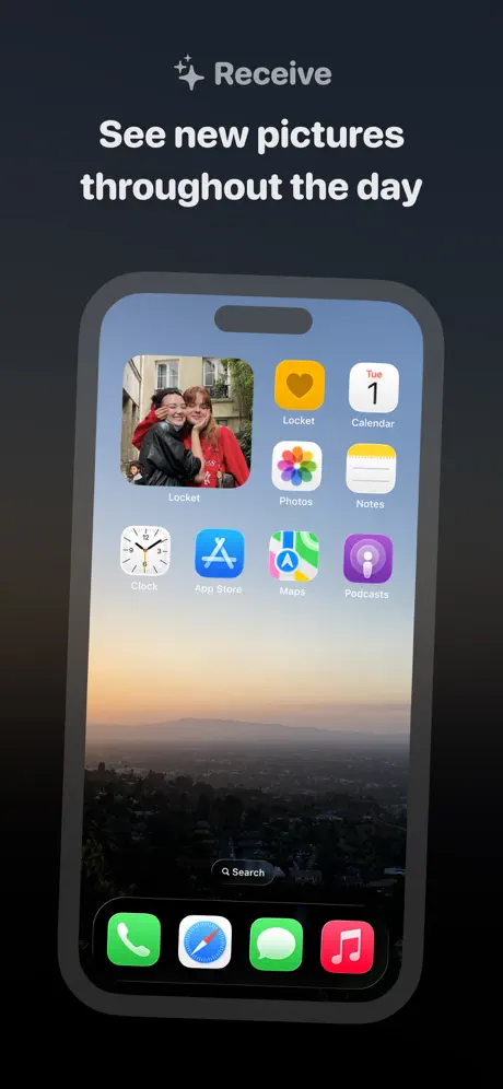
On-frame caption: “See new pictures throughout the day

Frame 5 pairs a sparkle glyph with 'Receive' and the headline 'See new pictures throughout the day.' Structurally, it is almost a twin of Frame 2: another realistic iPhone Home Screen, centered, with the Locket widget in the top-left slot. The wallpaper changes to a misty mountain sunrise with a blue-to-orange gradient sky. This time the widget displays two people in an embrace, one wearing red. The surrounding icons include Clock, App Store, Maps, and Podcasts alongside the persistent Calendar reading 'Tue 1,' Photos, Notes, and Locket. The dock icons are Phone, Safari, Messages, and Music—nearly identical to Frame 2, merely swapping Safari and Phone in position. The repetition is intentional: it reinforces that the widget is a persistent surface that updates. But for the shopper, the layout is so familiar that it scans as the same screenshot. The absence of a badge count shifts emphasis from notification volume to emotional content, yet the frame does not introduce any new UI pattern or spatial relationship. It occupies a valuable screenshot slot to make a point that Frame 2 already implied.

Locket Widget App Store screenshot 6 — Capture: Closing the Loop
06

Capture: Closing the Loop

On-frame caption: “Tap the widget to open the camera

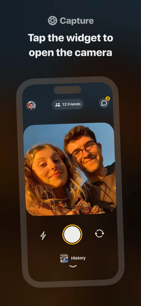
Frame 6 introduces an aperture glyph and the category 'Capture,' with the headline 'Tap the widget to open the camera.' Inside the device, the in-app camera UI fills the screen. The top sheet shows the user's circular avatar on the left, a '12 Friends' pill in the center, and a chat icon with a yellow badge '3' on the right. The viewfinder displays a sun-drenched selfie of two people against open sky. Below, the control bar is black: a flash glyph left, a large white shutter disc with a #FFD60A ring at center, and a flip-camera glyph right. Beneath the shutter, a 'History' thumbnail with a downward chevron suggests a pullable sheet. This is the most UI-dense frame in the set. The yellow shutter ring creates a nice bookend with Frame 1's yellow outline, except here the yellow is restrained to a thin stroke. The viewfinder image is cropped to roughly a 1:1.1 aspect ratio with heavy rounded corners—about 22px radius—which softens the mechanical camera interface into something friendly. Because the surrounding frame ground is a very dark warm brown near #1A0F08, the black camera UI does not separate as distinctly as it could; the device chrome bleeds into the poster background.

Locket Widget App Store screenshot 7 — Archive: History Feed
07

Archive: History Feed

On-frame caption: “Explore your History to travel back in time

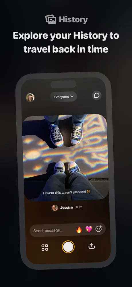
Frame 7 closes the loop with a picture-frame glyph, the label 'History,' and the headline 'Explore your History to travel back in time.' The device shows a feed screen. Top left: an avatar. Center top: an 'Everyone' dropdown pill. Right: a chat bubble icon. The hero image is a reflective-floor shot of two people's sneakers with rainbow caustics, captioned directly on the photo in white text: 'I swear this wasn't planned 🙌.' Below the image, the name 'Jessica' and a '36m' timestamp sit beside a small avatar. The bottom input bar mirrors Frame 4's treatment: 'Send message...' with fire, heart, and smiley icons. A bottom navigation row shows a grid glyph, a large white tappable circle, and a share/upload glyph. This frame introduces a caption-on-photo treatment not seen in earlier frames, adding typographic variety. Yet the bottom navigation is new; it has not appeared in previous in-app shots, so its function is slightly opaque. The 'Everyone' dropdown implies filtering, a concept not set up by prior frames. The frame succeeds at showing permanence—the photos live somewhere after they flash on the Home Screen—but it introduces architectural vocabulary without a map.

05The craft

Captions, colour and the mechanics of the sell

Caption pattern

Every frame follows an identical syntactic pattern: [Icon + Single-word category] followed by an imperative or descriptive headline. Frame 1: heart icon + 'Locket Widget' / 'Add your best friends to your Home Screen.' Frame 2: paper plane + 'Send' / 'Send pics to friends' Home Screens.' Frame 3: party horn + 'Rollcall' / 'Weekly photo dumps with your best friends.' Frame 4: speech bubble + 'Chat' / 'Reply to your friends' pics.' Frame 5: sparkle + 'Receive' / 'See new pictures throughout the day.' Frame 6: aperture + 'Capture' / 'Tap the widget to open the camera.' Frame 7: picture frame + 'History' / 'Explore your History to travel back in time.' This grammar is relentless in a useful way: the shopper learns the rhythm by Frame 3 and begins scanning only the headline deltas.

Visual system

The system is built on absence. Backgrounds are stripped of texture and gradient, letting the device emit its own light. Typography is exclusively white-on-black with one secondary grey tier. The only warm color is the brand yellow (#FFB020), which appears in badges, the shutter ring, and the outline of Frame 1. Device shadows are soft and diffuse, lifting the phone roughly 12–16pt off the ground without hard edges. In-app UI relies on full-bleed photography with rounded 20–24px corners, reinforcing the 'window into a friend's life' metaphor.

The thumbnail test

At thumbnail size, only three elements survive: the yellow heart icon, the white headline, and the glowing photo inside the device. The dark backgrounds compress into a uniform black slate, which means the set reads as low-contrast on a busy store page. The yellow app icon is the single highest-saturation element, so the thumbnail test passes for brand recognition but struggles for legibility of the headline text.

Conversion mechanics

The set does an excellent job of making the widget feel native to iOS, which reduces friction for users who have never customized their Home Screen. However, it never shows the actual widget-installation or friend-invite flow, which are the two hardest conversion cliffs. Every frame assumes the user is already inside the loop; there is no screenshot dedicated to the empty state, the permission prompt, or the 'Add Widget' system sheet. For a product whose growth is driven by mutual adoption, omitting the invitation mechanic from the store art is a missed onboarding opportunity.

06Where it slips

What we would change

Illustrative / Realistic Style Break

Frame 1 uses a thick yellow schematic outline of a phone that bears no visual relationship to the photorealistic steel-and-glass devices in Frames 2–7. The break is too severe for a seven-frame set. The fix is to commit: either render all devices as yellow abstractions to create a bold poster series, or replace Frame 1 with a realistic device showing a zoomed Home Screen so the set obeys a single material language.

Background Temperature Drift

The ground color shifts between warm umber (#1A120B), cool charcoal (#262626), green-black (#1C2416), and dark umber (#1A0F08). When swiped rapidly, the carousel feels like four different apps. The fix is to lock every exterior background to a single neutral near-black—#141414 works—and to shift the in-app backgrounds to match, eliminating the green cast in Frame 4 entirely.

Home Screen Redundancy

Frames 2 and 5 are structurally identical: centered realistic iPhones, top-left widget, iOS icon grid, dock at bottom. Only the wallpaper and the specific photo change. In a seven-frame narrative, this repetition wastes a slot. The fix is to delete one or transform Frame 5 into a Lock Screen widget, a notification rich-prompt, or a multi-size widget stack to demonstrate flexibility without repeating the same spatial composition.

Late-Game Navigation Surprises

Frame 7 introduces a bottom nav row and an 'Everyone' filter pill that have no precedent in Frames 3, 4, or 6. This forces the shopper to learn a new architectural convention on the final swipe. The fix is to either remove the bottom nav from Frame 7 to match the cleaner chrome of earlier frames, or seed that navigation pattern in Frame 3 so it feels like a returning element rather than a sudden addition.

07The recipe

How to apply this to your own app

  1. Commit to one material language.

    If you use a realistic device in Frame 2, do not use a cartoon outline in Frame 1. The shopper's brain parses consistency before it parses content.

  2. Lock the background hex.

    Dark-mode screenshot sets fail when the background drifts between charcoal, brown, and green. Pick one near-black and tint every frame to match; let the UI inside the device provide the color variation.

  3. Avoid composition recycling.

    If two frames show the same system context—like an iOS Home Screen—differentiate the crop, widget size, or camera angle. Identical layouts train the eye to skip.

  4. Seed navigation patterns early.

    If your final frame reveals a persistent bottom bar or filter, introduce the same chrome in at least one earlier frame so the shopper reads it as familiar rather than new.

08Takeaways

Five things worth stealing

  • A strict two-tier headline system creates scannable rhythm across frames.
  • Alternating between system context and in-app UI is the correct strategy for widget-centric products.
  • Photography quality matters more than UI density when selling a social loop.
  • Disciplined accent color usage trains the shopper to follow the action.
  • Tonal consistency across poster backgrounds is non-negotiable for swipe cohesion.
09The verdict

What the set actually achieves

The set successfully establishes a recognizable module (icon + label + headline + centered device) that shoppers can parse instantly. It prioritizes human photography over UI chrome, which correctly signals that the app is about people, not widgets. However, background color temperature drifts frame-to-frame, the illustrative device in Frame 1 clashes with the photorealistic devices in Frames 2–7, and the redundant Home Screen layout in Frames 2 and 5 blunts the narrative arc.

Designers building screenshot sets for ambient, system-integrated social products that must teach both 'where it lives' and 'what it feels like' in under ten seconds of swiping. Also useful for teams struggling to align realistic device mockups with abstract conceptual frames.

10Questions

Frequently asked

Why does Frame 1 look so different from the rest?

It opts for an illustrative yellow-outline device to abstract the Home Screen concept, but the choice clashes with the photorealistic devices in Frames 2–7.

What is the yellow accent used for?

It appears exclusively in the brand icon, notification badges, the shutter ring, and the Frame 1 outline—functionally anchoring the shopper's attention to interactive or branded moments.

Does the set show onboarding?

No. Every frame assumes the user is already inside the friend loop; there is no depiction of widget installation, contact syncing, or invite flows.

Why are Frames 2 and 5 so similar?

Both show an iOS Home Screen to prove the widget lives in native iOS context, but they repeat the same composition with only a wallpaper and photo swap.

11Keep reading

Build your own screenshot set

The full set

7 shots
Locket Widget App Store screenshot 1Locket Widget App Store screenshot 2Locket Widget App Store screenshot 3Locket Widget App Store screenshot 4Locket Widget App Store screenshot 5Locket Widget App Store screenshot 6Locket Widget App Store screenshot 7

About the app

Locket is a widget that shows live photos from your best friends, right to your Home Screen. You and your best friends will see new pictures from each other every time you unlock Locket Labs, Inc., via the App Store listing.

Screenshots and store metadata belong to Locket Labs, Inc.. They are shown here for design commentary and criticism. The analysis on this page is original work by floow.design. View the original listing.

More Social teardowns

Browse all →