Superlist app icon
ProductivityScreenshot teardown16 min read

Superlist App Store screenshots

Superlist’s App Store gallery treats the screenshot carousel less like a feature tour and more like a scored sequence: a dark, near-black stage, three loud accent colors, and two repeating compositional templates that alternate as you swipe. The set asks a shopper to recognize a brand system before they understand a workflow. For designers building their own galleries, it is a case study in chromatic discipline—and in the risks of letting style overrun narrative clarity.

Set published by Superlist Software GmbH · 8 frames analysed

4.5 · 407 ratingsFreev1.53.2Updated 4mo ago
Superlist App Store screenshot 1
01At a glance

The set in one screen

Framing
Two systems: angled iPhone 14/15 Pro devices (Frames 1–2) and straight-on devices inside rounded-rect color cards (Frames 3, 4, 6, 7, 8).
Captions
Bold white display headline (≈34–40 pt) with a secondary clause in muted grey (#8E8E93) at roughly 60 % opacity. The lockup is identical across six of eight frames.
Backdrop
Solid dark navy canvas; no gradients, no photography.
Type
Geometric sans-serif, tightly tracked, sentence case. Full-bleed left alignment with generous internal padding.
UI / copy split
High. The app interface fills roughly 55–65 % ofFrames 3–8, leaving limited negative space.
Frame 1 job
Establish brand promise and navigation paradigm simultaneously.

Sampled palette

#1C1C2E#1C1C2E
#FF3B30#FF3B30
#9B87E0#9B87E0
#0A84FF#0A84FF
#FFFFFF#FFFFFF
#8E8E93#8E8E93
02The challenge

What this screenshot set had to solve

Productivity apps face a brutal ASO paradox: every competitor shows a dark task list with a checkbox, so differentiation must happen at the compositional level, not the UI level. Superlist’s team needed to telegraph four distinct concepts—notes, voice AI, teamwork and integrations—without letting the gallery turn into a generic grid of identical dark-mode screenshots. The deeper challenge is legibility on a 6.1-inch store page thumbnail. Dark UI chrome on a dark background risks becoming a murky rectangle unless the surrounding art direction supplies enough contrast and focal points. The designers also had to introduce the app’s actual interface early; too much lifestyle illustration and the shopper assumes vaporware, too little and the app looks utilitarian.

Pick three hex values, two device angles, and one weird organic shape, then repeat them until the gallery becomes unmistakably yours.
03The approach

How the set argues its case

The designers compressed the brand into a repeating formula: dark navy ground + colored container + white headline + device + SVG squiggle. By alternating the device posture—angled and cinematic in Frames 1 and 2, straight-on and legible in the card frames—they manage to deliver both emotional impact and functional proof. The captions follow a strict call-and-response rhythm: a short imperative claim in white, followed by an explanatory clause in #8E8E93 grey. This reduces cognitive load, but it also caps the typographic expression at one mode. The scribbles are not decorative accidents; they are color-matched to the card beneath them (purple squiggle above lavender card, blue squiggle above blue card, red squiggle above red card), which is the kind of invisible stitching that makes a gallery feel designed rather than assembled.

Superlist positions itself as the premium, design-forward successor to the default task manager. The gallery never shows a home screen widget or a calendar view in isolation; it always shows the app embedded in a branded environment. The red-orange accent (#FF3B30) is used for the most aggressive claims—‘your whole day’ in Frame 1, the voice waveforms, the send buttons, the integration card—while lavender is reserved for collaboration and content-heavy screens. This color-semantics mapping helps repeat viewers build a mental model faster than copy alone could manage.

04Frame by frame

Every screenshot, and the job it does

Superlist App Store screenshot 1 — The Opening Gambit
01

The Opening Gambit

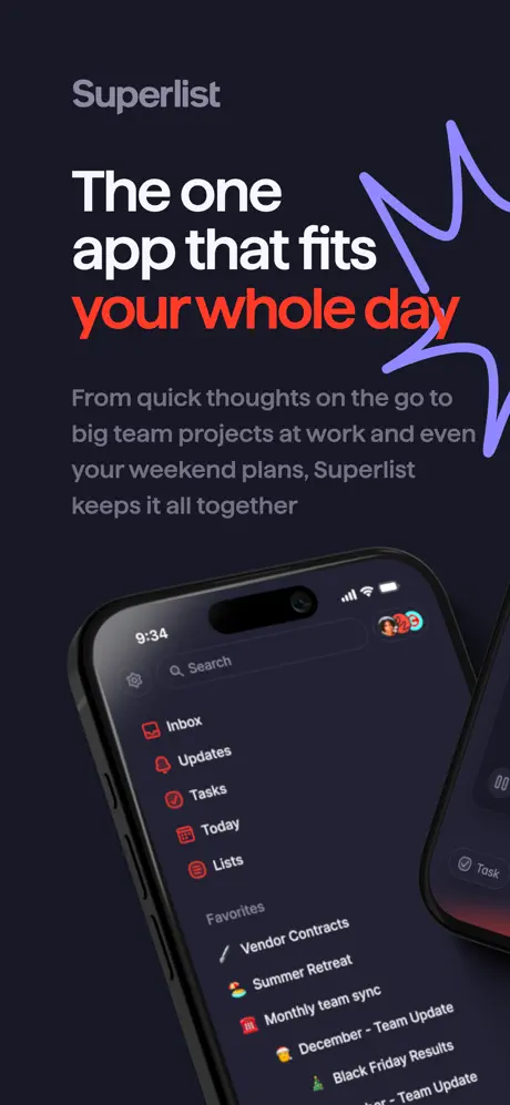
On-frame caption: “The one app that fits your whole day

Frame 1 opens with the wordmark ‘Superlist’ in a desaturated grey (#8E8E93) at the top-left margin. Below it, the headline is split: ‘The one app that fits’ is rendered in pure white, while ‘your whole day’ shifts to a warm red-orange (#FF4D2E) that matches the app’s internal iconography. The body copy underneath sits at approximately 21–24 pt in a lighter grey: ‘From quick thoughts on the go to big team projects at work and even your weekend plans, Superlist keeps it all together’. The text occupies the upper 40 % of the canvas, leaving the lower 60 % for the device. An iPhone 15 Pro enters from the bottom-right at roughly a 20-degree counter-clockwise tilt. The Dynamic Island is visible, and the status bar reads 9:34. On the screen, the app’s sidebar is visible: a search field, followed by Inbox, Updates, Tasks, Today and Lists, each with a small red icon. Below the collapsible ‘Favorites’ header sit workspace names—Vendor Contracts, Summer Retreat, Monthly team sync, December - Team Update, Black Friday Results—previews of which reappear in Frame 4 to prove continuity. A purple squiggle (#A78BFA) loops behind the headline and across the right edge of the canvas. The most structurally notable detail is the hard-cropped second device visible on the extreme right edge, its screen barely showing a ‘Task’ label. In thumbnail view, this reads as an export error rather than intentional layering, because less than 40 px of that second phone is visible. The overall balance is diagonal: text top-left, phone bottom-right, dead center empty. That emptiness is bold, but it requires the shopper to make a cross-canvas eye movement that many will skip.
Superlist App Store screenshot 2 — The Atmospheric Cut
02

The Atmospheric Cut

On-frame caption: “No caption text visible.

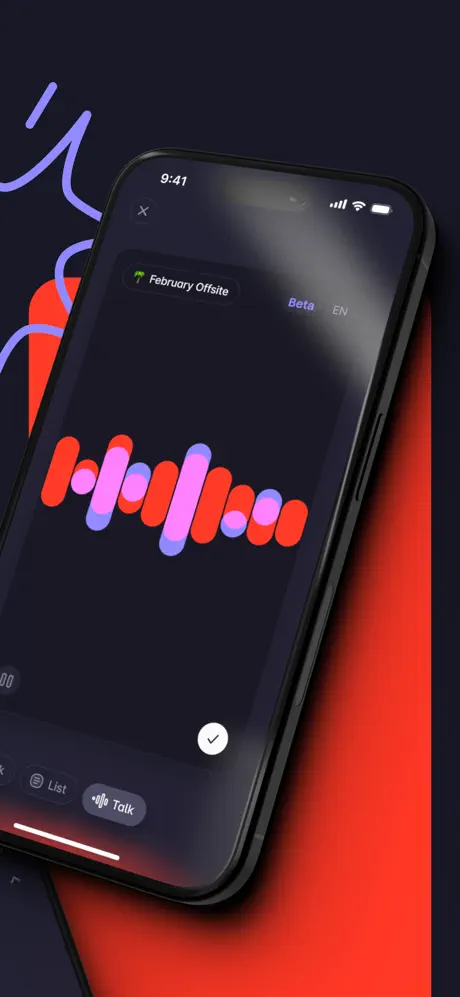
Frame 2 abandons typography entirely. The canvas is split diagonally between the same dark navy ground on the left and a saturated red field (#FF3B30) on the right. A purple squiggle enters from the top-left and is cropped hard by the frame edge. The iPhone dominates the center, angled similarly to Frame 1 but rotated clockwise by a few degrees. The status bar reads 9:41. The screen shows a voice-capture interface: a pill-shaped button at the top reads ‘February Offsite’ with a palm-tree icon, flanked by ‘Beta’ and ‘EN’ labels. The central visual is a waveform built from rounded rectangular bars in alternating red and purple (#D4A5FF). At the bottom of the screen, a white checkmark button floats above a grey ‘Talk’ pill. This frame functions as a mood board moment: it proves the product has kinetic energy and microphone access, but without a caption it does not explain *why* the waveform matters. In the swipe sequence, it relies on the context of Frame 4 to become meaningful. The reflection on the phone’s glass is strong enough to obscure some waveform detail, which is either a rendering choice meant to sell premium materiality or a readability loss, depending on your sympathy.

Superlist App Store screenshot 3 — Content Proof
03

Content Proof

On-frame caption: “Tasks and notes together. Turn your thoughts into actions.

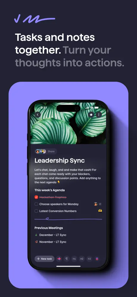
The composition shifts to the ‘card’ template. The device is centered vertically inside a large rounded rectangle filled with lavender (#9B87E0). Above the card, a small purple scribble acts as a fleuron. The headline is split: ‘Tasks and notes together.’ in white, followed by ‘Turn your thoughts into actions.’ in #8E8E93. The device itself is now straight-on, signaling that the shopper should read the pixels rather than feel the vibe. The screen displays a hybrid note-and-task document titled ‘Leadership Sync’. A hero image of green Calathea leaves occupies the top third, bleeding edge-to-edge within the app’s viewport. Below that, body copy reads: ‘Let’s chat, laugh, and make that cash! For each chat come ready with your blockers, questions, and discussion points. Add anything to the next agenda’. Further down, a task list labeled ‘This week’s Agenda’ shows a completed, strikethrough item ‘Hackathon Trophies’ in red, plus open checkboxes for ‘Choose speakers for Monday’ and ‘Latest Conversion Numbers’, the latter two with tiny avatar chips flush right. A section titled ‘Previous Meetings’ lists ‘December - LT Sync’ and ‘November - LT Sync’ with tree and explosion icons. The bottom toolbar exposes formatting controls: ‘+ New task’, paragraph, H1, H2, H3 and a palette icon. The lavender card casts a diffuse shadow against the navy background, lifting the composition into a shallow depth that works well at thumbnail scale. This frame does the heaviest functional lifting: it demonstrates that the app unifies long-form notes and structured tasks inside a single dark container.

Superlist App Store screenshot 4 — Voice AI, Contextualized
04

Voice AI, Contextualized

On-frame caption: “Talk tasks with AI. Use your voice to create lists and tasks.

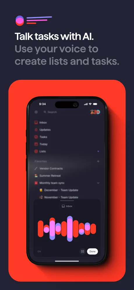
Frame 4 returns to the rounded-rect card system, but the fill is now red (#FF3B30), matching the red accent in Frame 1’s headline and Frame 2’s background. A circular gradient icon—pink to purple with two horizontal lines—sits in the top-left margin above the headline. The headline reads: ‘Talk tasks with AI.’ in white, followed by ‘Use your voice to create lists and tasks.’ in grey. The device shows the same sidebar navigation as Frame 1, establishing visual continuity: Inbox, Updates, Tasks, Today, Lists, and the identical Favorites list including Vendor Contracts, Summer Retreat, Monthly team sync and the Team Update entries. A bottom sheet is raised, containing a waveform in red and purple identical in DNA to Frame 2, but now contextualized: a small ‘Inbox’ label appears above the waveform, and controls below read ‘EN’, a ‘00’ timer, and a white ‘Done’ pill. By repeating the sidebar exactly, the designers perform a sleight-of-hand: the shopper recognizes the environment even though the foreground feature has changed. The red card is the brightest object in the entire gallery, making this frame impossible to miss. Its structural role is to translate Frame 2’s ambiguity into a labeled promise.

Superlist App Store screenshot 5 — The Keyword Waterfall
05

The Keyword Waterfall

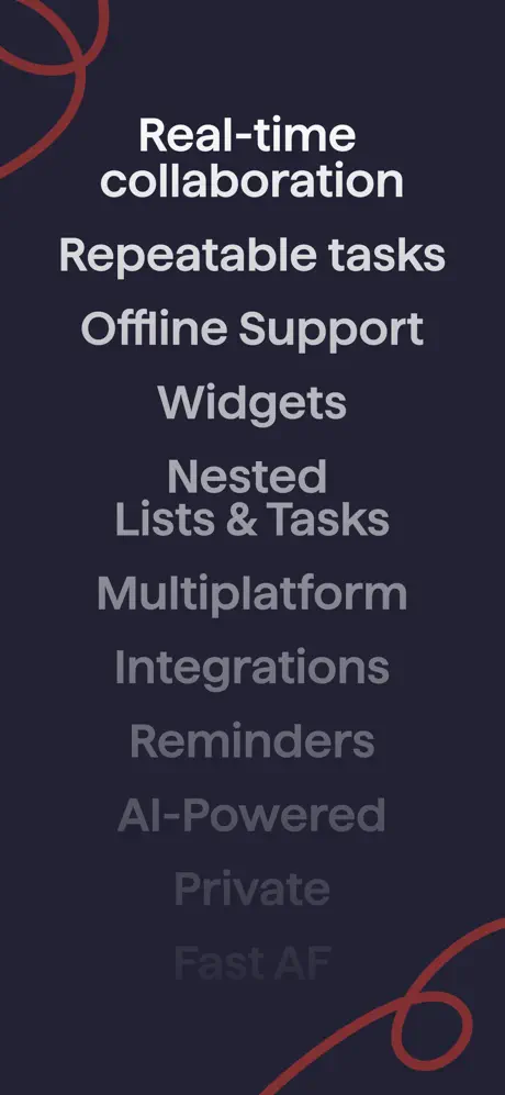
On-frame caption: “Real-time collaboration / Repeatable tasks / Offline Support / Widgets / Nested Lists & Tasks / Multiplatform / Integrations / Reminders / AI-Powered / Private / Fast AF

Frame 5 is the set’s hinge: no device, no UI, no hand-drawn squiggle beyond two thin red circular loops in the top-left and bottom-right corners. The background remains the same dark navy. A vertical stack of features is set in a bold sans-serif, left-aligned but optically centered. ‘Real-time collaboration’ appears largest and in pure white. Beneath it, the list continues: ‘Repeatable tasks’, ‘Offline Support’, ‘Widgets’, ‘Nested Lists & Tasks’, ‘Multiplatform’, ‘Integrations’, ‘Reminders’, ‘AI-Powered’, ‘Private’, and finally ‘Fast AF’. The typographic color cascades from white toward a dim #48484F, creating a depth-of-field fade toward the bottom. The effect is elegant at full resolution, but problematic in thumbnail view, where the lower six items disappear into the dark background. This frame breaks the ‘show, don’t tell’ rule of ASO design. Shoppers swiping at speed do not pause to read a manifesto; they scan for interface proof. By dedicating an entire frame to text, the sequence sacrifices visual momentum. Structurally, it acts as a SEO concession—those keywords matter for search indexing and for readers who consciously hunt for ‘Offline Support’ or ‘Widgets’—but as a piece of persuasive design it is the weakest link. The red scribbles are too delicate to compensate for the absence of a device.

Superlist App Store screenshot 6 — Natural Language Parsing
06

Natural Language Parsing

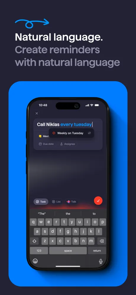
On-frame caption: “Natural language. Create reminders with natural language

Frame 6 introduces the third and final card color: a saturated blue (#0A84FF). A blue squiggle arrow sits above the headline in the top-left. The headline reads: ‘Natural language.’ in white, then ‘Create reminders with natural language’ in grey. Inside the blue card, the device displays an active input state. The text field contains: ‘Call Niklas every tuesday’ with ‘every tuesday’ highlighted in a brighter cyan-blue (#0A84FF). Below the cursor, parsed metadata chips appear: a yellow flag icon labeled ‘Meet’ and a red recurring icon labeled ‘Weekly on Tuesday’. Ghost rows for ‘Due date’ and ‘Assignee’ sit beneath. The native iOS keyboard occupies the bottom half of the device screen, rendered in dark mode with grey keys. Above the keyboard, the app’s input bar shows three mode pills—‘Task’ (active, circled), ‘List’, and ‘Talk’ (with waveform icon)—plus a red circular send button (#FF3B30) with a white checkmark. This is the most information-dense frame in the set. Including the system keyboard is a double-edged choice: it proves a native typing experience, but it also fills half the frame with Apple-owned chrome that does not communicate Superlist-specific value. The blue card is visually arresting because it is the only use of this hue, but that uniqueness also makes the frame feel slightly disconnected from the red-lavender dyad that dominates the rest of the gallery.

Superlist App Store screenshot 7 — Team Scale
07

Team Scale

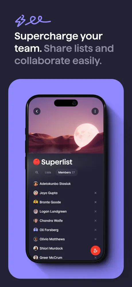
On-frame caption: “Supercharge your team. Share lists and collaborate easily.

Frame 7 returns to the lavender card (#9B87E0), explicitly pairing with Frame 3 and telling the shopper that lavender means ‘people and content’. The purple scribble reappears top-left. The headline: ‘Supercharge your team.’ in white, ‘Share lists and collaborate easily.’ in grey. The device screen shows a member directory. A header image of a moon rising over red desert mountains fills the top quarter. Below, a red circular icon with a white dot sits next to the word ‘Superlist’. A segmented control shows ‘Lists’ and ‘Members 27’, the numeral providing a concrete scale cue. The member roll includes: Adetokunbo Stasiuk, Joya Gupta, Bronte Goode, Logan Lundgreen, Chandra Wolfe, Oli Forsberg, Olivia Matthews, Shiori Murdock, and Greer McCrum. Each row carries a unique avatar and a small grey ‘x’ remove button flush right. A red floating-action button with a person-plus icon anchors the bottom-right corner of the screen. The straight-on framing invites the viewer to inspect the list density. However, because Frame 3 used an equally lush header image inside an identically shaped lavender card, the two frames risk merging in memory unless the shopper consciously reads the captions. The fix would have been to shift the team frame to a slightly different hue or to introduce a second device to vary the composition.

Superlist App Store screenshot 8 — The Integration Climax
08

The Integration Climax

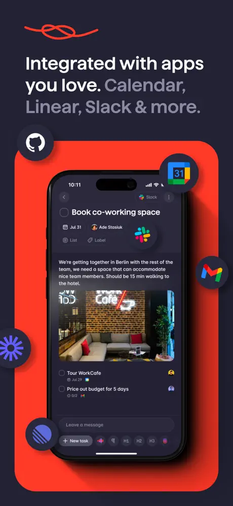
On-frame caption: “Integrated with apps you love. Calendar, Linear, Slack & more.

Frame 8 closes the sequence inside the red card (#FF3B30), bookending the gallery with the same color that opened it in Frame 1’s headline and Frame 2’s background. A red squiggle sits above the headline. The text: ‘Integrated with apps you love.’ in white, followed by ‘Calendar, Linear, Slack & more.’ in grey. The device shows a task detail view: ‘Book co-working space’. Metadata chips read ‘Jul 31’, assignee ‘Ade Stasiuk’, ‘List’, ‘Label’, and a Slack icon. Paragraph text describes a Berlin workcation, followed by an inline photograph of a brick cafe interior with a neon sign. Subtasks include ‘Tour WorkCafe’ with a calendar icon and ‘Price out budget for 5 days’. The bottom input bar shows ‘Leave a message’ plus the standard formatting toolbar. Around the exterior of the red card, five integration icons float like satellites: GitHub (top left), Google Calendar (top right), Gmail (middle right), a purple asterisk (bottom left), and a blue striped circle (bottom left, overlapping the card edge). Each icon carries a soft drop shadow. The composition is the busiest in the set. In full view, the icons read as ecosystem proof; in thumbnail view, they blur into scattered noise around the device silhouette. The red glow behind the phone is consistent with Frame 4, ending the sequence on a brand-color high note and giving the final swipe a sense of arrival.

05The craft

Captions, colour and the mechanics of the sell

Caption pattern

Single-line brand claim in #FFFFFF, followed by a longer functional descriptor in #8E8E93. The period separating the two sentences acts as a hard stop for scanning eyes. This pattern repeats unchanged in Frames 1, 3, 4, 6, 7 and 8. Frame 2 drops the caption entirely; Frame 5 drops the device. The result is a metronomic rhythm that becomes predictable by Frame 4.

Visual system

The art direction relies on a theater-in-the-round logic: the device is always the actor, the colored card is the spotlight, and the navy background is the curtain. Shadows are soft and diffuse, lifting cards by roughly 8–12 pt rather than cutting them out with hard edges. The internal app UI consistently shows the Dynamic Island, 9:34/9:41/10:11/10:48 status-bar times, and the native iOS keyboard in Frame 6, all of which quietly signal ‘native iOS app’ to a technical audience. The app’s own dark theme (graphite sidebar, red iconography, white text) is preserved across every screen, ensuring that the product does not look like a light-mode app forced into a dark marketing layout.

The thumbnail test

At small scale, Frame 1’s headline remains readable because the white and red text is massive and high-contrast. Frame 2, however, collapses into an abstract red-black blob because it carries no caption. Frame 5’s text list degrades into a grey smear at the bottom. Frames 3, 7 and 8 survive best because the light-colored card backgrounds (lavender and red) generate a bright border around the dark device, creating a thumbnail-sized halo that catches the eye against the surrounding store page chrome.

Conversion mechanics

The gallery converts through recognition. A shopper who sees red, lavender and scribbles in Frames 1–2 will still recognize them in Frames 7–8. The repeated sidebar navigation in Frames 1 and 4 performs the crucial ASO task of making the app feel knowable. However, Frame 5’s text-only approach and Frame 2’s captionless abstraction create two moments where the shopper has nothing to buy. The kitchen-sink approach of Frame 8—app icons, subtasks, inline images, metadata chips—risks cognitive overload at precisely the moment the shopper is deciding whether to scroll back or tap ‘Get’.

06Where it slips

What we would change

The orphaned blue card breaks chromatic harmony

Frame 6 is the only appearance of #0A84FF in the entire eight-frame set. Red recurs in Frames 1, 2, 4 and 8; lavender in Frames 3 and 7. Blue arrives once and then disappears, which makes the natural-language frame feel like a guest star rather than a member of the ensemble. Fix: Either shift Frame 6 to the established lavender family and use blue only as a scribble accent, or introduce a second blue-frame later in the sequence to justify the color’s presence in the palette.

Frame 1’s second-device crop looks like an export fault

On the extreme right edge of Frame 1, roughly 30–40 pixels of a second iPhone are visible, showing only a ‘Task’ label and a sliver of screen. Because the overlap is so slight, it does not read as intentional depth; it reads as a forgotten layer. Fix: Crop the canvas clean at the right edge, or bring the second device at least 20 % into frame so its presence is unmistakably deliberate.

The caption lockup is relentlessly identical

Six frames use the exact same two-line hierarchy: white claim, grey explanation. By Frame 4, the rhythm is machine-precise and therefore fatiguing. Fix: Vary the typographic lockup in at least one frame. For example, let Frame 7 use a single bold line with no grey subhead, or set a quote from a team member inside the lavender card to break the cadence.

Frame 5 halts visual momentum without enough typographic payoff

A text-only feature list is a defensible ASO choice for indexing keywords, but the fading opacity treatment renders the bottom half illegible at thumbnail scale. Fix: Replace the frame with a device showing an offline state or a home-screen widget, or at minimum render every line at 100 % opacity so each keyword competes equally.

Frame 8’s integration icons flatten the composition

The five floating app icons (GitHub, Calendar, Gmail, etc.) sit very close to the device bezel and overlap the red card edge without enough shadow separation. At small scale, they merge into visual confetti. Fix: Shrink the icons by 15–20 %, increase their shadow blur radius, and pull them farther from the device silhouette so they read as satellites rather than stickers.

07The recipe

How to apply this to your own app

  1. Ground the gallery in one dark neutral

    Superlist’s #1C1C2E canvas acts like a theater curtain. Whatever you place in front of it—red, lavender, or blue—reads as intentional spotlighting. Choose one ground color and do not deviate.

  2. Pair your accent colors to features

    Red equals voice and action. Lavender equals content and teams. If you map color to meaning, repeat the mapping at least twice so shoppers learn your vocabulary.

  3. Use hand-drawn marks as signature

    The SVG squiggles are low-execution, high-personality. One organic shape, repeated in the accent color of its paired frame, is enough to make a gallery feel authored rather than templated.

  4. Never hide your navigation in only one frame

    Superlist shows its sidebar in Frames 1 and 4. Repeating a core navigation pattern creates the subliminal impression that the app is easy to learn because the viewer has already seen it twice.

  5. Treat the thumbnail as the real canvas

    Frames 3, 7 and 8 read best as thumbnails because the light-colored cards create a bright border around the dark phone. If your UI is dark-on-dark, you must compensate with a luminous container or your screenshot collapses into a black square on the store page.

08Takeaways

Five things worth stealing

  • Strict color repetition builds brand recognition faster than a rainbow of feature highlights.
  • Two compositional templates—angled cinematic and straight-on card—are enough to carry eight frames without monotony.
  • A text-only frame is a liability unless every word is rendered at full contrast.
  • Hand-drawn scribbles are a cheat code for personality against geometric UI.
  • The final frame should echo the first frame’s palette so the sequence feels circular rather than abandoned.
09The verdict

What the set actually achieves

A gallery that reads as unmistakably branded from fifty pixels away. The red, lavender and blue card system creates immediate color memory. However, the set sacrifices narrative momentum in its fifth frame with a text-only feature cascade, and the blue card in Frame 6 is chromatically orphaned, breaking the pattern of paired color usage established by the red and lavender frames.

Designers building dark-mode productivity, utility, or dev-tool apps who need their gallery to feel like a single branded environment rather than a disconnected feature dump. It rewards teams with the time to build custom device renders and a locked-down style guide.

10Questions

Frequently asked

Why does Frame 2 have no caption?

It is an atmospheric cutaway, functioning like a trailer shot. It relies on Frame 4 to supply the caption context. That is a risky narrative bet in ASO, where every frame is often consumed in isolation.

What font is used in the captions?

The screenshots do not reveal the typeface name, but the rendering is a geometric neo-grotesque with a large x-height, tight tracking, and a single weight. It behaves like Inter or SF Pro Display.

How does the set handle the dark UI on dark background legibility problem?

By wrapping the straight-on devices in high-chroma cards (red, lavender, blue). The card acts as a luminous mat, preventing the dark phone from bleeding into the dark background.

Is the waveform in Frame 2 and Frame 4 identical?

Not pixel-identical, but constructed from the same design system: rounded pill bars in alternating red and purple. This repetition trains the eye to associate that specific color pairing with voice input.

11Keep reading

Build your own screenshot set

The full set

8 shots
Superlist App Store screenshot 1Superlist App Store screenshot 2Superlist App Store screenshot 3Superlist App Store screenshot 4Superlist App Store screenshot 5Superlist App Store screenshot 6Superlist App Store screenshot 7Superlist App Store screenshot 8

About the app

From the team that created Wunderlist: Superlist is the modern to-do list and notes app that keeps your work and life beautifully organized. Create tasks with AI voice input, Superlist Software GmbH, via the App Store listing.

Screenshots and store metadata belong to Superlist Software GmbH. They are shown here for design commentary and criticism. The analysis on this page is original work by floow.design. View the original listing.

More Productivity teardowns

Browse all →