Supernotes app icon
ProductivityScreenshot teardown15 min read

Supernotes App Store screenshots

This case study unpacks how a notes app uses violent color shifts, floating sticker badges, and maximalist editorial framing to sell seven distinct features in a single App Store swipe session.

Set published by Supernotes · 7 frames analysed

4.8 · 112 ratingsFreev3.2.4Updated 4mo ago
Supernotes App Store screenshot 1
01At a glance

The set in one screen

Framing
Mix of center-weighted single-device portraits and one triptych hero; hardware bezels are always present, always iPhone 14/15 Pro with Dynamic Island.
Captions
Category label in wide-tracked small caps + uppercase at top; massive two-to-three-line headline in heavy rounded sans-serif; occasional inline graphic badges that replace words.
Backdrop
Aggressive per-frame color blocking: hot pink, pink-to-blue gradient, sky blue, safety orange, custard yellow, electric purple, warm off-white.
Type
Single rounded sans family (likely a geometric neo-grotesque); extreme weight contrast between 14pt small-caps labels and 80–100pt bold headlines; white glow/shadow on emphasized words.
UI / copy split
Roughly 55% device UI and 45% marketing typography/graphics. The UI is never left to speak for itself—every screen is annotated, stickered, or underlined.
Frame 1 job
Frame 1 must answer 'What is this?' and 'Why should I care?' in under two seconds. The designers choose density over simplicity, stitching three modalities into one billboard.

Sampled palette

#FF5C9A#FF5C9A
#F2A0C8#F2A0C8
#6BB5FF#6BB5FF
#5CADFF#5CADFF
#FF6B35#FF6B35
to #F9E79F#FFF8DC
02The challenge

What this screenshot set had to solve

The core challenge is categorical confusion. Supernotes does not fit the standard 'notes' mental model; it is also a flashcard deck, a map journal, a collaborative wiki, and an AI writing companion. In the App Store, a shopper swipes through five to seven screenshots in less than thirty seconds total. If Frame 1 tries to be everything, it risks being nothing. If subsequent frames each introduce a new color, a new layout, and a new metaphor, the set risks feeling like seven different apps. The design team had to build a visual system elastic enough to contain flashcards, maps, and comment threads without breaking coherence, while still telegraphing enough novelty to interrupt the scroll.

The designers layered explanatory stickers directly onto the screenshots, preserving interface fidelity while forcing the marketing message into the foreground.
03The approach

How the set argues its case

The strategy is 'isolation through saturation.' Rather than threading features together with a single neutral background, each frame owns one color. Continuity is handled at the typographic level: the same heavy rounded sans-serif appears in every headline, the same small-caps category label appears at the top, and the same 'soft 3D' graphic language—puffy stickers, oversized pins, marker underlines—reappears throughout. The sequence is also carefully ordered: brand promise (hero), AI augmentation (proofreading), structured data (table), spatial memory (map), learning (flashcards), social proof (collaboration), and ecosystem lock-in (cross-platform). It mirrors the classic AIDA funnel: attention, interest, desire, action.

The set positions the product as a creative tool first and a productivity tool second. The demo content—Star Wars checklists, etymology deep-dives, obscure vocabulary lists—filters for curious, culturally literate users and implicitly warns corporate buyers that this is not another beige Notion clone.

04Frame by frame

Every screenshot, and the job it does

Supernotes App Store screenshot 1 — The Triptych Hero
01

The Triptych Hero

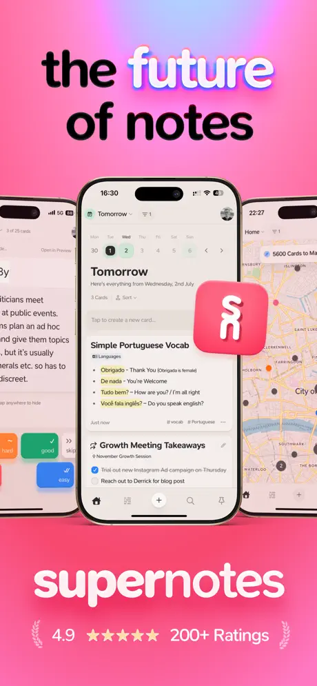
On-frame caption: “The future of notes

The background is a saturated hot pink gradient, roughly #FF5C9A at the top rolling into a deeper magenta at the bottom. The headline 'the future of notes' occupies the upper third. 'the' and 'of notes' are set in near-black (#0A0A0A), while 'future' is rendered in white (#FFFFFF) with a glowing chromatic-offset shadow—likely cyan and magenta drop shadows that give it a neon-sign vibrancy. Below the headline, three iPhones are staged in a triptych: the center device is fully visible, while the left and right devices are cropped at the vertical thirds, acting as paratextual accents rather than readable screens. The center phone shows the app's home view under the header 'Tomorrow,' with a calendar strip (Mon–Sun) highlighting Wednesday the 1st. A subhead reads 'Here's everything from Wednesday, 2nd July,' followed by a card list. The first card, 'Simple Portuguese Vocab,' carries a 'Languages' tag and bullet points: 'Obrigado - Thank You (Obrigada is female),' 'De nada - You're Welcome,' 'Tudo bem? - How are you? / I'm all right,' and 'Você fala inglês? - Do you speak english?' The second card, 'Growth Meeting Takeaways,' has checkboxes for 'Trial out new Instagram Ad campaign on Thursday' and 'Reach out to Derrick for blog post.' A floating app icon—a rounded square in the same hot pink with a white abstract 'S' mark—hovers in the foreground, partially obscuring the right edge of the center phone. At the very bottom, the wordmark 'supernotes' appears in a bold, rounded sans-serif in white, followed by a social-proof lockup: '4.9 ★★★★★ 200+ Ratings' flanked by small laurel wreaths. The side devices show partially visible interfaces: the left phone reveals a flashcard review with orange 'hard' and green 'good' buttons, while the right phone displays a map view with '5600 Cards to Map.' The density is intentional but borderline chaotic; the frame tries to communicate three modalities at once before the user has committed to a single swipe.
Supernotes App Store screenshot 2 — AI Proofreading
02

AI Proofreading

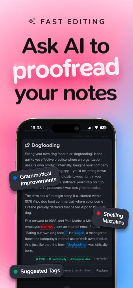
On-frame caption: “Ask AI to proofread your notes

The background shifts to a smooth gradient from bubblegum pink (#F2A0C8) at the top to sky blue (#6BB5FF) at the bottom. A small sparkle glyph introduces the category 'FAST EDITING' in wide-tracked small caps. The headline reads 'Ask AI to proofread your notes,' with 'proofread' emphasized in white with the same glow treatment seen in Frame 1, while the surrounding words remain in near-black. A single iPhone is centered, displaying the app in dark mode—a smart choice because the dark interface (#1A1A1A cards on #0F0F0F background) pops against the pastel backdrop. The note title is 'Dogfooding,' followed by body text explaining the concept. The designers have added three floating annotation badges that look like peeled stickers: a navy pill labeled 'Grammatical Improvements' with a blue dot; a dark pill labeled 'Spelling Mistakes' with a red dot; and a charcoal pill labeled 'Suggested Tags' with a green dot. These badges point to corresponding UI elements: the red dot badge hovers near the misspelled word 'shehwv' (underlined in red), while the green dot badge points toward the hashtag row at the bottom of the note: '#1976 #productivity #business idea # definition.' A bottom sheet peeks up offering 'Ignore' and 'Replace' actions. The time on the status bar reads 19:33, and the battery shows 73%. The composition is effective but slightly overcrowded; the bottom-right 'Spelling Mistakes' badge obscures part of the paragraph it is meant to highlight.

Supernotes App Store screenshot 3 — Table Layout
03

Table Layout

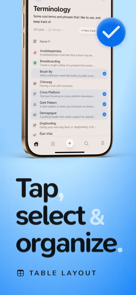
On-frame caption: “Tap, select & organize.

Here the background is a uniform, airy blue—approximately #5CADFF—occupying the full canvas. The category label 'TABLE LAYOUT' sits at the bottom, preceded by a small grid icon. The headline 'Tap, select & organize.' is positioned in the lower half, with 'Tap,' and 'organize.' in black and 'select &' in white, creating a rhythmic contrast that echoes Frame 1's mixed-color typography. The device is cropped tightly at the top; we see no status bar, only the note header 'Terminology' and the description 'Some cool terms and phrases that I like to use, and keep track of.' Below that, a metadata line reads '28 Cards' and 'Recent,' plus a '+ New Card' button. The list itself is the focus: rows for 'Anatidaephobia,' 'Breadboarding,' 'Brush By,' 'Chinwag,' 'Cross Platform,' 'Dark Pattern,' 'Demagogue,' 'Dogfooding,' and 'Élan Vital.' Each row has a left-hand icon and a short description snippet. Four rows carry blue checkmarks on the right edge, implying a multi-select state. A large, floating blue circle with a white checkmark hovers in the upper right, outside the device bounds, reinforcing the selection metaphor. The phone's tab bar is visible at the very bottom, grounding the image in actual UI. The overall restraint—one phone, one list, one concept—makes this the most immediately scannable frame of the set.

Supernotes App Store screenshot 4 — Map Layout
04

Map Layout

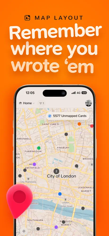
On-frame caption: “Remember where you wrote 'em

The palette swings hard to a saturated orange, roughly #FF6B35, filling the entire background. The category 'MAP LAYOUT' is anchored at the top with a map-pin icon. The headline 'Remember where you wrote 'em' is set in a bold, rounded white face, occupying the upper third and casting a faint drop shadow to stay legible against the warm ground. A single iPhone shows a map centered on the City of London, with street labels like 'Finsbury,' 'Smithfield,' and 'Southwark' visible. Colored pins—red, green, purple, blue, black—dot the map. A banner overlay reads '5577 Unmapped Cards' with a sparkle icon. A numbered cluster bubble shows '2' near the City of London label. In the bottom left corner, a decorative oversized pin in the app's signature hot pink (#F85A9C) floats off-device, acting as a branding anchor. The status bar shows 12:05, 4G, and a full 100% battery. The decision to use a real city map rather than an abstract diagram adds credibility, though the 'Unmapped Cards' count—5577—raises more questions than it answers at a glance.

Supernotes App Store screenshot 5 — Flashcards
05

Flashcards

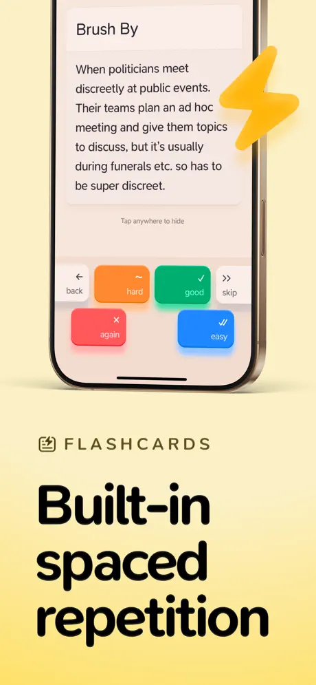
On-frame caption: “Built-in spaced repetition

The background moves to a soft custard gradient, from pale cream (#FFF8DC) at the top to a deeper butter yellow (#F9E79F) at the bottom. The category label 'FLASHCARDS' appears at the bottom left with a small card-stack icon. The headline 'Built-in spaced repetition' sits in heavy black type below the device. The phone displays a flashcard review session for the term 'Brush By.' The card body reads: 'When politicians meet discreetly at public events. Their teams plan an ad hoc meeting and give them topics to discuss, but it's usually during funerals etc. so has to be super discreet.' Below that, microcopy says 'Tap anywhere to hide.' The bottom half of the screen shows a four-button grid: 'back' (light gray), 'hard' (orange, approx #FF9F43), 'good' (green, approx #34C759), 'skip' (light gray), 'again' (red, approx #FF3B30), and 'easy' (blue, approx #007AFF). A yellow lightning-bolt graphic floats at the upper right, partially overlapping the device bezel. The tab bar is visible at the bottom. This frame succeeds because the value proposition—spaced repetition—is communicated both by the headline and by the literal Anki-style button matrix inside the UI.

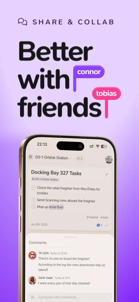
Supernotes App Store screenshot 6 — Share & Collab
06

Share & Collab

On-frame caption: “Better with friends

The background is a violet gradient, shifting from lavender (#E0B0FF) at the top to a deeper purple (#9B59B6) at the bottom. The category label 'SHARE & COLLAB' sits at the top with a chat-bubble icon. The headline 'Better with friends' is set in black, but the composition disrupts the text line: two rounded name badges, 'connor' in purple and 'tobias' in pink, are inserted between the words 'with' and 'friends,' their stems dropping down like cursor markers. This is the set's most playful typographic moment. The phone shows a shared note titled 'Docking Bay 327 Tasks,' nested under 'DS-1 Orbital Station.' The checklist includes 'Check the rebel freighter from Mos Eisley for hostiles,' 'Send Scanning crew aboard the freighter,' and 'Mop up droid fluid.' Tags read '#imperial #todo,' and the date is 'Jun 8th 2023.' Below the note, a 'Comments' section shows two avatars: 'TK-3315' at 22:05 ('There's no one on board the freighter! According to the log the crew abandoned ship on takeoff') and 'Darth Vader' at 22:11 ('I want every part of that ship checked!'). A 'Compose new comment...' field sits at the bottom. The status bar shows 22:13 and 42% battery. The Star Wars demo data is a high-risk, high-reward choice—it demonstrates nested threading and real-time collaboration without looking like sterile corporate Lorem Ipsum, but it also caps the app's perceived seriousness.

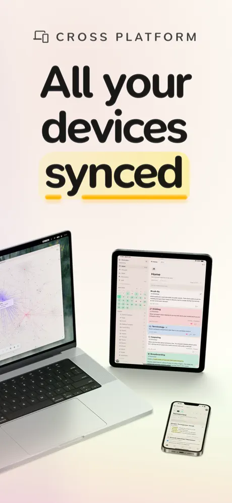
Supernotes App Store screenshot 7 — Cross Platform
07

Cross Platform

On-frame caption: “All your devices synced

The final frame neutralizes the palette to a warm off-white (#FFF8F2) with a subtle pink-peach gradient at the top edge. The category label 'CROSS PLATFORM' appears at the top with a dual-screen icon. The headline reads 'All your devices synced,' with the word 'synced' highlighted by a thick yellow marker underline (#FFD43B) that looks like a highlighter stroke. Instead of a phone, the frame presents a three-device ecosystem: a MacBook Pro on the left, an iPad in the center, and an iPhone on the right. The MacBook screen shows a node-graph visualization—colored dots connected by faint lines—while the iPad shows a split-pane note view with colored cards in the sidebar and content on the right. The iPhone displays a list view similar to Frame 1. The hardware is rendered with soft drop shadows on a clean surface, borrowing language from Apple's own marketing photography. There is no hot pink, no floating stickers, no 3D badges; the frame relies entirely on hardware lust and the yellow underline to carry interest. It functions as a trust signal rather than a feature pitch.

05The craft

Captions, colour and the mechanics of the sell

Caption pattern

Category label at top, large headline in the upper third, device centered, secondary text or brand mark at bottom. Frame 1 is the only exception, placing the brand name and rating at the bottom edge in a dedicated lockup.

Visual system

The system relies on three repeating ingredients: (1) a full-bleed gradient or flat color field that changes per frame; (2) a centered iPhone with visible Dynamic Island and tab bar, cropped tightly enough to show content but loosely enough to feel like a physical object; and (3) an extruded graphic element that floats in front of the device—app icon, checkmark bubble, map pin, lightning bolt, or name badge. These floating elements cast soft drop shadows, giving the set a diorama-like depth that standard flat screenshots lack.

The thumbnail test

At thumbnail size, the hero frame reads as a pink rectangle with black text. The novelty is the white glowing 'future' word, but the side phones collapse into indistinct gray slabs. Frame 4's orange ground and white headline remains the most legible at 120px width. Frame 7's off-white ecosystem shot nearly disappears against the App Store's own white background, failing the squint test.

Conversion mechanics

The headline hierarchy is excellent for conversion: Frame 1 promises the future, Frame 2 removes effort (AI), Frame 3 adds control (organize), Frame 4 adds memory (location), Frame 5 adds learning, Frame 6 adds people, Frame 7 removes friction (sync). Each headline is a verb-forward value proposition, not a feature name. However, the social proof in Frame 1 ('200+ Ratings') is relatively weak for a 4.9-star app; most top-tier competitors flaunt '50k+' or '100k+' ratings. The small number is honest but may trigger skepticism about scale.

06Where it slips

What we would change

Frame 1 is catastrophically dense

By showing three devices simultaneously—list, flashcard, and map—the hero image asks the eye to parse three contexts before the user has even read the headline. The side phones are cropped so aggressively that their screens become colorful noise rather than supplementary proof. At thumbnail size, the center phone's actual UI is illegible beneath the floating app icon and wordmark. The fix is radical simplification: isolate the center phone, remove the side devices entirely, and let the 'Tomorrow' card stack breathe. If cross-modal variety is essential, ghost the side phones at 15% opacity behind the hero device so they read as texture, not content.

Floating badges in Frame 2 obscure the evidence

The 'Spelling Mistakes' badge sits directly atop the paragraph discussing Paul Maritz, covering the red underline beneath 'shehwv' that is supposed to prove the feature. The badge contradicts its own purpose by hiding the mistake it calls out. The fix is simple: offset the badge to the right, using a thin connector line or leader, so the underlined text remains fully visible. Alternatively, shrink the badge to a pill that sits in the margin, preserving the sticker aesthetic without occluding the UI.

The color whiplash weakens brand retention

Moving from hot pink to orange to yellow to purple in six swipes trains the user to expect novelty, but it also prevents any single color from owning the brand. By Frame 7, the warm off-white background feels like a different product entirely. The app icon pink only appears as a background in Frame 1 and a decorative map pin in Frame 4; there is no persistent brand anchor. The fix is to introduce a recurring chromatic constant—perhaps a 4px hot pink baseline bar or a small app icon watermark in the top-left corner of every frame—that survives the background shifts and confirms the viewer is still inside the same product funnel.

Frame 7 fails the continuity test

The ecosystem shot shows three devices displaying three different pieces of content. The MacBook displays a node-graph visualization never seen elsewhere in the set, while the iPad shows notes and the iPhone shows a list. A shopper swiping rapidly will not infer 'sync' from mismatched screens; they may instead assume each device runs a different app. The fix is to show the exact same note—'Dogfooding' or 'Brush By'—across all three devices, so continuity is proven visually rather than verbally. The headline can do less work if the imagery does more.

Demo data polarizes the audience

'Darth Vader' comments and 'Mop up droid fluid' tasks are memorable but signal that the app is built for fandom rather than work. Enterprise shoppers, students in formal programs, or users over thirty-five may read the Star Wars references and question whether the tool is frivolous. The fix is not to sterilize the content, but to universalize it: use a vivid but neutral scenario like planning a documentary shoot or organizing a volunteer kitchen. The prose can remain witty without requiring franchise literacy.

07The recipe

How to apply this to your own app

  1. Use dark-mode UI captures against light pastel backgrounds for automatic contrast, as seen in Frame 2.

    If your app supports dark mode, place a dark screenshot on a soft gradient. The bezel disappears and the interface glows. Just ensure your floating annotations do not cover the very pixels you are trying to show.

  2. Color-code by feature, not by brand, if your feature set is broader than your brand recognition.

    Supernotes can afford candy colors because no one color owns the category. If you are entering a saturated market, each frame's background hue can act as a wayfinding signal for the feature inside—orange for maps, blue for tables—so users remember the feature, not just the logo.

  3. Treat your headline as a sentence, not a label.

    Every Supernotes headline is a verb-forward clause: 'Ask AI to proofread your notes,' 'Remember where you wrote 'em.' This is easier to scan than 'AI Proofreading' or 'Map View.' Write headlines that complete the sentence 'With this app, I can...'

  4. If you stage multiple devices, synchronize their content.

    Cross-platform frames only work when the content is identical across screens. Mismatched visuals read as different apps. Pick one rich note and propagate it across every device in the shot.

  5. Add one extruded 3D element per frame to create depth.

    The floating app icon, checkmark bubble, map pin, and lightning bolt all cast soft shadows that lift the composition off the canvas. In Figma or Blender, render a simple rounded rectangle or geometric shape in the frame's key color and let it overlap the phone bezel. The slight parallax makes the screenshot feel like a physical object rather than a flat export.

08Takeaways

Five things worth stealing

  • Maximalism can work if typography is consistent. The Supernotes set survives seven different background colors because the type family, weight, and rounding never change.
  • Every frame needs a single floating graphic that overlaps the device bezel. This creates a diorama effect and trains the eye to look at the UI, not just the frame.
  • Headlines should be readable at 120px width. That means six words or fewer, heavy weight, and high contrast against the background. Frames 3 and 4 pass this test; Frame 1 does not.
  • Demo content is a targeting mechanism. Star Wars jokes filter for creative users and repel corporate buyers. Choose your sample data with the same intent you choose your keywords.
  • Social proof should match scale. A 4.9-star rating with '200+ Ratings' may raise more doubts than it settles. If the volume is low, consider burying the rating count and letting the stars speak alone, or move social proof to the description rather than the hero frame.
09The verdict

What the set actually achieves

The set lands on a maximalist, editorial system: every frame gets its own candy-colored background, its own headline with mixed-color emphasis, and its own floating 3D badge or decorative flourish. The product reads as playful, fast, and multi-modal. Whether that maximalism converts casual browsers into installers depends on whether they find the energy infectious or exhausting.

Designers building screenshot sets for multi-modal productivity apps that need to communicate breadth without producing a bland grid of identical screens. Also useful for teams debating whether to use dark UI against light marketing backdrops.

10Questions

Frequently asked

Why does the hero frame use three devices?

It is an attempt to compress the entire feature set into the first impression. The center device shows notes, the left shows flashcards, and the right shows maps. However, at thumbnail size the side phones collapse into gray noise, reducing legibility. A single dominant device with ghosted sidekick screens at low opacity would achieve the same breadth without the clutter.

How does Frame 2 keep the dark mode UI legible against a pastel gradient?

The dark interface uses near-black card backgrounds (#0F0F0F to #1A1A1A) and light gray text, creating a value contrast of roughly 85% against the pink-to-blue background. The pastel gradient has no dark values near the center phone, so the bezel and screen form a dark island that the eye immediately finds.

What is the purpose of the floating 3D badges?

They function as inline annotations that let the designers keep the UI screenshot authentic while still adding marketing explanation. Instead of redesigning the interface to accommodate tutorial text, they layered sticker-like pills on top. The trade-off is occlusion, which Frame 2 suffers from more than others.

Why does the color palette change so aggressively between frames?

The designers treat each frame as a standalone magazine cover. The color shift signals a new feature chapter and prevents swipe fatigue. The risk is brand dissolution—by the final frame, the viewer may not associate the warm off-white with the hot pink hero. A recurring brand mark or accent color would bridge the gap.

11Keep reading

Build your own screenshot set

The full set

7 shots
Supernotes App Store screenshot 1Supernotes App Store screenshot 2Supernotes App Store screenshot 3Supernotes App Store screenshot 4Supernotes App Store screenshot 5Supernotes App Store screenshot 6Supernotes App Store screenshot 7

About the app

Free your thoughts with Supernotes, the fast, lightweight notes app. Write beautiful notecards that are perfect for personal, work, and educational use – all your ideas, meeting, Supernotes, via the App Store listing.

Screenshots and store metadata belong to Supernotes. They are shown here for design commentary and criticism. The analysis on this page is original work by floow.design. View the original listing.

More Productivity teardowns

Browse all →