TIDE app icon
Health & FitnessScreenshot teardown13 min read

TIDE App Store screenshots

When a wellness app offers sleep tracking, Apple Watch complications, Pomodoro timers, meditation libraries, soundscapes, and daily quotes, the App Store page faces an immediate taxonomy problem: every swipe competes for attention while risking category confusion. The shopper does not yet know whether TIDE is a sleep utility, a meditation companion, or a watch-face boutique, so the screenshots must telegraph six distinct product surfaces—some data-dense, some purely atmospheric—within a five-second skim. The challenge visible across this eight-frame set is not merely showing features, but sequencing them so that a fragmented identity reads as versatility rather than clutter.

Set published by The Procter & Gamble Company · 8 frames analysed

4.9 · 7.1K ratingsFreev1.37.0Updated 4mo ago
TIDE App Store screenshot 1
01At a glance

The set in one screen

Framing
Mixed—full device chassis on Frames 1, 2, and 4; screen-only or free-floating UI on Frames 5, 6, 7, and 8; scattered hardware on Frame 3.
Captions
Bold two-line headline, centered, with a sub-line of two laurel-wrapped badges directly beneath it on every frame.
Backdrop
Varies per frame: slate-to-pink gradient (Frame 1), deep cobalt (Frame 2), warm cream (Frame 3), pale peach (Frame 4), icy cyan (Frame 5), pale mint (Frame 6), warm blush (Frame 7), and sky-blue with abstract orb (Frame 8).
Type
Large geometric sans-serif for headlines; medium-weight system-style sans for UI labels and badges.
UI / copy split
UI-heavy in Frames 2, 4, and 8; photography-heavy in Frames 6 and 7; balanced in Frames 1, 3, and 5.
Frame 1 job
Establish cross-platform breadth and social proof before introducing any single feature.

Sampled palette

#B8C5D1#B8C5D1
#48689A#48689A
#F0EBE3#F0EBE3
#FDF6F0#FDF6F0
#E2F0F2#E2F0F2
#E4F0E6#E4F0E6
02The challenge

What this screenshot set had to solve

The core tension in this set is breadth versus cohesion. TIDE needs to signal that it is a sleep tracker, a focus timer, a meditation library, a quote journal, a soundscape player, and a watchOS utility—all without looking like six apps stitched together. In a category dominated by tightly branded palettes (the purples of Calm, the oranges of Headspace), the screenshots also need to own a recognizable color signature. Additionally, the product surfaces vary wildly in information density: Frame 2’s sleep hypnogram is essentially adashboard, while Frame 6’s soundscape grid is a content catalog. The challenge is to make both feel like they belong to the same download, and to do it before the user’s thumb swipes to the next app.

“Sleep, Focus Meditation & Relax”
03The approach

How the set argues its case

The designers elected for a frame-specific emotional register: cool, data-driven blues for sleep; dark, space-themed blacks for focus; airy pastels for meditation and soundscapes. A rigid headline-to-badge hierarchy sits above every composition, letting the laurel wreath motif act as the glue between otherwise divergent aesthetics. Hardware realism is deployed selectively: the iPhone appears when spatial context helps (cross-selling the Watch, showing the timer UI), then disappears when the content is the hero (quotes, soundscapes, widgets). This modular strategy bets on mood matching over brand lock-in.

Positioned as a premium, multi-modal wellness ecosystem rather than a single-use tool. The Apple Watch faces, iOS widgets, and Dolby Atmos badge all argue that this is an integrated platform, not a niche utility. The presence of an Apple logo glyph in Frame 3 and a forward-dated iOS 26 claim in Frame 8 further suggests the developer is leaning into platform-native credibility.

04Frame by frame

Every screenshot, and the job it does

TIDE App Store screenshot 1 — The Ecosystem Anchor
01

The Ecosystem Anchor

On-frame caption: “Sleep, Focus / Meditation & Relax

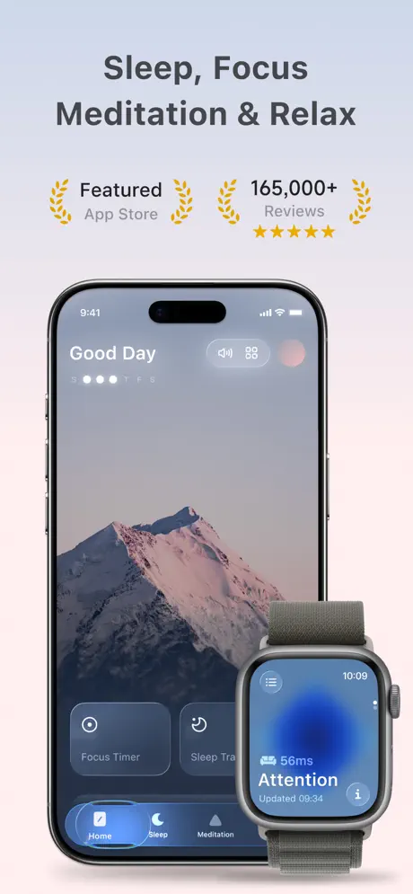
The opener centers a modern iPhone Pro with Dynamic Island, its display showing a misty mountain wallpaper overlaid with the greeting “Good Day” in a bold, tightly-tracked white sans-serif at roughly 34 pt. Beneath the greeting, a letter-spaced tracker shows the days of the week as a row of dots. The bottom tab bar—Home, Sleep, Meditation—uses a bright blue lozenge to highlight the active Home state. To the right, an Apple Watch with an olive fabric loop breaks the phone’s rectangle, displaying a blue radial face with “56ms Attention” and “Updated 09:34.” The background drifts from a cool slate grey-blue (#B8C5D1) at the top to a warm pale pink (#F0E0D8) at the bottom. Between headline and hardware, two laurel badges read “Featured App Store” and “165,000+ Reviews” above a row of five gold stars. The headline syntax omits a final conjunction, reading “Sleep, Focus Meditation & Relax,” which introduces a slight grammatical wobble before the user has even processed the UI.
TIDE App Store screenshot 2 — The Data Explosion
02

The Data Explosion

On-frame caption: “Track & Improve / Sleep Quality. zzz

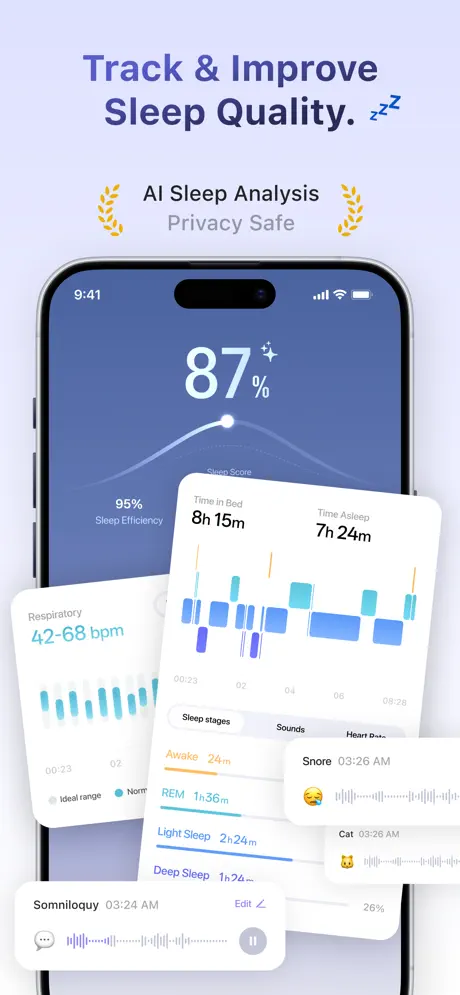
The palette shifts to a saturated midnight blue (#48689A). The phone chassis is still present but secondary, because white rounded cards explode forward in a Z-axis stack, casting soft diffuse shadows that break the bezel. Dominating the screen is an 87% Sleep Score set in a thin-weight sans-serif at roughly 80 pt, capped by a small sparkle glyph. A spline curve traces beneath the score. The forwardmost card shows “Time in Bed 8h 15m” and “Time Asleep 7h 24m,” backed by a hypnogram bar chart in cyan and indigo blocks plotted against a 00:23 to 08:28 axis. Below that, a tab bar reads “Sleep stages,” “Sounds,” and “Heart Rate,” while a list details “Awake 24m,” “REM 1h36m,” “Light Sleep 2h24m,” and “Deep Sleep 1h24m,” each with a color-matched underline in orange, teal, sky, and navy. Peripheral cards show “Respiratory 42-68 bpm” with a vertical bar chart, and a “Snore 03:26 AM” card with a waveform and sleeping emoji. By decoupling the analytics from the phone frame, the designers signal depth and credibility, though the density approaches the edge of legibility at thumbnail scale.

TIDE App Store screenshot 3 — The Watch Scatter
03

The Watch Scatter

On-frame caption: “Wellness Companion / on Your [Apple logo] WATCH.

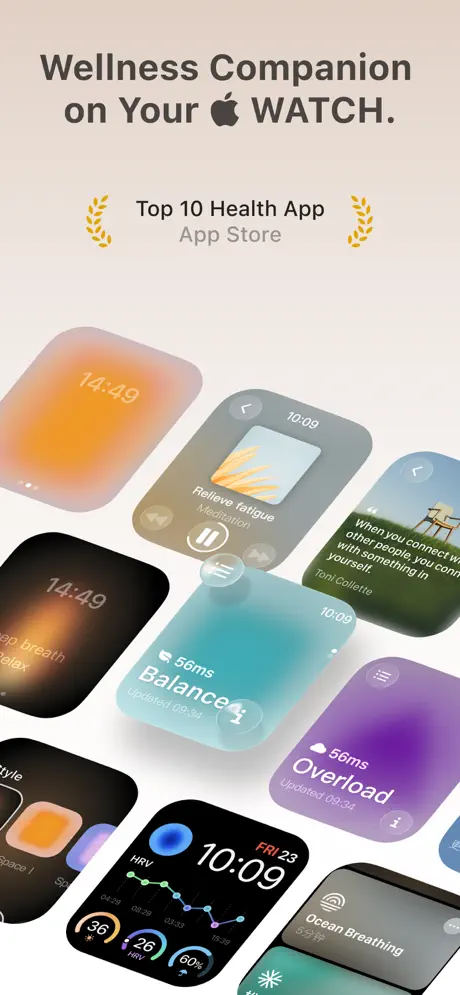
This frame abandons the iPhone entirely, scattering nine Apple Watch faces across a warm cream background (#F0EBE3) at rotations between roughly -15° and +15°. The headline inserts the actual Apple logotype, a typographic choice that signals first-party polish but risks guideline friction. The watches display surfaces ranging from “Reliev e fatigue Meditation” to an HRV dashboard, a teal “56ms Balance” face, a purple “56ms Overload” face, and an “Ocean Breathing 5分钟” surface with Chinese minute characters. Because no single watch is scaled as the hero, the eye pans across the mosaic without a clear hierarchy; the central teal and purple cards win attention by virtue of saturation alone. The laurel badge below the headline reads “Top 10 Health App App Store.” As a compositional gambit, the scatter proves breadth, yet it introduces a chaotic energy that sits uneasily with the app’s contemplative promise.

TIDE App Store screenshot 4 — The Immersive Timer
04

The Immersive Timer

On-frame caption: “Focus 🍅 Timer / Find Your Flow.

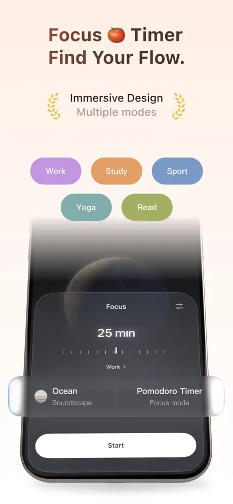
Productivity is introduced through five category pills—Work in lavender (#BFA8E0), Study in apricot (#E8AA80), Sport in sky blue (#8BBFE8), Yoga in muted teal (#7FBDBD), and Read in sage green (#A8B872)—arranged in a centered 3-over-2 formation above the hardware. The phone presents a dark, space-themed UI: a planetary body silhouettes behind a glassmorphic black card that reads “Focus” and “25 min” in white at roughly 40 pt, with a dry-tick ruler beneath. Two smaller glass cards offer “Ocean Soundscape” and “Pomodoro Timer Focus mode,” while a wide white pill button labeled “Start” anchors the bottom. The background is a pale peach (#FDF6F0) that echoes Frame 1’s lower gradient, creating the first real color callback in the sequence. The contrast between the inky focus UI and the pastel pills is striking, though the pill text flirts with insufficient contrast against the pale ground.

TIDE App Store screenshot 5 — The Content Library
05

The Content Library

On-frame caption: “Reduce Stress with / 🧘 Meditations.

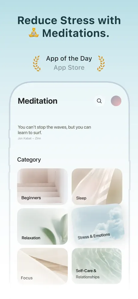
Meditation is shown through a simulated screen-only chassis—no side buttons or notch—against a light cyan wash (#E2F0F2). The header reads “Meditation” in bold black, flanked by a search glyph and a pink-toned avatar circle. Below, a quote occupies the upper content area: “You can’t stop the waves, but you can learn to surf.” followed by “Jon Kabat - Zinn” in a smaller grey subheading. Under the “Category” heading, a 2×3 grid of rounded image tiles presents “Beginners” on pale stairs, “Sleep” on draped linen, “Relaxation” on a plant tendril, “Stress & Emotions” on clouds, “Focus” on timber, and “Self-Care & Relationships” on water ripples. Labels sit at the lower-left of each tile, backed by subtle gradient scrims. Dropping the physical device here softens the pitch, but the transition from hardware-heavy frames to this floating screen feels abrupt because the corner radii and shadow treatments diverge from the chassis-based frames earlier in the sequence.

TIDE App Store screenshot 6 — The Soundscape Catalog
06

The Soundscape Catalog

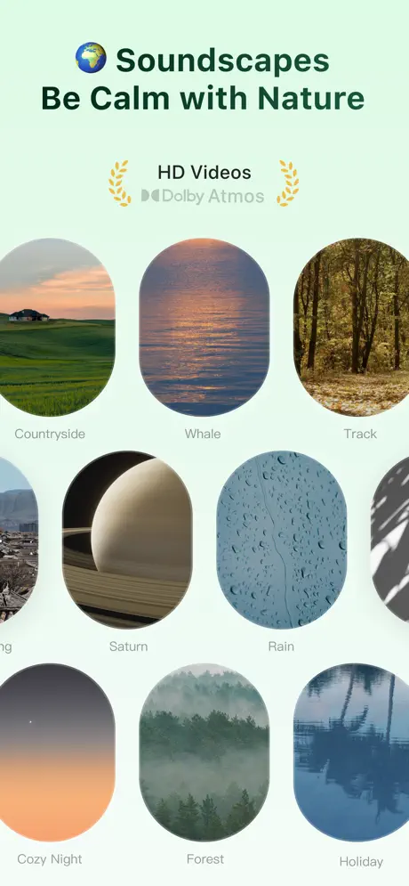
On-frame caption: “🌍 Soundscapes / Be Calm with Nature

This frame goes full-bleed with a tight three-column grid of vertically elongated pill-shaped images, each with an aspect ratio of roughly 1:1.4. Visible labels include Countryside, Whale, Track, Saturn, Rain, Cozy Night, Forest, and Holiday. The photography is cinematic, but the ovals are cropped aggressively at the left and right edges of the canvas, producing a hemmed-in, infinite-scroll preview rather than a composed gallery. Above the grid, the laurel badges read “HD Videos” and “Dolby Atmos,” the latter accompanied by a small speaker glyph. The background is a pale mint (#E4F0E6) that harmonizes with the nature imagery but offers almost no separation from the lighter thumbnails. With no device frame to ground the UI, the frame reads as content marketing rather than software demonstration, a significant context shift from the data-rich sleep frame two swipes earlier.

TIDE App Store screenshot 7 — The Editorial Quote Deck
07

The Editorial Quote Deck

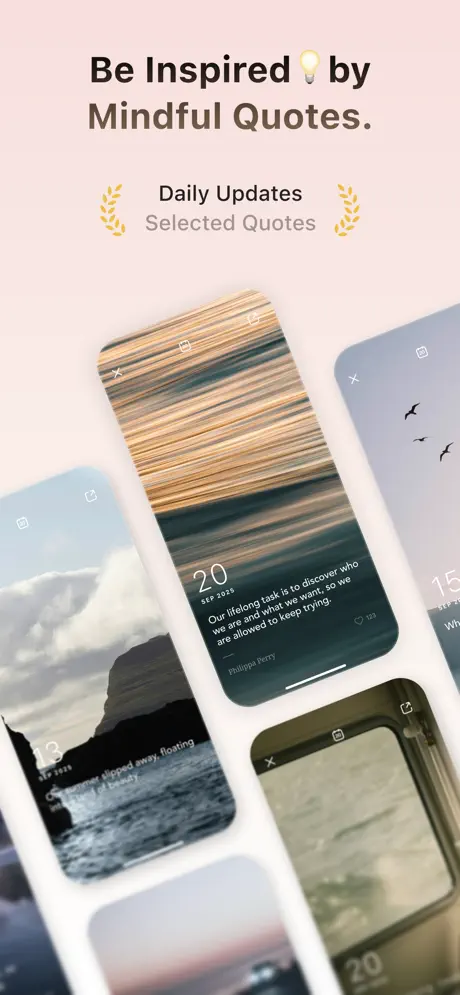
On-frame caption: “Be Inspired 💡 by / Mindful Quotes.

Three rotated phone screens are layered in a fan arrangement against a blush background (#F5EAE8). The center card, most legible of the three, displays motion-blurred sunset streaks in orange and teal behind the date “20 SEP 2023” and the quote: “Our lifelong task is to discover who we are and what we want, so we are allowed to keep trying.” — Philippa Perry. A heart icon and the number 123 sit at the lower right. Flanking cards show coastal cliffs and birds against a pale sky, partially obscured by blur and shadow. Close, bookmark, and share glyphs cap each screen. The roughly 12-degree rotation grants depth but pushes the body copy toward the threshold of comfortable reading. The aesthetic is unmistakably editorial, yet the frame sacrifices immediate comprehension for atmosphere, and without a static device, the shopper may momentarily wonder whether this is still the same app.

TIDE App Store screenshot 8 — The Widget Mosaic
08

The Widget Mosaic

On-frame caption: “Optimized for / iOS 26 & watchOS.

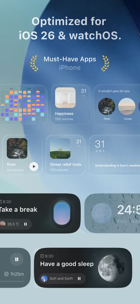
The closing frame carries a jarring headline: “Optimized for iOS 26 & watchOS,” a forward-dated claim that reads as either placeholder error or speculative fantasy. Behind the text, a large soft-focus blue orb (#8FB8CF) bleeds from the upper left against a lighter sky (#C5DDE8). No device frames the content; instead, a dense mosaic of iOS widgets floats in simulated home-screen context. Visible widgets include a multicolored habit grid, “Happiness TIDE everyday,” “River Soundscapes” with a central play button, a temperature readout of 26.5°C, and a prominent dark-mode sleep widget captioned “Have a good sleep” beside a photorealistic moon. The laurel badge reads “Must-Have Apps iPhone.” The density argues ecosystem ubiquity, but the sheer number of rectangles—nine or more—creates a Where’s-Waldo effect that undermines the clarity of any individual widget. As a final argument, the frame shouts breadth; what it whispers is visual exhaustion.

05The craft

Captions, colour and the mechanics of the sell

Caption pattern

Every caption follows an identical lockup: a bold, two-line value proposition centered in the upper third, followed by a centered sub-line of two laurel-flanked badges. For example, Frame 1 reads “Sleep, Focus / Meditation & Relax” above “Featured App Store” and “165,000+ Reviews.” Frame 5 reads “Reduce Stress with / Meditations.” above “App of the Day” and “App Store.” This cadence creates a predictable rhythm that helps the shopper parse intent quickly, though it also means no single frame breaks the pattern to deliver a surprise.

Visual system

There is no single visual system; there are eight. Background colors shift dramatically per frame. Device framing alternates between full chassis, floating screen, scattered hardware, and pure UI abstraction. Shadows range from the soft diffused lifts on Frame 2’s white cards to the sharp diagonal shadows on Frame 7’s tilted phones. The one constant is the golden laurel wreath, which brackets the social-proof text like a seal of approval on every slide.

The thumbnail test

At thumbnail scale, Frame 2’s high-contrast white cards on cobalt blue survive compression best. Frame 4’s dark planet and white “25 min” typography also reads clearly. Frame 6’s pastel mint and green photography, however, flattens into a single undifferentiated hue, and Frame 8’s dense widget collage becomes visual noise. The red/orange of the tomato emoji in Frame 4 and the globe in Frame 6 act as useful high-contrast punctuation marks during rapid scrolling.

Conversion mechanics

Frames 1 and 2 do the heaviest persuasive lifting. Frame 1 answers the cross-platform question immediately by nesting the Apple Watch inside the iPhone composition, while Frame 2 provides the analytical proof points—sleep stages, respiratory rate, snore detection—that justify the app’s utility over a free timer. Frame 4’s Pomodoro surface will convert productivity-focused shoppers, but only if they swiped far enough to see it. The quote and soundscape frames (7 and 6) are better suited to retention than acquisition; they answer ‘what does it feel like?’ rather than ‘what problem does it solve?’ For cold traffic, the set might benefit from placing Frame 2 earlier in the sequence.

06Where it slips

What we would change

The Background Palette Fractures Brand Memory

In eight frames, the background shifts through slate, cobalt, cream, peach, cyan, mint, blush, and sky blue. Without a single anchoring canvas color, TIDE risks feeling like eight different apps. A shopper swiping rapidly will remember the fragments—blue sleep, green nature, pink quotes—but not the umbrella brand. The fix is to lock the sequence to two signature environmental colors, perhaps the deep cobalt for data modes and the warm beige for content modes, letting feature accents live inside the UI cards rather than on the walls.

Headline Credibility Hits a Typographic Wall

Frame 8’s “iOS 26” claim is a credibility wound. Even if interpreted as a stylistic placeholder, it reads as careless to a detail-oriented App Store shopper. Frame 1’s headline, “Sleep, Focus Meditation & Relax,” is grammatically incomplete, missing either a comma after Focus or a nominal sync for Relax. These are not minor quibbles; at the top of the funnel, copy precision signals engineering precision. A full editorial pass is required, and Frame 8 should be rebuilt with an accurate OS reference or replaced with a generic ‘Optimized for iPhone & Apple Watch.’

Compositional Discipline Wavers Between Frames

Frame 6’s edge-to-edge pill images need at least 24 pt of breathing room on the left and right margins; as they stand, the ovals feel cropped by the display edge rather than deliberately framed. Frame 3’s nine-watch scatter lacks a focal hero: reducing the count to five and scaling one watch to 140% would give the eye a landing pad. Frame 5’s screen-only chassis is elegant, but its shadow weight and corner radii do not match the physical devices in Frames 1, 2, and 4, introducing an unintentional inconsistency. The fix is to standardize either the device frame (always show a bezel) or the screen abstraction (never show one), or to establish a clear alternating rhythm so the variation feels intentional.

Accessibility Contrast Is Inconsistent

Frame 4’s pastel category pills—especially the lavender Work and apricot Study buttons—sit on a pale peach background that yields barely 3:1 contrast, failing WCAG AA standards for small text. Frame 7’s rotated cards place white quotation text over motion-blurred photography without consistent scrims, making legibility dependent on the underlying image brightness. The fix is to add a 40% black scrim behind all text on photographic backgrounds and to darken the category pill backgrounds by at least 20% lightness to guarantee separation from the canvas.

07The recipe

How to apply this to your own app

  1. Color anchoring

    If your app does many things, resist the urge to give every feature its own background color. Pick one or two environmental hues and let the UI inside the phone do the talking.

  2. Device choreography

    Alternating between full chassis, exploded cards, scattered hardware, and frame-less UI is effective only if the rhythm is predictable. Establish a metronome—e.g., device on odd frames, abstraction on even frames—so the variation reads as system, not noise.

  3. Social-proof rhythm

    TIDE’s laurel-wreath badge lockup appears on every frame. If you adopt a recurring motif like this, keep the position pixel-identical. The shopper’s eye will learn to skip to it for context, speeding up comprehension.

  4. Data as hero

    Frame 2 proves that letting UI cards break the bezel can communicate depth faster than showing the full screen. If your app generates charts or metrics, try exploding one or two cards forward instead of flattening everything inside the safe area.

08Takeaways

Five things worth stealing

  • Breadth can be a liability if the canvas changes color on every swipe; anchor the sequence with a restricted environmental palette.
  • Cross-platform credibility is best established by physically nesting one device inside another’s composition, as seen in Frame 1.
  • Exploded UI cards (Frame 2) communicate data depth more persuasively than a flat screenshot, but stop before the composition turns to clutter.
  • Every headline must survive an editorial stress test; a typo or anachronism in the final frame undermines trust built across seven prior swipes.
  • The presence of an Apple logotype in a headline may trigger App Store guideline scrutiny; use platform references cautiously.
  • When showing widget density, prioritize a single hero widget over a mosaic; shoppers cannot parse nine rectangles in under two seconds.
09The verdict

What the set actually achieves

The set communicates range successfully; a skimming shopper will leave with a clear sense that TIDE does ‘a lot.’ However, the lack of a unifying canvas color or consistent device frame means the brand itself is less memorable than any individual feature. The sleep-tracking frame likely converts data-oriented users, while the Watch and widget frames establish ecosystem credibility, but the overall impression is modular rather than systemic.

This set is a useful reference for designers building multi-tool wellness or productivity apps that span iPhone and Apple Watch. Teams struggling to communicate feature breadth without looking like a ‘bloatware’ download will find TIDE’s modular mood-matching instructive, even if the execution needs tighter curation. It is also a cautionary study for anyone tempted to change the background color on every frame.

10Questions

Frequently asked

Why does Frame 8 mention iOS 26?

The screenshot literally displays the text “Optimized for iOS 26 & watchOS.” It is likely a placeholder or typo that survived the export process. In a live storefront, this would almost certainly confuse shoppers or trigger rejection concerns.

Does the set use any hardware framing consistently?

No. Frames 1, 2, and 4 show full iPhone chassis; Frame 5 shows a screen-only rounded rectangle; Frame 3 uses scattered Apple Watch hardware with no iPhone; Frames 6, 7, and 8 use no hardware at all.

What is the recurring visual motif across all frames?

A pair of gold laurel wreaths flanking two lines of social proof or category metadata. This badge lockup appears in identical position and scale on every frame, acting as the set’s only true constant.

Which frame has the highest information density?

Frame 2, which stacks sleep score cards, hypnogram charts, respiratory bars, and snore detection waveforms in a single composition. Frame 8’s widget mosaic is visually dense, but the individual widgets contain less legible data.

Is the Apple logo in Frame 3 permitted by App Store guidelines?

Apple’s guidelines generally restrict the use of the Apple logo in marketing materials without explicit permission. While the screenshot may pass review, it is a risk factor that designers should flag with legal or marketing stakeholders before shipping.

11Keep reading

Build your own screenshot set

The full set

8 shots
TIDE App Store screenshot 1TIDE App Store screenshot 2TIDE App Store screenshot 3TIDE App Store screenshot 4TIDE App Store screenshot 5TIDE App Store screenshot 6TIDE App Store screenshot 7TIDE App Store screenshot 8

About the app

Get service that suits you from Tide Cleaners, the #1 dry cleaner. We're talking easy laundry pick up and delivery, dry cleaning coupons, detailed order tracking, and more, all The Procter & Gamble Company, via the App Store listing.

Screenshots and store metadata belong to The Procter & Gamble Company. They are shown here for design commentary and criticism. The analysis on this page is original work by floow.design. View the original listing.

More Health & Fitness teardowns

Browse all →