Tiimo app icon
ProductivityScreenshot teardown12 min read

Tiimo App Store screenshots

Tiimo’s App Store screenshot set positions a visual AI planner inside a tightly controlled chromatic world. Every frame, whether showing dense task lists or a celebratory empty state, sits against a saturated violet canvas that approximates #7C3AED, occasionally shifting to a lighter tint where the ambient lighting changes. The set alternates between light and dark interface modes, demonstrating system flexibility without abandoning the brand wrapper. A high-contrast serif typeface handles all marketing captions, while the UI itself relies on a clean geometric sans. The sequence runs eight frames long, mixing full-device mockups, social-proof badges, lifestyle photography, and a split testimonial. For designers building their own set, Tiimo offers a clear lesson in using a single background color to unify disparate UI states into a coherent, aisle-worthy presentation.

Tiimo App Store screenshot 1
01At a glance

The set in one screen

Framing
Consistent iPhone bezel with Dynamic Island visible in light-mode frames; device shown in hand or floating against a violet stage
Captions
Editorial serif, centered, white, serving as the headline for each frame
Backdrop
Solid brand violet #7C3AED across all frames except the final two lifestyle shots
Type
Display headlines appear to be set in a crisp, high-stroke-contrast serif akin to a modern Playfair or Tiempos, while all internal UI labels use a neutral geometric sans, likely SF Pro, at a compact 15–17 pt size
UI / copy split
A balance between legible interface chrome, emoji iconography, and generous marketing captions that never overlap the device screen
Frame 1 job
Establish immediate editorial credibility via the "App of the Year 2025" laurel lockup while showing a real hand and a fully readable task list

Sampled palette

#7C3AED#7C3AED
#A78BFA#A78BFA
#FFFFFF#FFFFFF
#0A0A0A#0A0A0A
#1C1C1E#1C1C1E
#3E2A56#3E2A56
02The challenge

What this screenshot set had to solve

The central tension in designing for a productivity app with AI and focus features is avoiding the sterile, spreadsheet-like aesthetic that dominates the category. Tiimo needed to signal visual planning and AI assistance without turning the screenshot set into a gallery of chat bubbles or yet another calendar grid. The challenge was to sequence eight frames so that a shopper swiping at speed could grasp the full loop: planning, AI ingestion, prioritization, focus, and emotional payoff. Additionally, the team had to weave in multiple Apple awards and user love without letting that social proof eclipse the actual interface. Balancing credibility, feature breadth, and warmth in eight static frames is the core design problem this set attempts to solve.

App Store shoppers do not buy features; they buy the story of a better version of their day. Tiimo’s screenshots stage that story as a single continuous scene.
03The approach

How the set argues its case

A single color plus a serif headline voice plus alternating light and dark interface modes create a premium presentation that feels more editorial than utilitarian, but the real engine is the narrative sequencing: context, credibility, input, execution, reward, and proof. The designers treat the brand purple as a theater curtain that never drops.

The screenshots position Tiimo as a lifestyle object as much as a utility. By placing a hand in frame one and a human face in frame seven, the set signals that the app is built for bodies and emotions, not just for desk-bound power users. The awards in frame two reinforce the claim without requiring the user to understand the UI first.

04Frame by frame

Every screenshot, and the job it does

Tiimo App Store screenshot 1 — The credibility handshake
01

The credibility handshake

On-frame caption: “A visual AI planner built for real life

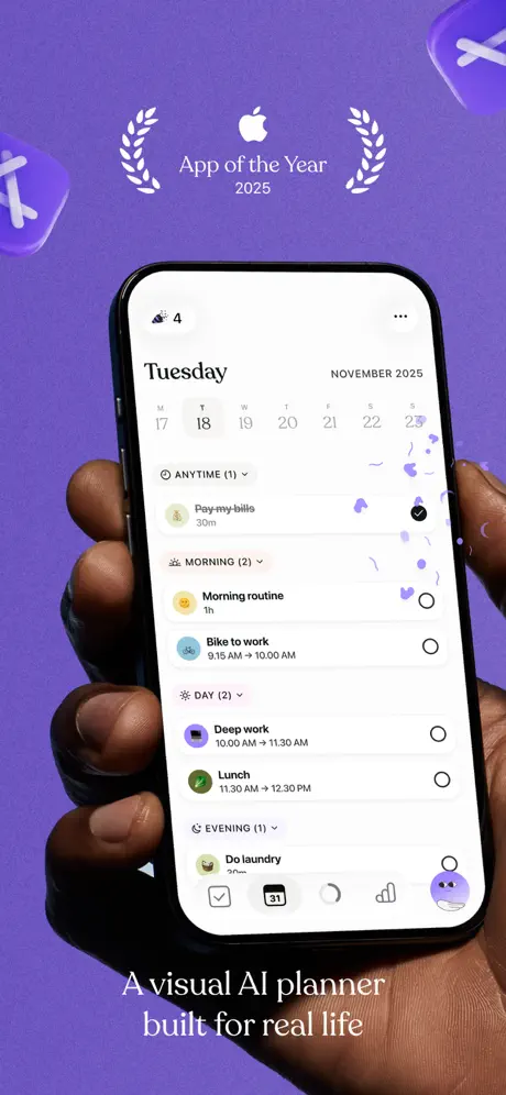
Frame one shows a dark-skinned hand gripping a modern iPhone from below against a #7C3AED violet field. Centered above the device, a white Apple logo sits between twin laurel wreaths with the text “App of the Year 2025.” The phone displays a light-mode schedule titled “Tuesday” with a weekly date strip running 17–23 November 2025 and tasks grouped under ANYTIME, MORNING, DAY, and EVENING. Each task row carries a circular emoji icon on the left and a completion ring on the right. The tab bar at the bottom reveals a calendar icon stamped with the number 31 and a circular profile avatar. By placing the hand and the award lockup in the same frame, the shot establishes both human scale and editorial credibility before the shopper has parsed a single UI element.
Tiimo App Store screenshot 2 — Awards over interface
02

Awards over interface

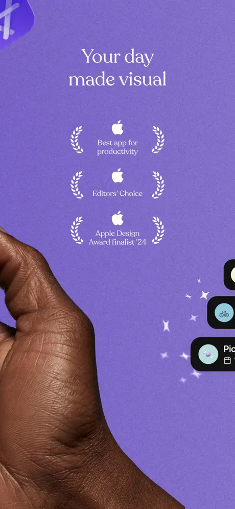
On-frame caption: “Your day made visual

The second frame keeps the violet ground but crops the phone aggressively on the right edge so only slivers of black UI cards are visible, showing a bike icon and a picture icon with white sparkles. A hand enters from the left, fingers wrapped around the phone’s edge. Centered in the negative space are three stacked white Apple badges: “Best app for productivity,” “Editors’ Choice,” and “Apple Design Award finalist ‘24.” The headline “Your day made visual” sits above them in the same serif used throughout. This frame is entirely social proof; the UI barely peeks in. The composition relies on asymmetry—the hand anchors the left, the device slivers pull the eye right, and the awards occupy the optical center.

Tiimo App Store screenshot 3 — Natural language becomes structure
03

Natural language becomes structure

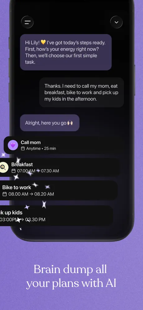
On-frame caption: “Brain dump all your plans with AI

Frame three switches to a full-height dark-mode device floating on the same purple canvas, captioned at the bottom: “Brain dump all your plans with AI.” The screen shows a chat thread against a near-black #0A0A0A background. The first bubble reads, verbatim, “Hi Lily! 💛 I’ve got today’s steps ready. First, how’s your energy right now? Then, we’ll choose our first simple task.” The user replies, “Thanks. I need to call my mom, eat breakfast, bike to work and pick up my kids in the afternoon.” The AI responds, “Alright, here you go 🙌,” followed by structured tasks with icons in colored circles. The chat bubbles use a muted aubergine tint—roughly #3E2A56—creating subtle depth without high contrast.

Tiimo App Store screenshot 4 — Focus as a singular act
04

Focus as a singular act

On-frame caption: “Stay on task from start to finish

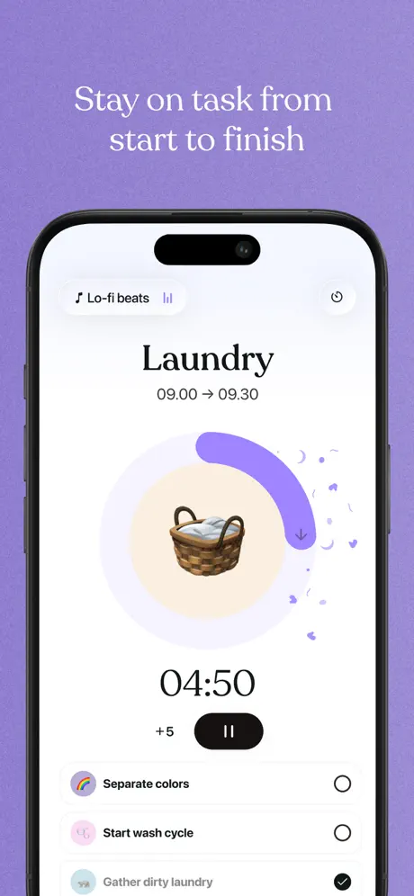
Here the device returns to light mode, captioned “Stay on task from start to finish” at the top in white serif. The UI centers on a single task, “Laundry,” timed “09.00 → 09.30.” A large circular progress ring in #8B5CF6 encloses a laundry-basket emoji on a pale peach circle. Below, a bold timer reads “04:50,” flanked by a “+5” button and a black pause pill. A top-left pill advertises “Lo-fi beats” with a musical note and equalizer bars. Beneath the timer, a checklist includes “Separate colors,” “Start wash cycle,” and “Gather dirty laundry,” the last checked off. The layout is radial and focused, stripping away navigation to isolate the act of doing.

Tiimo App Store screenshot 5 — Drag-to-prioritize mechanics
05

Drag-to-prioritize mechanics

On-frame caption: “Prioritize your to-dos in a click

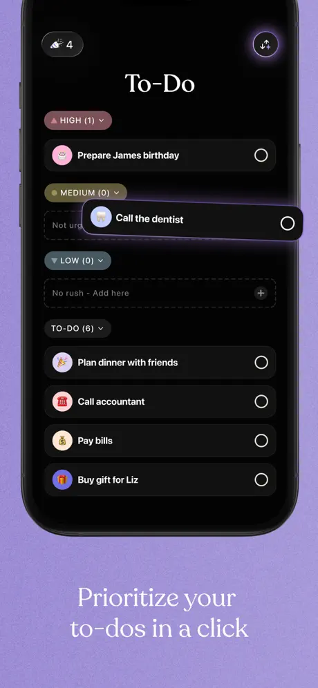
Captioned “Prioritize your to-dos in a click,” this frame presents a dark-mode to-do list. The header reads “To-Do,” with a weather icon showing “4” at the upper left and a share icon inside a purple ring at the upper right. Segmented priority lanes are labeled HIGH (1), MEDIUM (0), and LOW (0), each with a colored dot—pink, olive, and blue-grey respectively. A card reading “Call the dentist” is captured mid-drag with an elevated shadow, moving between lanes. Below, a TO-DO (6) section lists tasks such as “Prepare James birthday,” “Plan dinner with friends,” and “Pay bills,” each with an emoji icon and an empty completion ring. The dark cards read as approximately #1C1C1E, sitting cleanly on the black ground.

Tiimo App Store screenshot 6 — Emotional payoff
06

Emotional payoff

On-frame caption: “Celebrate every step

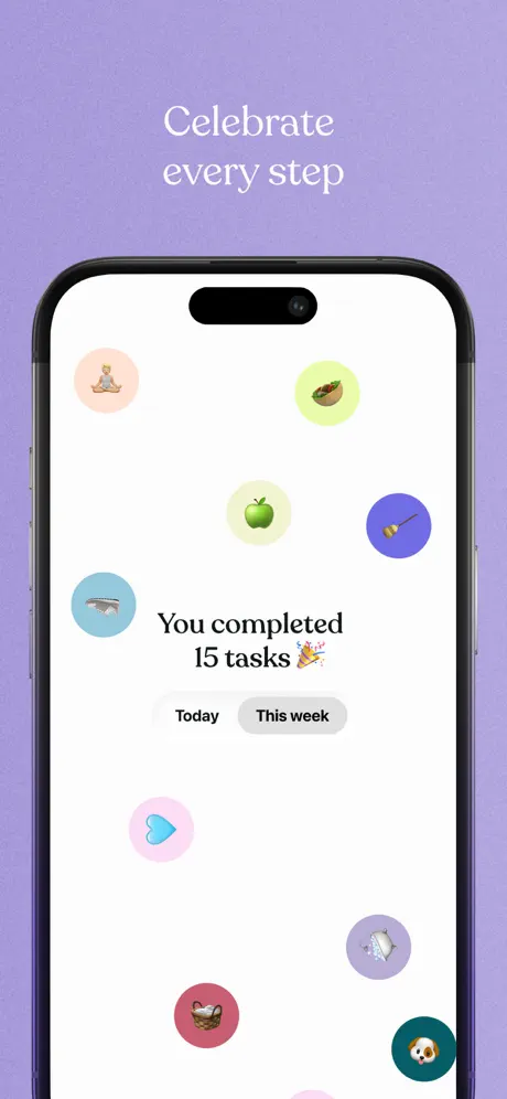
This frame shows a celebratory light-mode screen captioned “Celebrate every step.” The center of the phone displays the text “You completed 15 tasks 🎉” above a segmented control with “Today” selected in a grey pill and “This week” adjacent. Around this hub, emoji icons float inside pastel-colored circles—peach, lime, mint, lavender, butter, pink, red, and teal—scattered asymmetrically like confetti. The background is pure white, and the tab bar is hidden, giving the composition breathing room. Unlike the utility-driven frames before it, this shot sells emotional payoff, using negative space to make the achievement feel personal rather than transactional.

Tiimo App Store screenshot 7 — Testimonial part one
07

Testimonial part one

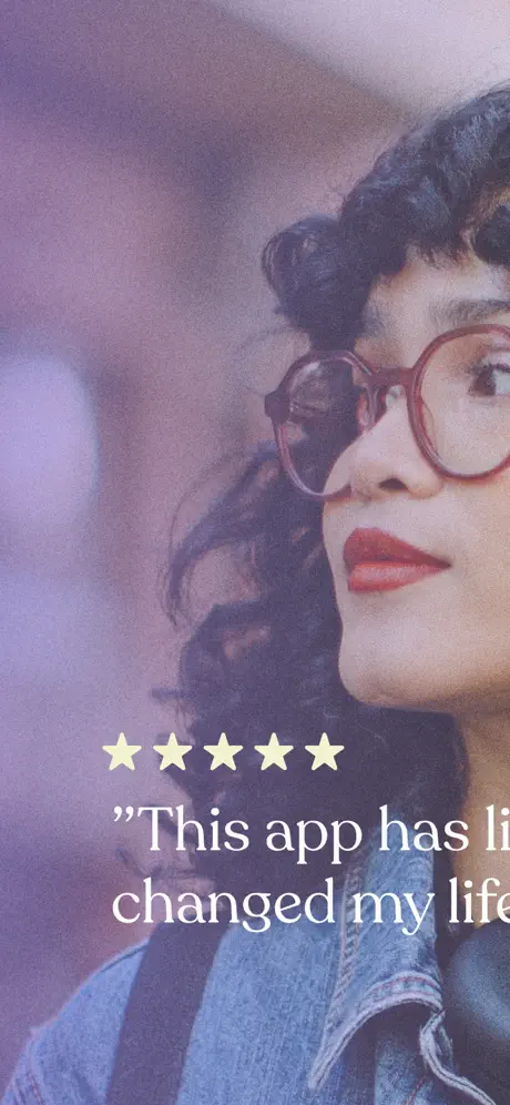
On-frame caption: “"This app has li ... changed my life"

The seventh frame abandons the device entirely for lifestyle photography. A person with curly dark hair, red glasses, and a denim jacket appears in soft-focus purple-tinted light. Overlaid in the lower third are five yellow stars and a serif quote that begins, verbatim, “This app has li” on one line and “changed my life” on the next. The crop is a medium close-up, focusing on the face. Because the type is white and set against a darker region of the photo, it remains legible, though the line break splits the word “literally,” forcing the reader to wait until the next frame to resolve the sentence. The purple tint keeps the frame chromatically linked to the rest of the set.

Tiimo App Store screenshot 8 — Testimonial part two
08

Testimonial part two

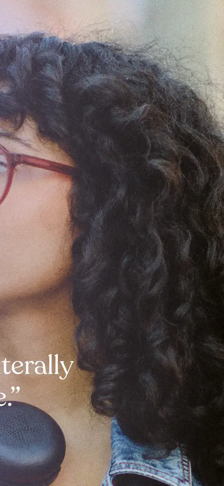
On-frame caption: “"...terally ...e."

The final frame is an extreme close-up continuation of the same photograph, showing the subject’s hair, shoulder, and collar. The overlaid text completes the broken word: “...terally ...e.”—resolving the testimonial to “literally changed my life.” The device is gone, the purple background is gone, and the frame functions purely as a photographic full-bleed sign-off. The crop is so tight that the context established in frame seven is almost lost at thumbnail scale. As a pair, these two frames attempt a cinematic split, but in the rapid-swipe context of the App Store, they risk being consumed as disconnected fragments rather than a single coherent testimonial.

05The craft

Captions, colour and the mechanics of the sell

Caption pattern

Every caption is a complete sentence or fragment that describes a user benefit rather than a feature name. They sit outside the device, centered, in a generous size that competes with the UI for attention. This editorial choice slows the eye down and forces a headline-skimming pattern before the shopper dives into the pixels.

Visual system

The visual system is built on three rules: one purple background to rule them all, one serif voice for the canvas, and one rounded iPhone silhouette to contain the story. Inside that container, the UI is allowed to switch between light and dark, chat and list, timer and calendar, because the frame around it never changes.

The thumbnail test

At small scale, the violet stage reads instantly, and the white serif captions remain legible against it. The dark-mode frames hold enough contrast to avoid disappearing into a black blob. However, the final lifestyle frame loses the violet anchor almost entirely, which means the last impression at thumbnail size is a generic portrait rather than a branded product moment.

Conversion mechanics

The set converts through sequence, not shock. A shopper sees the calendar, feels the credibility, watches the AI parse chaos, feels the timer focus, and lands on a human face. The emotional arc is intentional. However, the conversion path is broken when frame two hides the product behind badges and when frames seven and eight force the shopper to solve a sentence puzzle across a swipe boundary.

06Where it slips

What we would change

The most honest summary

Tiimo’s set succeeds through brute-force consistency: the violet stage, the serif headline voice, and the alternating light-dark UI demonstrations create a package that feels intentional and designed. The narrative arc is sound, moving from calendar context to AI onboarding, focus mode, prioritization, rewards, and finally human testimony. However, the set makes a dangerous trade in frame two by hiding nearly all UI behind social-proof badges, and the two-frame testimonial split at the end sacrifices clarity for cinematic flair. For designers studying this set, the strongest takeaway is that a single background color can carry an entire sequence; the weakest element is the decision to let a sentence dangle across a swipe boundary.

The one thing to steal

Steal the chromatic stage. Locking every single frame to one brand color—#7C3AED in this case—allows the rest of the design to vary wildly without losing shelf cohesion. Whether the UI inside is white, black, or photographic, the shopper always knows they are looking at the same product.

The honest fix

Move the testimonial to a single frame by overlaying the complete quote on the lifestyle photo and place it adjacent to a UI frame—perhaps combining the achievement state with the user photo in a split layout, or replacing frame eight with a functional shot such as a home-screen widget or lock-screen live activity so the set closes on a product feature rather than an unresolved photograph. Additionally, in frame two, pull the crop back to reveal at least one full task card or list row so the awards feel anchored to tangible software rather than floating in a vacuum.

07The recipe

How to apply this to your own app

  1. 1. Pick one signature background color and refuse to change it, even when your UI demo switches between light and dark modes.

    You get to pick your signature background color once. Make it loud enough to own the thumbnail, then repeat it behind every frame so the eye tracks continuity even when the phone screen changes from black chat bubbles to white calendars. The background is your billboard; the device is just the window.

  2. 2. Sequence your frames as a story arc—context, credibility, input, execution, reward—rather than as a feature grid.

    Cut the random feature collage. Instead, walk the shopper through time: show the overloaded calendar, the AI that digests it, the focus block that executes it, and the celebration that completes it. A linear narrative lets a stranger project themselves into the app in under four seconds.

  3. 3. If you use serif headlines, make sure they are sized to survive the App Store thumbnail compression.

    Serif type adds editorial authority, but thin strokes can disappear at small scale. Test your headline at 300 px wide. If the counters clog, increase the weight or size until the caption reads as fast as a tabloid headline. The caption is the hook; the UI is the proof.

  4. 4. Never split a readable sentence across two screenshots unless you are willing to lose the second half of your message.

    Shoppers swipe in fractions of a second. If your testimonial starts on frame seven and ends on frame eight, most viewers will only see one half and assume the quote is broken or irrelevant. Treat every frame as a self-contained poster that also happens to connect to the next.

  5. 5. Show the interface in at least six of your eight frames; awards and lifestyle shots are seasoning, not the meal.

    Social proof and human photography warm up the set, but the App Store is still a software storefront. If you hide the UI behind badges or crop the device into abstraction, you force the shopper to buy on trust alone. Let the awards sit next to the pixels they describe, not in front of them.

08Takeaways

Five things worth stealing

  • The #7C3AED violet canvas unifies light-mode, dark-mode, and photographic frames into a single brand environment that is instantly recognizable during a fast swipe
  • Frame one’s combination of the hand, the App of the Year lockup, and the full task list manages to communicate human context, credibility, and product density simultaneously without feeling crowded
  • The alternating timeline of frames—showing planning, AI chat, focus timer, and drag-to-prioritize—covers the core Jobs-to-be-Done in a logical progression that teaches by example rather than explanation
  • The two-frame testimonial split breaks readable comprehension; at small thumbnail scale, neither frame delivers a complete thought on its own
  • Frame two is essentially a social-proof wall with almost no visible interface; a shopper could pass through two frames and still not understand what the app looks like
  • Frame eight’s extreme close-up crop removes the device, the purple brand ground, and most of the subject’s face, leaving the set to end on an abstract hair texture that does not reinforce product value
09The verdict

What the set actually achieves

Because the team chose a single theatrical backdrop and refused to vary it, even dark-mode UI frames feel like chapters of the same book rather than disconnected feature dumps. The set reads as a linear narrative—calendar, awards, AI chat, focus timer, prioritization, celebration, testimony—which makes it easier for a shopper to project themselves into the workflow. The consistency of the violet stage also allows Tiimo to get away with wildly different interface skins (white schedule, black chat, dark to-do list) without breaking visual continuity.

Teams who want to sell an emotional arc, not a feature grid. If your app has a strong brand color and you are willing to let the UI play supporting actor to the narrative, this model will work. It is less suited to apps that need to show dense data or complex customization up front.

10Questions

Frequently asked

The set ends on a photo with no device. Is that risky?

Yes. The App Store crops thumbnails aggressively, and a face with no UI chrome does not communicate software value. It is a branding flex, but it sacrifices the last possible moment to show the product.

Why does the testimonial span two frames?

It is a cinematic choice that mimics magazine spreads, but it fails the swipe test. At shelf scale, the split reads as two incomplete thoughts rather than one continuous quote.

Does showing both light and dark mode help or hurt?

It helps. It proves the app respects system settings and feels modern. Because the violet background never changes, the mode switch inside the phone actually adds visual variety without breaking cohesion.

What is the most important layout rule here?

The marketing caption never overlaps the device screen. It lives on the canvas, not on the mockup, which preserves the illusion that the UI is a real phone while the headline is editorial commentary.

11Keep reading

Build your own screenshot set

The full set

8 shots
Tiimo App Store screenshot 1Tiimo App Store screenshot 2Tiimo App Store screenshot 3Tiimo App Store screenshot 4Tiimo App Store screenshot 5Tiimo App Store screenshot 6Tiimo App Store screenshot 7Tiimo App Store screenshot 8

About the app

Screenshots and store metadata belong to Tiimo. They are shown here for design commentary and criticism. The analysis on this page is original work by floow.design. View the original listing.

More Productivity teardowns

Browse all →