Yukee app icon
ProductivityScreenshot teardown9 min read

Yukee App Store screenshots

Yukee App Store Screenshot Set: A Study in Type-First Productivity Packaging

Set published by Pierre Jacquel · 8 frames analysed

3.0 · 1 ratingsFreev2.0Updated 6mo ago
Yukee App Store screenshot 1
01At a glance

The set in one screen

Framing
iPhone 15 Pro Max-style chassis, mostly straight-on with intermittent 15–20° counter-clockwise/clockwise tilts (Frames 2 and 5). No hand models, no environmental context.
Captions
Bold geometric sans-serif, two-tone: primary nouns/verbs in near-black (#111111), secondary grammar in mid-gray (#AAAAAA).
Backdrop
Pure white (#FFFFFF) across all eight frames. No gradients, no textures.
Type
Headlines treated as graphic lockups rather than sentences; rag-right alignment never used—every caption is force-wrapped by design.
UI / copy split
InsideFrames: 65%, CopyOverlays: 35%
Frame 1 job
Position the app as a three-headed productivity tool—tasks, events, habits—while anchoring trust with a human testimonial.

Sampled palette

#111111#111111
#AAAAAA#AAAAAA
#007AFF#007AFF
#F2F2F7#F2F2F7
#FFD60A#FFD60A
#34C759#34C759
02The challenge

What this screenshot set had to solve

A todo application lives or dies on the promise of clarity. In the Productivity category, shoppers scroll through neon grids, militaristic checkmarks, and feature-bloated canvases. For a brand built around minimalism, the screenshot set must communicate task management, event planning, habit tracking, and deep customization without ever feeling like a feature dump. The challenge is architectural: how do you signal depth through restraint? Yukee’s answer is radical—a near-monochrome, typography-led system where the device is treated as a window rather than a shrine. Captions are stripped to black-and-gray orchestrations, forcing the reader to process hierarchy before they absorb the UI. It is a high-risk strategy; strip away color and ornament, and there is nowhere for sloppy alignment or proofreading errors to hide.

"Yukee is simply the best to-do app I know" — Frame 1 testimonial, attributed to Paul, Designer.
03The approach

How the set argues its case

The governing logic is editorial, not promotional. There are no gradient backgrounds, no lifestyle props, no feature callouts in neon. The canvas is a flat white (#FFFFFF), and the iPhone is rendered either dead-straight or at a shallow off-axis rotation. Within this austerity, the designers use contrast as their only dramaturgy: black vs. gray in the captions, active blue toggles vs. inactive gray tracks inside the UI, gold badges against dimmed lists. The sequence alternates between utility frames—task creation, categories, reminders—and emotional payoff frames—streak celebrations, user reviews—giving the swipe journey a narrative pulse. By using standard iOS conventions (pill tags in #F2F2F7, #007AFF toggles, dotted list separators) the app signals native credibility, while the customized star-glyph app icons in Frame 7 hint at personality without breaking the system.

The set deliberately avoids category clichés. There are no clock icons paired with ‘Save time!’ slogans, no exploding checkmarks. Instead, it adopts the visual language of a premium lifestyle magazine: large negative space, rag-free line breaks, and a whispered color palette. This positions Yukee as a tool for users who are exhausted by productivity theater and are looking for administrative calm.

04Frame by frame

Every screenshot, and the job it does

Yukee App Store screenshot 1 — The Value Proposition
01

The Value Proposition

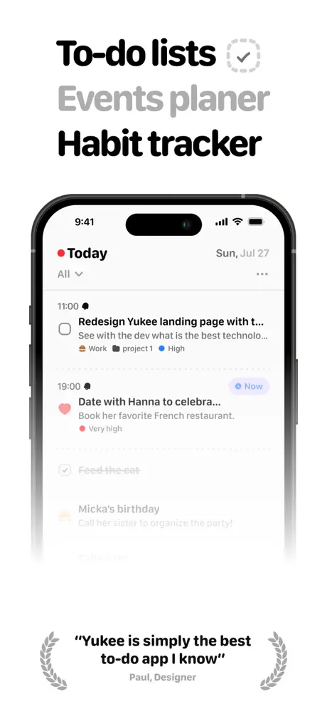
On-frame caption: “The opening frame establishes the app’s triad positioning with a three-line typographic lockup: ‘To-do lists’ in #111111, ‘Events planer’ in #AAAAAA, and ‘Habit tracker’ in #111111. A dashed-circle checkmark icon floats to the right of the first line, acting as a graphic period. The device sits centered, showing the Today list for ‘Sun, Jul 27.’ Inside the UI, the list is densely informative: four tasks are visible, including ‘Redesign Yukee landing page with t…’ and ‘Date with Hanna to celebra…,’ each truncated but legible enough to imply a real content model, with tags for ‘Work,’ ‘project 1,’ and priority dots. Below the phone, a testimonial is bookended by gray laurel wreaths: ‘Yukee is simply the best to-do app I know,’ attributed to ‘Paul, Designer.’ The bottom of the device is consumed by a heavy white-to-transparent gradient fade that ghosts out the lower tasks—an aggressive choice that sacrifices legibility for vertical grounding. Notably, the gray line contains a typo: ‘planer’ rather than ‘planner,’ which undermines the precision the frame is trying to sell.

The headline stack is roughly 48–56 pt against the white field, with the gray middle line set slightly lighter to create a visual skip. The phone’s top bezel and Dynamic Island are fully intact, proving this is a full-screen capture rather than a cropped mockup.
Yukee App Store screenshot 2 — Task Creation
02

Task Creation

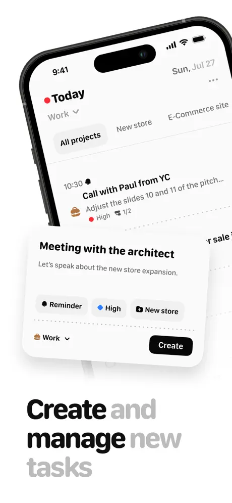
On-frame caption: “Here the device breaks axis, tilting counter-clockwise roughly fifteen degrees so the Dynamic Island and left antenna band catch specular highlight. The headline below reads ‘Create and manage new tasks,’ with ‘Create’ and ‘manage’ in #111111 and ‘and’ and ‘tasks’ in #AAAAAA. This two-tone treatment turns the caption into a visual sawtooth. Inside the device, a task-creation modal hovers over the list, titled ‘Meeting with the architect’ with a sub-line ‘Let’s speak about the new store expansion.’ Below, three pill tags read ‘Reminder,’ ‘High’ (blue dot), and ‘New store,’ followed by a ‘Work’ category dropdown and a solid black ‘Create’ button with white text. The dotted horizontal dividers inside the modal are a tactile touch, but the rotation of the phone means the modal’s bottom edge slices uncomfortably close to the frame border, creating tension without a clear bleed strategy. The background list peeks through just enough to show filter pills—‘All projects,’ ‘New store,’ ‘E-Commerce site’—hinting at project taxonomy without stealing focus.

The modal’s corner radius sits at roughly 24 pt, consistent with iOS sheet presentation, while the tags use a subtle #F2F2F7 fill with 1 pt borders. The ‘Create’ button appears to be #000000 fill, not the system blue.

Yukee App Store screenshot 3 — Habit Payoff
03

Habit Payoff

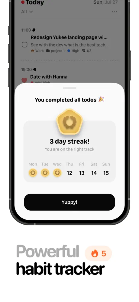
On-frame caption: “This is the emotional beat. The device is straight-on, and a celebration modal dominates the center: ‘You completed all todos 🎉’ followed by a gold hexagonal badge with a laurel icon and ‘3 day streak!’ in bold #111111. Sub-copy reads ‘You are on the right track’ in #888888, and a micro-calendar shows Monday through Wednesday filled with gold coin icons, while Thursday (12) through Sunday (15) remain numerically empty. The primary action button is a stark black pill reading ‘Yuppy!’—a colloquial CTA that contrasts with the clinical tone of the rest of the set. Below the device, the caption splits again: ‘Powerful’ in #AAAAAA, a peach-toned fire icon inside a pale circular lozenge numbered ‘5,’ and ‘habit tracker’ in #111111. The background list is dimmed to roughly 50 % black overlay, which successfully pushes the modal forward but flattens the underlying UI into murk.

The peach lozenge behind the fire icon appears to be about #FFE8E0, sitting as the only warm tone outside the device in the entire set. The calendar row labels use a small-caps treatment (Mon, Tue, Wed) in #888888.

Yukee App Store screenshot 4 — Calendar View
04

Calendar View

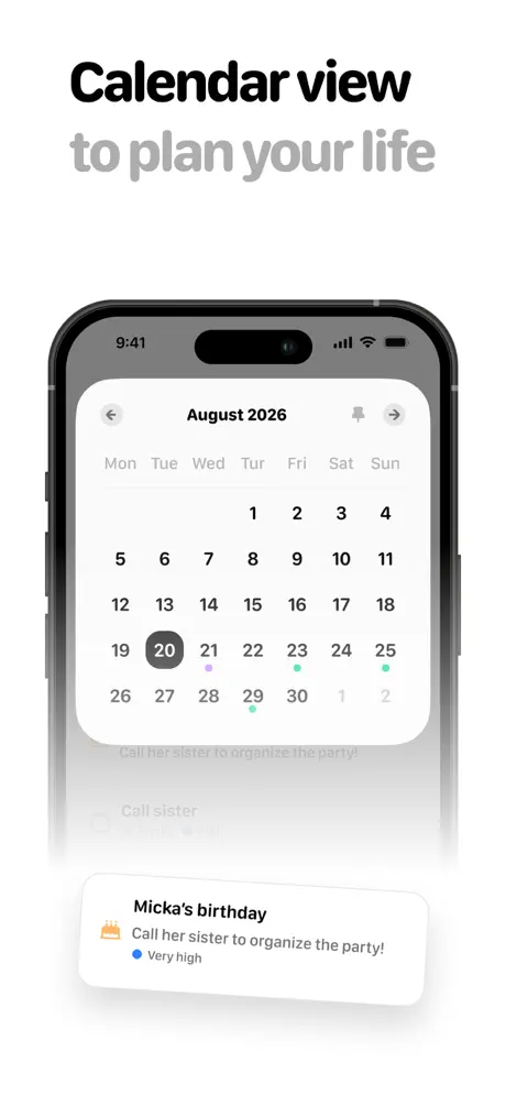
On-frame caption: “The calendar proposition is delivered with the headline ‘Calendar view’ in #111111 and ‘to plan your life’ in #AAAAAA. Inside the device, a modal sheet presents ‘August 2026’—a year far enough in the future to read as placeholder data rather than a live screenshot. The calendar grid uses a standard Monday-start header, with the 20th selected in a near-black (#333333) circle. Color-coded dots appear beneath the 21st (lavender, approx #AF52DE), 23rd (mint, approx #34C759), 25th (mint), and 29th (teal), suggesting event tagging. Below the phone, a detached floating card shows ‘Micka’s birthday’ with a cake icon and ‘Very high’ priority, visually linking the calendar to the underlying task list. Like Frame 1, this uses an aggressive bottom gradient that fades the lower calendar rows into white fog. Using 2026 rather than the current year breaks the ‘this is my everyday app’ illusion; it reads as mockup data that was never refreshed.

The floating card is physically separated from the phone, overlapping the gradient fade, which makes it read as a conceptual annotation rather than a screenshot element. Its shadow is soft and diffused, roughly 8 pt drop at 10 % opacity.

Yukee App Store screenshot 5 — Reminders
05

Reminders

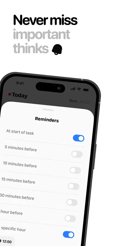
On-frame caption: “The device tilts again, this time clockwise, presenting a reminders configuration sheet. The headline reads ‘Never miss important thinks’—another typo, this time ‘thinks’ for ‘things’—with a solid black bell icon punctuating the last line. Inside the phone, a list of reminder intervals is shown: ‘At start of task’ (toggle ON, #007AFF), ‘5 minutes before’ (OFF, #E5E5EA track), ‘10 minutes before,’ ‘15 minutes before,’ ‘30 minutes before,’ ‘hour before,’ and ‘specific hour’ (ON). The status bar still reads ‘Sun, Jul 27,’ maintaining continuity with Frame 1. The issue here is twofold: the typo is arguably worse on a frame about ‘important things,’ and the unrelenting stack of inactive gray toggles creates a visual column of disappointment down the right side. A more curated state, with one or two mid-interval toggles enabled, would have suggested thoughtful defaults rather than an app that arrives silent.

The toggle active color is the system #007AFF, while inactive tracks sit in #E5E5EA. The list uses hairline dotted separators rather than full 1 px rules, which keeps the density light despite having seven rows.

Yukee App Store screenshot 6 — Categories & Projects
06

Categories & Projects

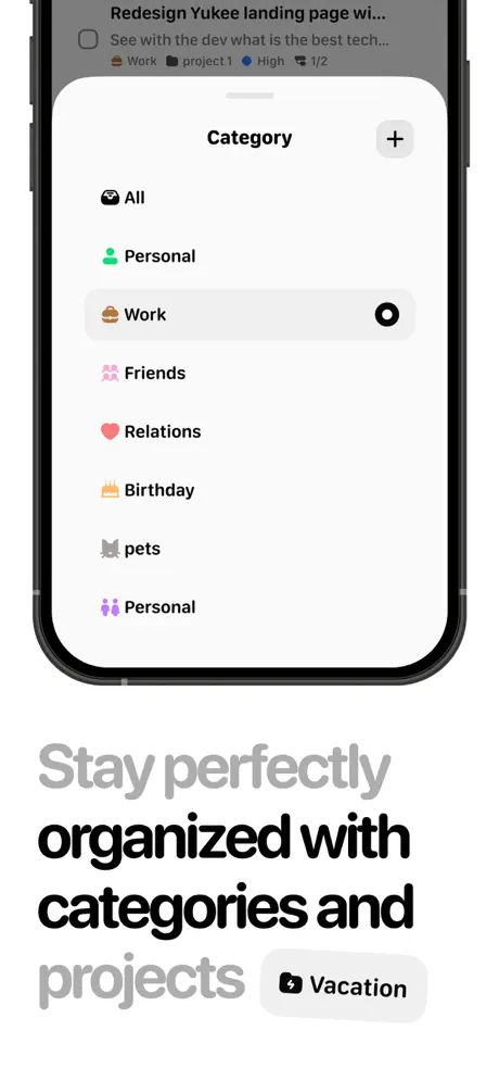
On-frame caption: “Back to a straight device, displaying a ‘Category’ management modal. The headline below is the most verbose in the set: ‘Stay perfectly organized with categories and projects,’ with ‘Stay perfectly’ and ‘projects’ in #AAAAAA while the center clause is #111111. A small ‘Vacation’ tag with a luggage icon floats beside the word ‘projects,’ like a stray piece of UI that drifted down from the phone. Inside the modal, the list reads: ‘All,’ ‘Personal’ (user icon, green), ‘Work’ (briefcase, selected in #F2F2F7 with a black checkmark), ‘Friends’ (pink people icon), ‘Relations’ (heart), ‘Birthday’ (cake), ‘pets’ (cat, inexplicably lowercase), and a second ‘Personal’ entry (purple people icon). That duplicate category is a glaring content error; it suggests the database is half-built. The plus button in the top-right corner of the modal is circled in a light gray stroke, adding to the iOS-native vocabulary.

The selected ‘Work’ row carries a #F2F2F7 fill that spans edge-to-edge inside the modal, while the surrounding rows sit on pure white. The checkmark on the right is a solid black circle with white glyph, not the system blue.

Yukee App Store screenshot 7 — Customization
07

Customization

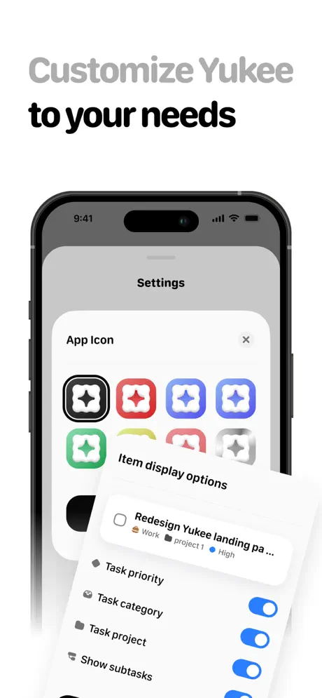
On-frame caption: “Customization is the theme. The headline ‘Customize Yukee to your needs’ splits the gray/black rule differently: ‘Customize’ and ‘to your needs’ in #AAAAAA, with ‘Yukee’ in #111111, giving brand name priority over semantic meaning. The device shows a Settings screen with an ‘App Icon’ grid: eight rounded-square variants in black, red, blue, periwinkle, green, yellow, pink, and gray, each containing a four-point star glyph. The black variant carries a 2 pt #111111 selection border. Over this, a bottom sheet titled ‘Item display options’ lists toggles for ‘Task priority,’ ‘Task category,’ ‘Task project,’ and ‘Show subtasks’—all four switched ON. Because every toggle is active, the frame fails to demonstrate the very flexibility it is selling. A mixed state—two on, two off—would have instantly communicated configurability. The layering of the sheet over the icon grid is competent, though the bottom of the sheet is cropped by the phone’s bezel, truncating any options below.

The icon grid uses rounded squares with corner radii around 20 % of the edge length, sitting in two rows of four. The overlay sheet has the standard iOS 16+ rounded top corners at roughly 20 pt.

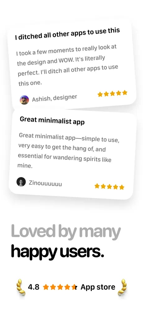
Yukee App Store screenshot 8 — Social Proof
08

Social Proof

On-frame caption: “The set abandons the device entirely for the final frame, switching to pure social proof. Two floating review cards cast soft shadows against the white background. The first reads: ‘I ditched all other apps to use this / I took a few moments to really look at the design and WOW. It’s literally perfect. I’ll ditch all other apps to use this one. / Ashish, designer’ with five gold stars. The second: ‘Great minimalist app / Great minimalist app—simple to use, very easy to get the hang of, and essential for wandering spirits like mine. / Zinouuuuuu’ with five gold stars. Below, the caption ‘Loved by many happy users’ echoes the two-tone treatment, followed by a lockup of gold laurels, ‘4.8,’ a mostly-filled fifth star glyph, and ‘App store.’ Removing the device here gives the reviews room to breathe, but the sudden absence of the phone object breaks the spatial contract established by the previous seven frames. The shopper is left looking at cards, not an app.

The star glyphs are #FFCC00 or similar, and the laurels are flat gold icons rather than embossed. The cards use a subtle drop shadow (y: 4, blur: 12, opacity: 6 %) to lift them off the white field without feeling material.

05The craft

Captions, colour and the mechanics of the sell

Caption pattern

Each caption is parsed as a graphic object rather than plain text. The designers consistently render primary nouns and verbs in #111111 and secondary conjunctions/prepositions in #AAAAAA. For example, Frame 2 reads ‘Create and manage new tasks,’ where ‘Create’ and ‘manage’ are black and ‘and’ and ‘tasks’ are gray. Frame 4 uses the same rule on ‘Calendar view / to plan your life.’ This forces the shopper to re-read the phrase twice—once for shape, once for meaning—which increases dwell time but risks fatigue if stretched too far.

Visual system

The color system is deliberately withholding. The only saturated hues live inside the device: #007AFF for active toggles, a peach-toned fire icon in Frame 3, mint and lavender calendar dots in Frame 4, and gold for streak badges in Frame 3. Outside the phone, the world is strictly black, gray, and white. Even the testimonial stars in Frame 8 are a restrained gold (#FFCC00 or similar) rather than traffic-light orange. This creates a consistent rule: color denotes interactive or emotional state; everything else is infrastructure.

The thumbnail test

Yes. Frame 1 reads instantly at thumbnail scale because the three-line headline stack is treated as a poster: ‘To-do lists’ and ‘Habit tracker’ punch in black while ‘Events planer’ recedes in gray. The centered device and the laurel-wrapped testimonial create a symmetrical focal point that resolves cleanly even at 120 px height.

Conversion mechanics

The set assumes the shopper already understands what a todo app is; there is no onboarding walkthrough or annotated arrow explaining gestures. This is appropriate for the Productivity category, where users are feature-literate. However, Frame 2’s rotated modal and Frame 5’s tilted toggles are the only moments that hint at depth; the rest of the frames are static, presentation-style portraits. A single frame showing an interaction mid-gesture—swipe-to-complete, drag-to-schedule—might have increased conversion by proving the app is fluid, not just pretty.

06Where it slips

What we would change

Copy-editing failures undermine the minimal premise

In a layout where every word carries structural weight, typos read as product defects, not minor oversights. Frame 1 contains ‘Events planer’ instead of ‘planner.’ Frame 5 contains ‘important thinks’ instead of ‘things.’ For a productivity tool promising organization, these are fatal. Fix: run every caption and every piece of in-device UI through a strict proofreading pass before export. In Frame 6, ‘pets’ is inexplicably lowercase while every other category is Title Case, and the duplicate ‘Personal’ entry with conflicting icons suggests the content model is unfinished. Fix: audit all placeholder data for casing consistency and remove duplicate entries.

The aggressive gradient fade obscures the product

Frames 1 and 4 both use a heavy white-to-transparent gradient at the bottom of the device, ghosting out lower rows of tasks and calendar dates. It turns the phone into a floating monolith and hides the actual UI. Fix: crop the screenshot cleanly at a natural content boundary—above a divider or below a complete row—or show the full screen with a grounded shadow. If fade is stylistically mandatory, reduce its height by 60 % so at least one more row remains fully opaque.

Toggle states fail to demonstrate configurability

Frame 7 shows four toggles—Task priority, Task category, Task project, Show subtasks—_ALL_ switched ON. Because there is no visual variation, the viewer cannot infer the action of changing a setting; they only see a wall of blue. Fix: set two toggles to ON and two to OFF. The same issue appears in Frame 5, where five of seven reminder toggles are OFF; the column of gray switches looks inert and depressing. Fix: enable the 10-minute and 30-minute toggles to suggest sensible defaults are already configured.

Perspective rhythm is erratic

Frames 2 and 5 are tilted; the remaining six frames are straight-on. Without a system—perhaps odd frames straight, even frames tilted—the rotation feels accidental rather than rhythmic. Fix: commit to a single viewing angle for the entire set, or alternate with mathematical consistency so the shopper feels intentionality rather than sloppiness.

Dating choices break realism

Frame 4 shows ‘August 2026,’ which is years ahead of any reasonable release cycle. Calendar screenshots should use the current month or the immediate next month; future-dated mockups signal that the interface is not a real, living product. Fix: regenerate the calendar capture for the current period, or use a generic ‘August’ with the year cropped if the UI requires it.

07The recipe

How to apply this to your own app

  1. Separate structural captions from descriptive captions

    Yukee proves that a headline can be a graphic object. Try rendering your primary verb in #111111 and everything else in #AAAAAA; if the sentence still scans, you have a poster, not a paragraph.

  2. Reserve saturated color for inside the device

    By trapping color inside the phone frame and keeping the surrounding canvas achromatic, Yukee trains the eye to read the UI as the only interactive zone. Apply this rule if your app icon or brand color is loud—let the phone screen carry the chroma while the store frame stays editorial.

  3. Audit your placeholder data like it is production copy

    Every row, toggle state, and date inside your screenshot is part of the sales pitch. Before exporting, check for duplicates, typos, inconsistent casing, and unrealistic future dates. Shoppers will not forgive a lowercase ‘pets’ next to a Title Case ‘Birthday.’

  4. Use gradient fades sparingly

    If you must fade content to suggest scrolling, keep the fade band narrow. Better yet, crop the screenshot at a content boundary so the shopper sees a complete, self-contained screen rather than a ghosted truncation.

08Takeaways

Five things worth stealing

  • Typography can carry an entire set if the hierarchy is disciplined; Yukee’s black/gray caption system is its strongest asset.
  • Native iOS UI conventions (toggles, sheets, pill tags) communicate credibility faster than custom widgets in the Productivity category.
  • Restraint magnifies mistakes. When the layout is quiet, every typo, duplicate category, and uneven perspective shift becomes a shouting error.
  • Emotional payoff frames (streaks, reviews) should be earned by preceding utility frames; Yukee’s pacing from task creation to habit celebration to social proof follows a logical narrative arc.
  • Removing the device in the final frame can work for social proof, but it breaks spatial continuity—ensure the card styling is strong enough to stand alone.
09The verdict

What the set actually achieves

The set establishes a recognizable visual rhythm within the first two swipes and maintains it through frame seven. A shopper can infer the app’s interaction patterns—modals, toggles, pill tags, native sheets—without reading a word of description. However, the absence of rigorous copy-editing and the reliance on aggressive bottom gradients undercut the precision the layout demands.

This set is a useful reference for designers building category-typical utility apps (task managers, habit trackers, calendar tools) who want to avoid the neon-and-confetti aesthetic of mass-market competitors. It demonstrates how to sell depth through restraint, provided the designer has the editorial discipline to proofread every pixel.

10Questions

Frequently asked

Why does Frame 3 use ‘Yuppy!’ instead of a standard button label like ‘Continue’?

It is a tonal choice that attempts to inject warmth into an otherwise clinical set. Whether it converts better than a neutral label is untestable from the screenshot alone, but it does create a memorable moment.

Is the two-tone caption treatment accessible?

The #AAAAAA gray on #FFFFFF background yields a contrast ratio of roughly 2.9:1, which fails WCAG AA for small text. For decorative caption lines this may be acceptable, but for any critical CTA it would be non-compliant.

What is the purpose of the detached floating card in Frame 4?

It acts as a visual annotation, linking the calendar dot on the 29th to a concrete task (‘Micka’s birthday’). By placing it outside the phone, the designers avoid cropping the calendar grid, but the floating element looks slightly disconnected from the device plane.

Should Frame 8 include a device?

Not necessarily. Testimonial frames often drop the hardware to let reviews feel human. However, because seven preceding frames all contained the phone, Frame 8 reads as a category break rather than a conclusion. Adding a faint device silhouette behind the cards might have preserved continuity.

11Keep reading

Build your own screenshot set

The full set

8 shots
Yukee App Store screenshot 1Yukee App Store screenshot 2Yukee App Store screenshot 3Yukee App Store screenshot 4Yukee App Store screenshot 5Yukee App Store screenshot 6Yukee App Store screenshot 7Yukee App Store screenshot 8

About the app

**Yukee – a beautiful minimalist to-do app for humans..** Yukee is a simple but powerful to-do app that focus on the user experience. Its intuitive and beautiful design will Pierre Jacquel, via the App Store listing.

Screenshots and store metadata belong to Pierre Jacquel. They are shown here for design commentary and criticism. The analysis on this page is original work by floow.design. View the original listing.

More Productivity teardowns

Browse all →